MOTU History

Jack Kirby’s Influence in MOTU: Overblown?

Image source: Jukka Issakainen

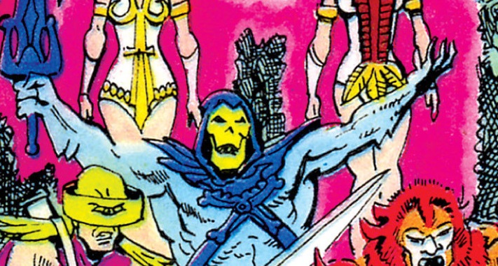
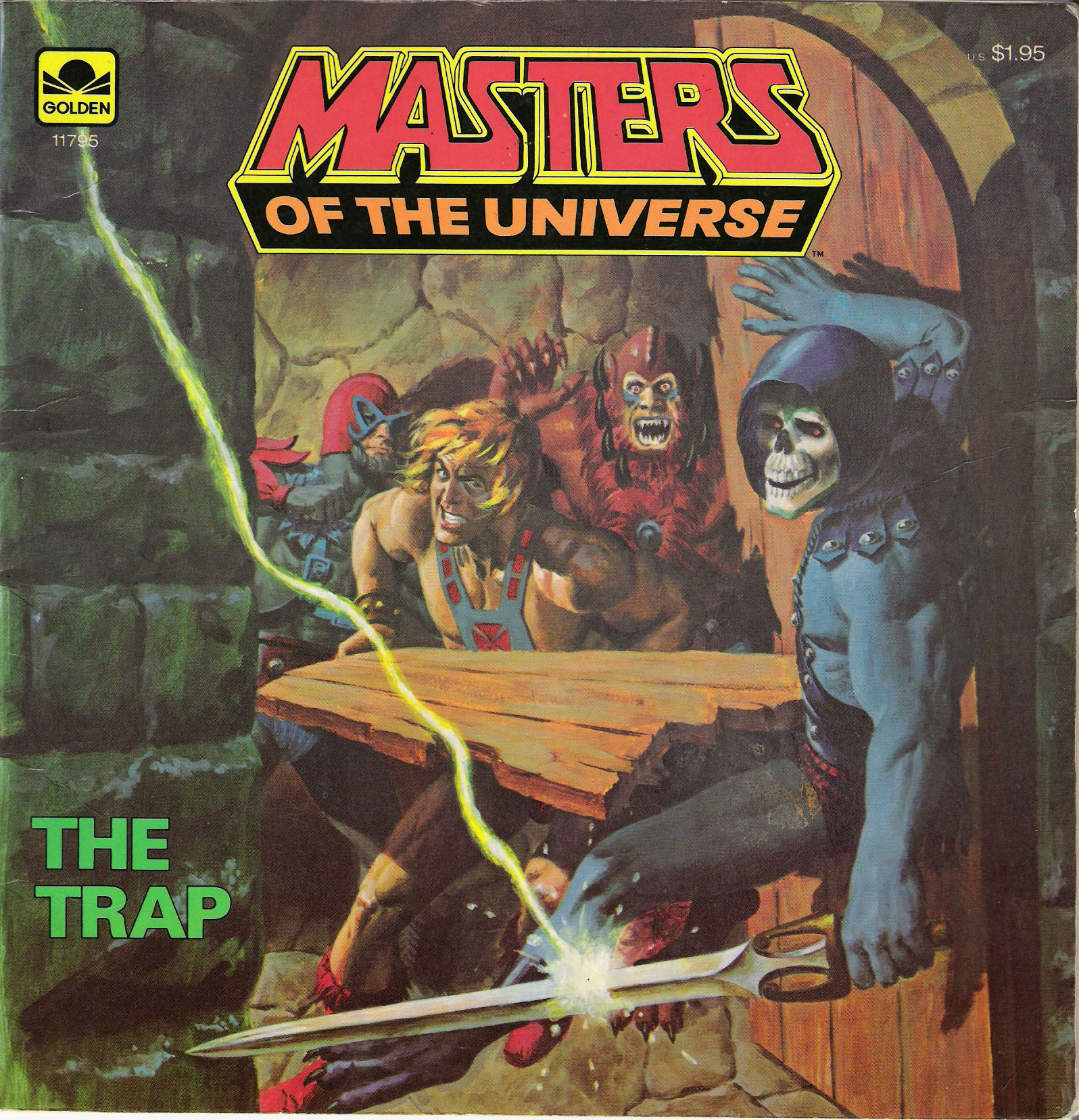
Fans have been talking about the influence of Jack Kirby’s Fourth World/New Gods series on Masters of the Universe for years. This narrative seems to have started on the various discussion boards many years ago, inspired by the 1982 series of full-size MOTU comic books produced by DC comics. I’ll talk about some of the proposed areas of influence, and try to provide as much historical context around them as possible.
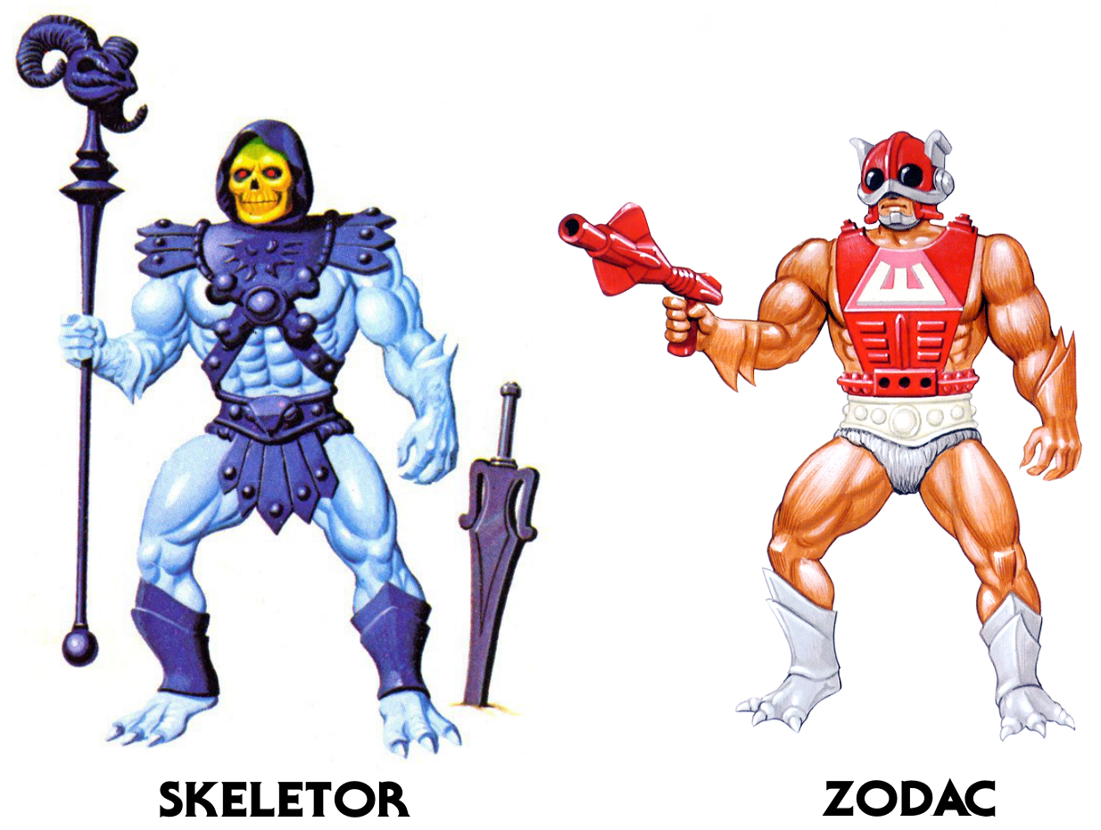
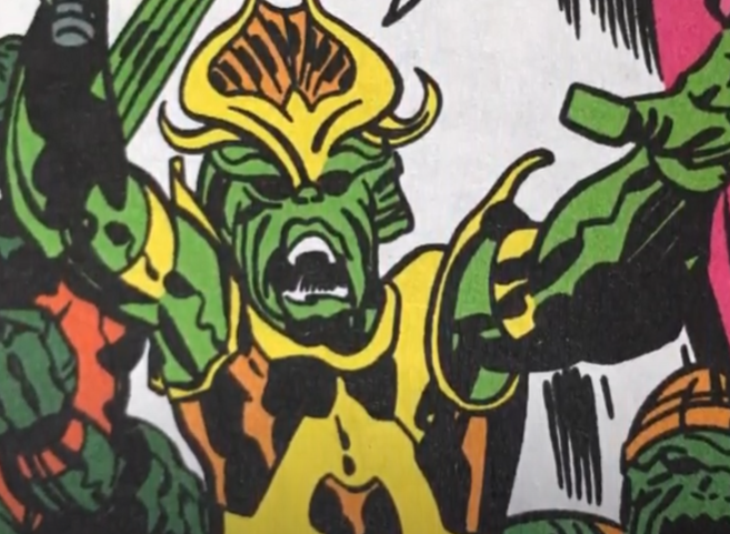
DC Comics – Zodac

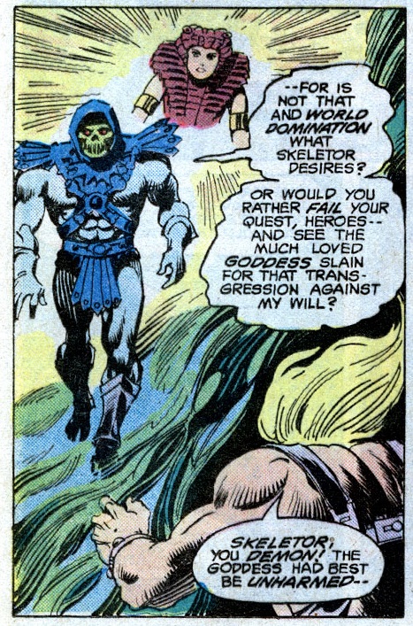
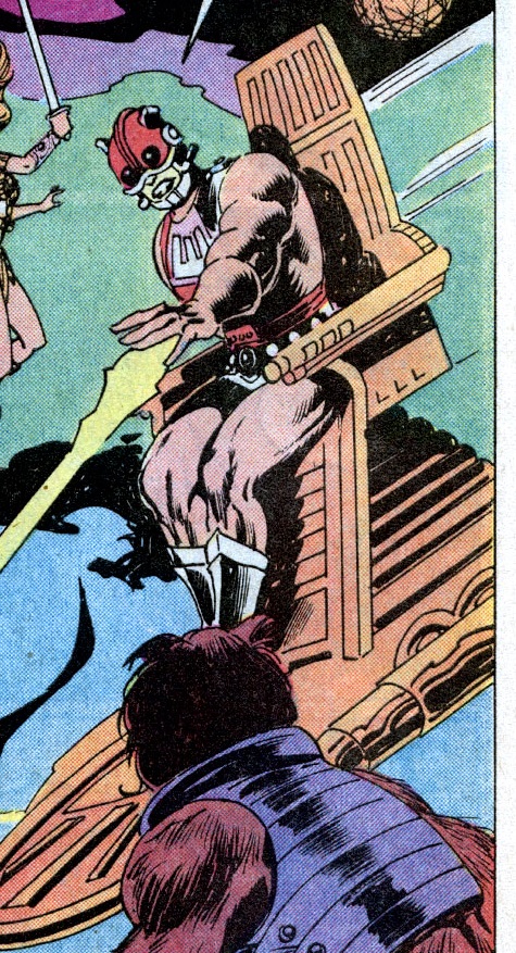
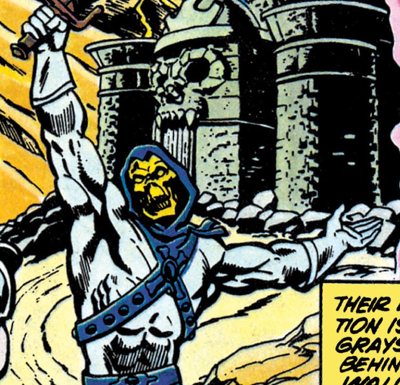
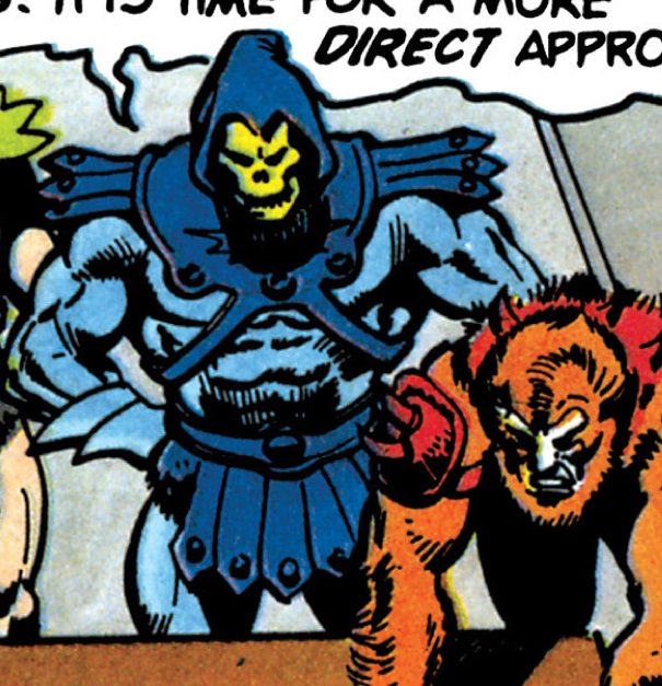
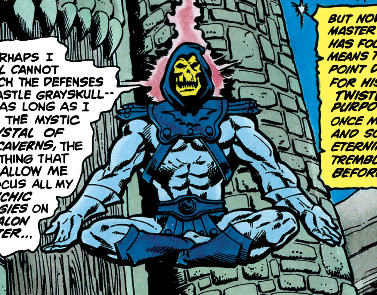
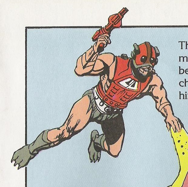
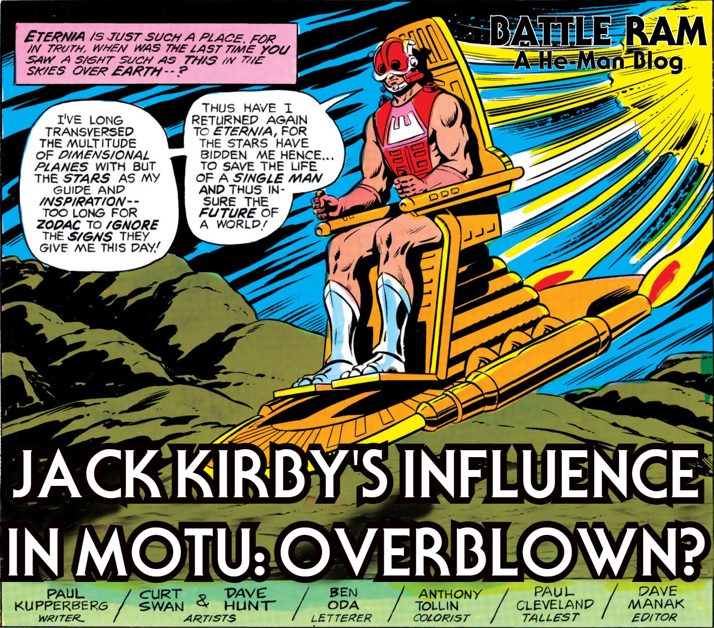
In the DC series, beginning with Fate is the Killer, Zodac is portrayed as “rider of the spaceways.” Like Metron, he travels through space in a flying chair (in this case it’s the throne from Castle Grayskull with a platform added underneath). Like Metron, he is not strictly aligned with either the heroes or the villains. The fact that Zodac and Metron are characterized in similar ways doesn’t mean they’re exactly the same – Metron seems more focused on seeking knowledge, while Zodac is more focused on maintaining the balance between good and evil.

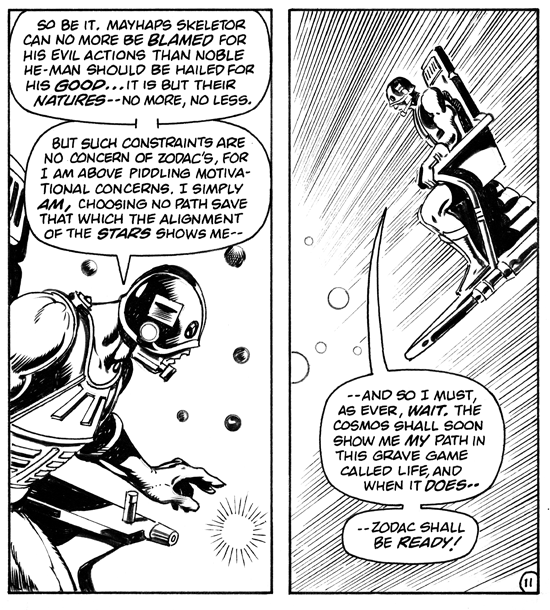
Image source: James Eatock (cleaned up by Jukka Issakainen)

It should be noted that this characterization of Zodac came from DC Comics, not Mattel. Prior to the DC Comics stories, Mattel wanted to position him as a heroic warrior (this was the intention of the designer, Mark Taylor) or as a bounty hunter (an idea that came from Mattel’s marketing department). The bounty hunter thing indicates they still had Star Wars very much in mind – and MOTU was created to compete with Star Wars in the toy aisle.

From author of the DC MOTU series’ perspective, a Jack Kirby influence on Zodac seems to have actually been unintentional, or coincidental. Back in 2010, James Sawyer interviewed Paul Kupperberg, the person who wrote all five comics in the DC series:

James Sawyer: Were you playing homage to any specific genres or stories when fleshing out the He-Man concept? Many fans point to the similarities between Zodac and Metron and naturally assume that the character is loosely based on him.

Paul Kupperberg: None of the above! I don’t remember making the Kirby New Gods connection at the time, although I’m sure I must have seen it had it pointed out to me, but I’m not very big on the whole ‘homage’ thing. You call it ‘homage,’ I call it ‘cheating.’ Kirby already created Metron. If I need Metron, I’ll use Metron, not create a second-generation rip-off that’s not only NOT going to be as good but is going to make people point and see that I don’t have any ideas of my own. Julius Schwartz used to call a certain group of writers he worked with “archaeologists,” because all they ever did was dig up everybody else’s old characters and bits and use them rather than creating something new.

Emphasis added. Read the full interview here.

1987 Masters of the Universe Movie

However, there is at least one clear area of Jack Kirby inspiration in Masters of the Universe. That came in the 1987 Masters of the Universe movie. Director Gary Goddard said:

As the director of Masters of the Universe, it was a pleasure to see that someone got it. Your comparison of the film to Kirby’s New Gods was not far off. In fact, the storyline was greatly inspired by the classic Fantastic Four/Doctor Doom epics, The New Gods and a bit of Thor thrown in here and there. I intended the film to be a “motion picture comic book,” though it was a tough proposition to sell to the studio at the time. “Comics are just for kids,” they thought. They would not allow me to hire Jack Kirby who I desperately wanted to be the conceptual artist for the picture…

I grew up with Kirby’s comics (I’ve still got all my Marvels from the first issue of Fantastic Four and Spider-Man through the time Kirby left) and I had great pleasure meeting him when he first moved to California. Since that time I enjoyed the friendship of Jack and Roz and was lucky enough to spend many hours with Jack, hearing how he created this character and that one, why a villain has to be even more powerful than a hero, and on and on. Jack was a great communicator, and listening to him was always an education. You might be interested to know that I tried to dedicate Masters of Universe to Jack Kirby in the closing credits, but the studio took the credit out.

Gary Goddard

So to sum up so far, we can confirm the 1987 Masters of the Universe Movie plot was partially influenced by Kirby’s Fourth World, Fantastic Four and Thor stories. We also can see, potentially at least, some unconscious influence by Kirby’s Fourth World on the character of Zodac as portrayed in the 1982 DC comics, although it’s possible that it’s just coincidental.

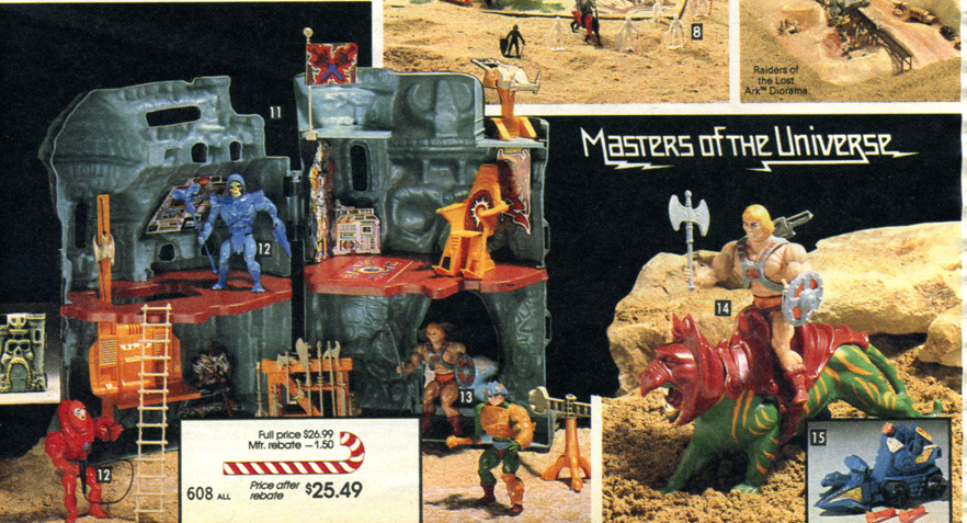
1982 Masters of the Universe Toyline

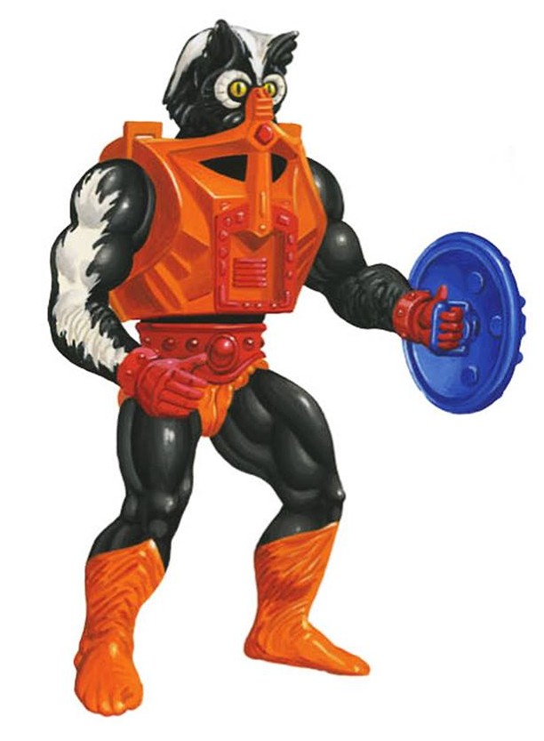
Over the last couple of years, I’ve noticed a number of videos from former Masters of the Universe Classics Brand Manager Scott Neitlich (whose tenure on the line ran from its beginning in 2008 until 2014). In his YouTube channel, Spector Creative, he’s claimed in several videos that there was a Jack Kirby influence not just on story, but on toy design, including the visual look of Battle Ram, Wind Raider, Beast Man, Skeletor and many others, particularly in the first couple of waves.

Scott’s premise is that Mattel had done some design work in the late 1970s for a potential New Gods toyline. He had found a folder of this material when he was at Mattel, doing some research for the MOTU Classics line. He notes that when designers work on a project that doesn’t go forward, the tendency is to reuse some of that work in future lines. That’s absolutely true, it does happen. For example. Dragon Walker was originally created for a pitch for a new toyline, unrelated to Masters. That line wasn’t greenlit, so Dragon Walker was brought into MOTU. Similarly, an early drawing of a character by Mark Taylor for an unproduced line called Rob-N & the Space Hoods was rebooted as Man-At-Arms in the MOTU line.

Evil Sheriff of Nottingham-type character for the Rob-N & the Space Hoods line pitch from 1980, repurposed as Man-At-Arms with some design changes

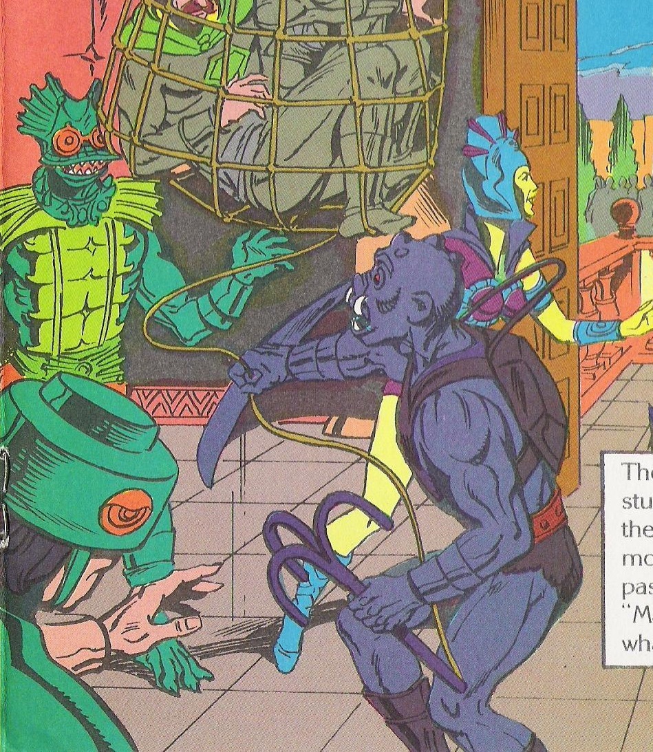
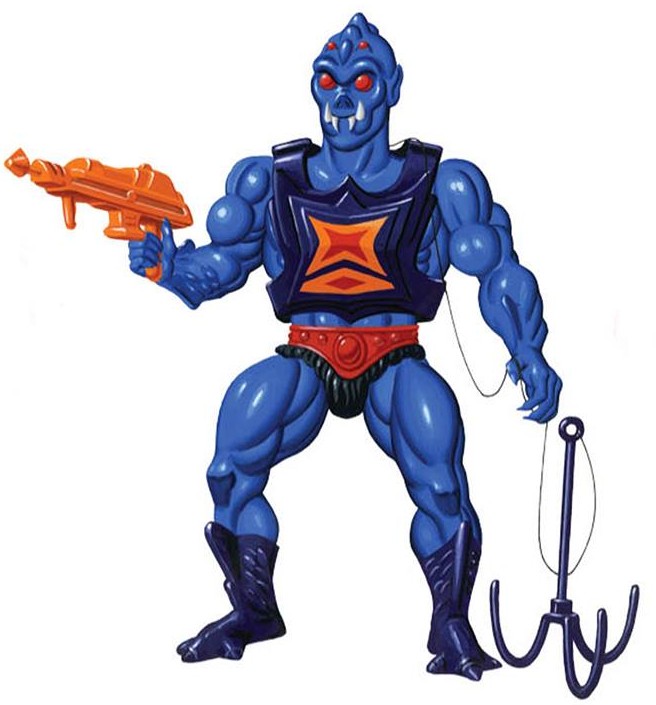
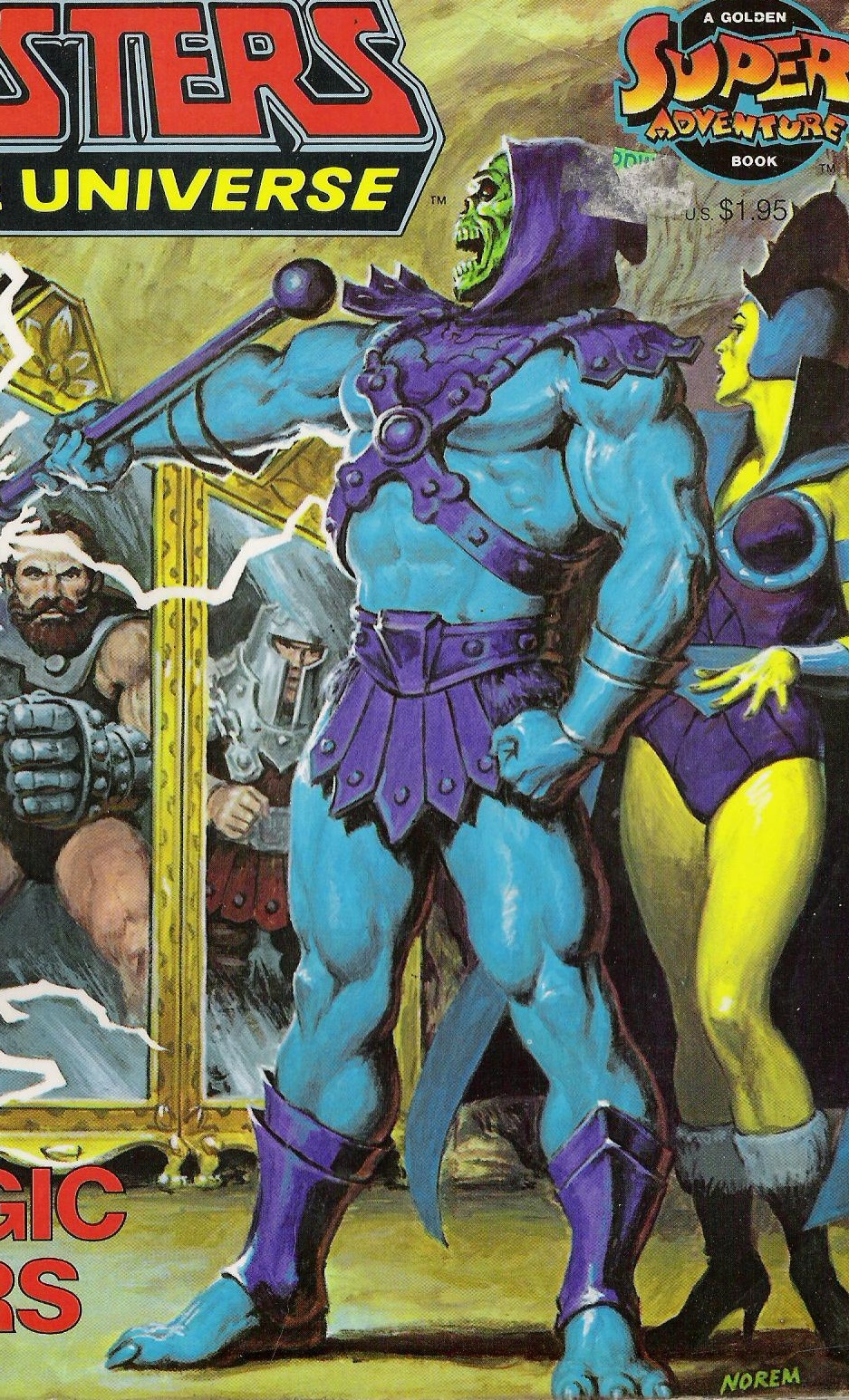
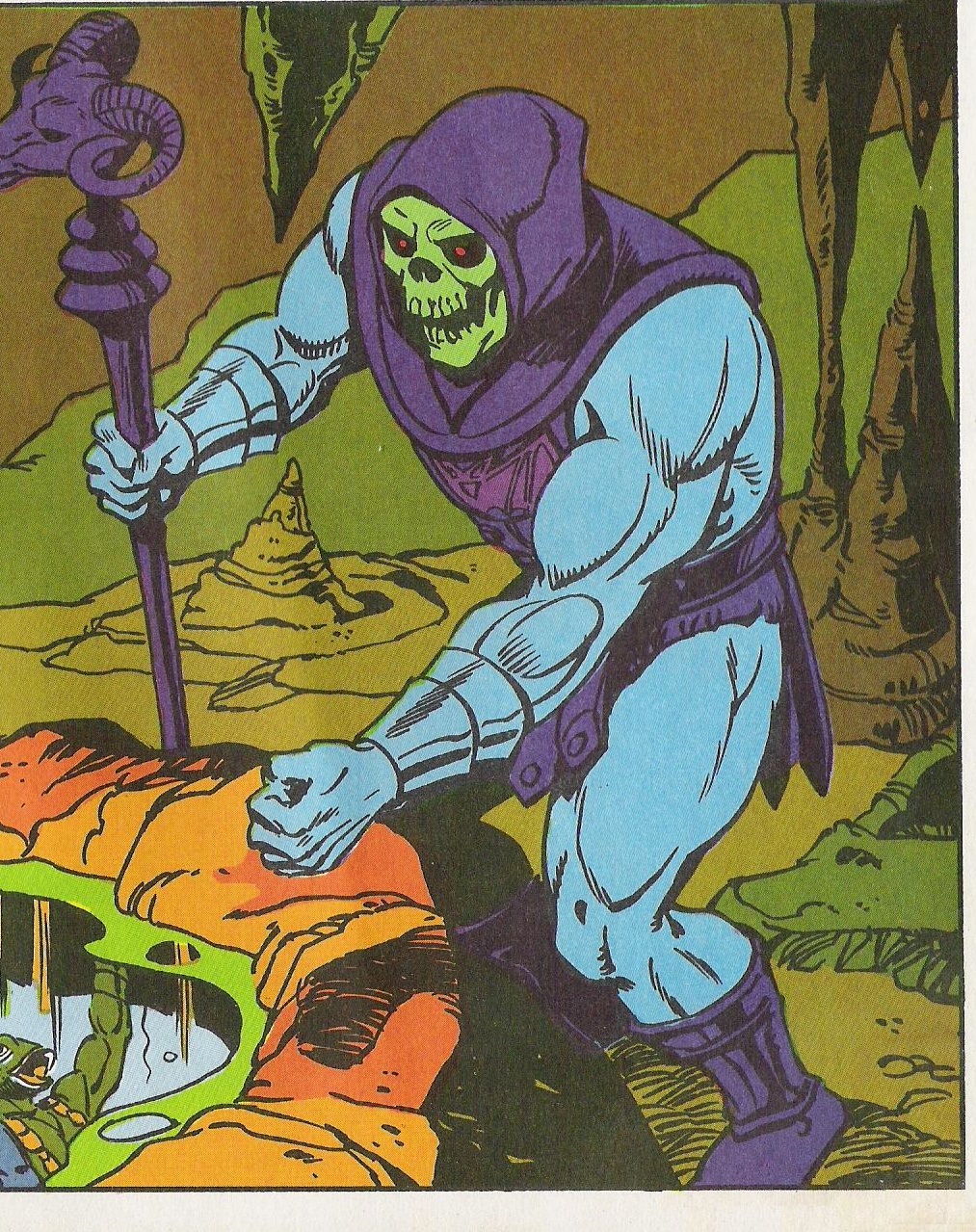
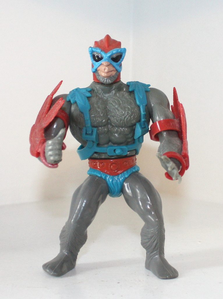
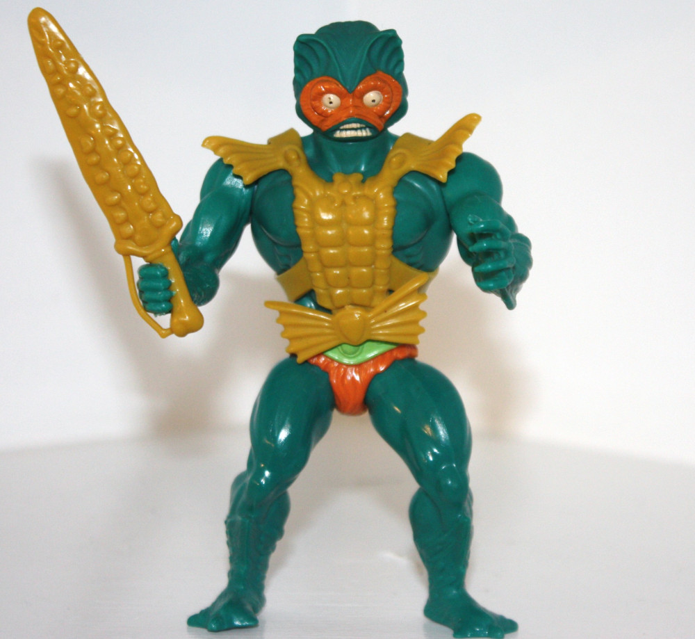
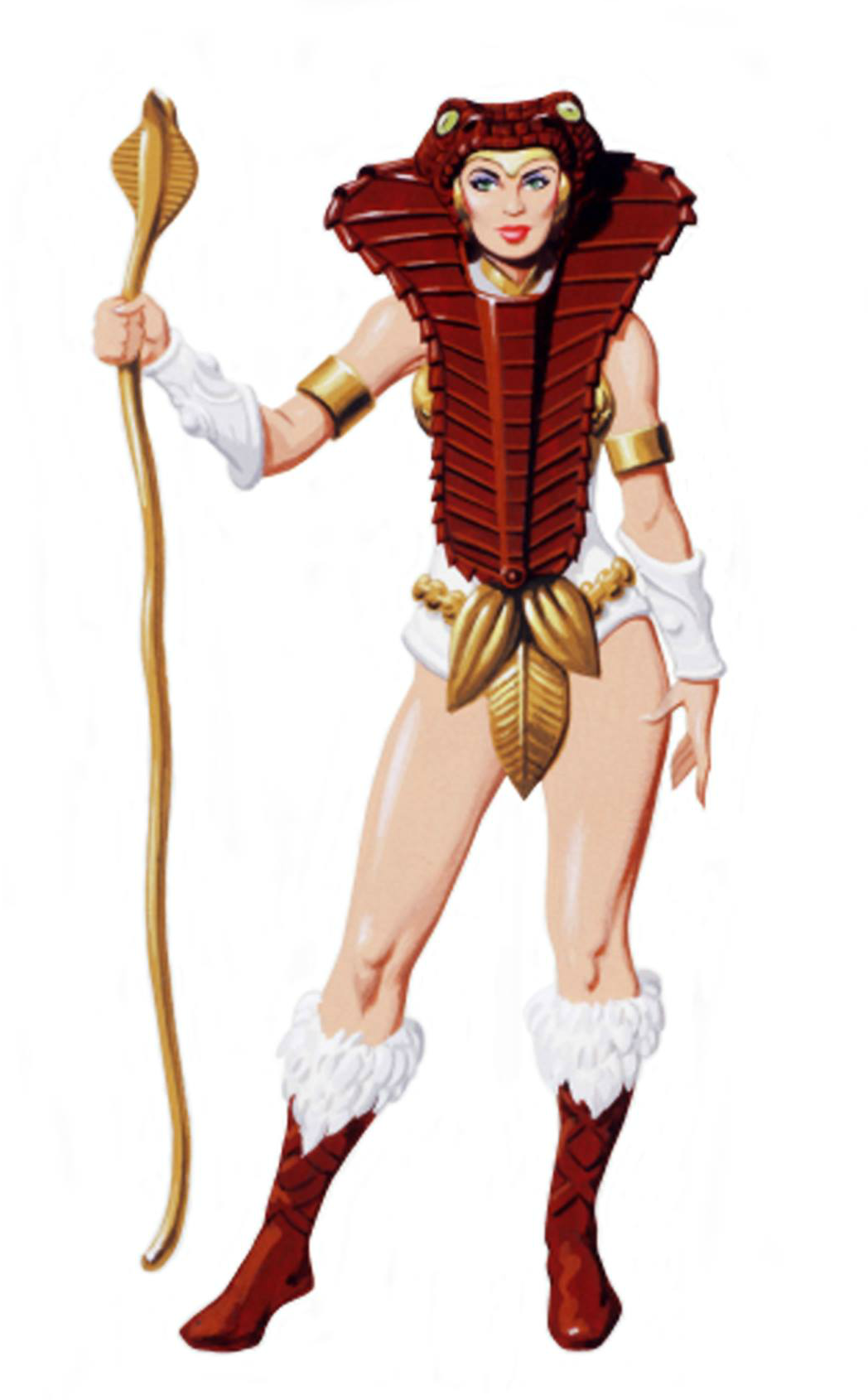
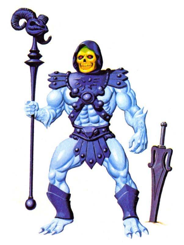
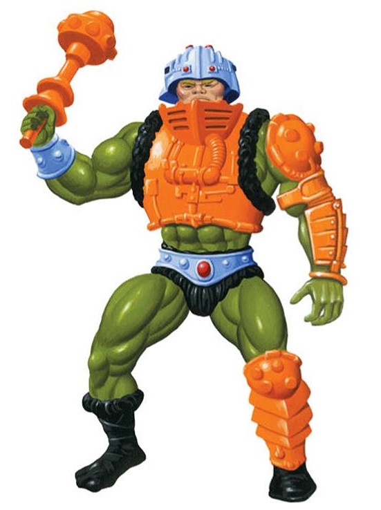
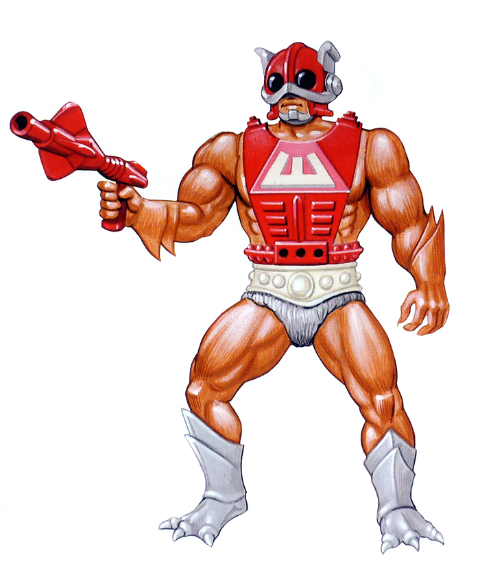
However, because that kind of recycling happens in toy companies does not mean that New Gods concepts were recycled into MOTU. In his video, Scott links characters like Mekaneck, Zodac, Man-E-Faces, Man-At-Arms, Mer-Man, Teela, Battle Cat/Panthor, Battle Ram, and others to the New Gods. However, all of the visual parallels are pretty insubstantial – they are frankly parallels you could make between MOTU and any number of science fiction, fantasy and superhero properties. Often they’re just based on having similar colors.

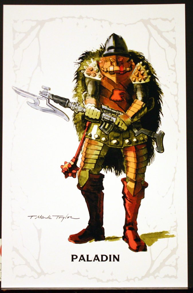
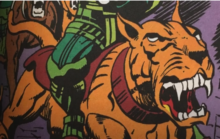
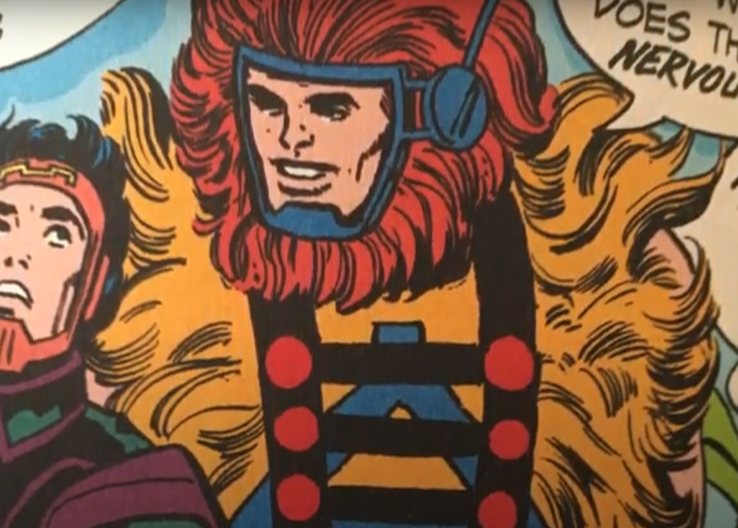
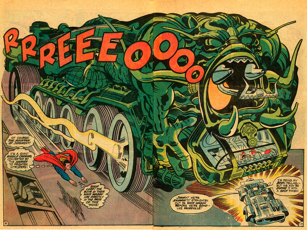
Below are the images that Scott identifies with existing MOTU characters. As you can see, these are not close matches, but instead are based on existing archetypes and color styles that are far more pervasive than just New Gods or MOTU. I would say that at most both properties were drawing on many of the styles and influences that pervaded pop culture from the 1950s to the 1970s, but that’s true of just about every property of this type really through the 1990s.

However, I can say it’s very unlikely that Kirby was an influence on Mark Taylor and Ted Mayer for the MOTU line. Between the two of them, they did 100% of the visual design work for the 1982 line of toys, and some of the 1983 line as well. I have in my archives many hours and thousands of words of interviews with Mark Taylor and Ted Mayer, including my own interviews that I did with them for this blog and also for the Dark Horse Toys of He-Man and the Masters of the Universe. They mentioned a lot of influences, including Frank Frazetta, Prince Valiant, conquistadors and knights, Flash Gordon, Star Wars, muscle cars and World War II military aircraft. Never once did either of them mention a Jack Kirby influence. Moreover, I recently reached out to Ted Mayer to ask specifically if there was any Jack Kirby influence on MOTU. He had this to say:

I never heard anyone mention the comic series while we were working on He-Man. The only subject that came up was Frank Frazetta, but that was only in the background, his books were out and every designer was looking at them. All this of course was in the visual design area, I cannot speculate if marketing was looking at this, but I doubt it!

Ted Mayer

Note that Ted Mayer worked with both Mark Taylor (who lead visual design on MOTU for its first year) AND Roger Sweet (who lead the design team for MOTU in its second year and for most of its original run), and he was in a unique position to know if New Gods had had any influence on the line. If he never heard of it having been an influence, it’s very unlikely that it ever was. Mark’s primary work on action figure lines prior to MOTU was mostly on packaging, including for Tarzan and I believe Clash of the Titans and Flash Gordon. Around 1980 he was pulled into creating concept art for various toylines, including Rob’N and the Space Hoods, Miniworld, Masters of the Universe, Giants, Conan (summer 1981) and Kid Gallant. Of those, only MOTU went forward.

In a video about the Grayskull Space Suit, in the comments, Scott also claims that the cardboard space suit inside the original Castle Grayskull was another Kirby design. In response to a fan theory that the space suit was Queen Marlena’s suit that she brought with her from earth, Scott says: “Yeah but it doesn’t really look very ‘earth’, likely because Kirby designed it.”

This is even more far-fetched. The space suit was illustrated by Rebecca Salari Taylor, Mark Taylor’s wife. She worked as a freelance illustrator for Mattel, and was never involved in male action figures until Mark was leading the visual design for the MOTU line. Primarily she worked on Barbie and preschool properties, focusing on fashion design. She said that the labels and cardboard pieces for the castle were based on futuristic icons and previous artwork by Mark to help make MOTU something more than just a Conan or Tarzan-type property. She never worked on any Jack Kirby line.

Castle Grayskull space suit carboard cutout, illustrated by Rebecca Salari Taylor

Here is a quick rundown of a few things I can confirm (from direct statements from the creators) influenced some of the toys Scott mentioned in his videos:

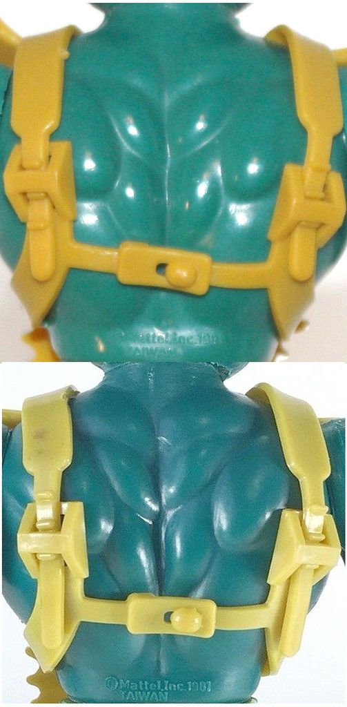
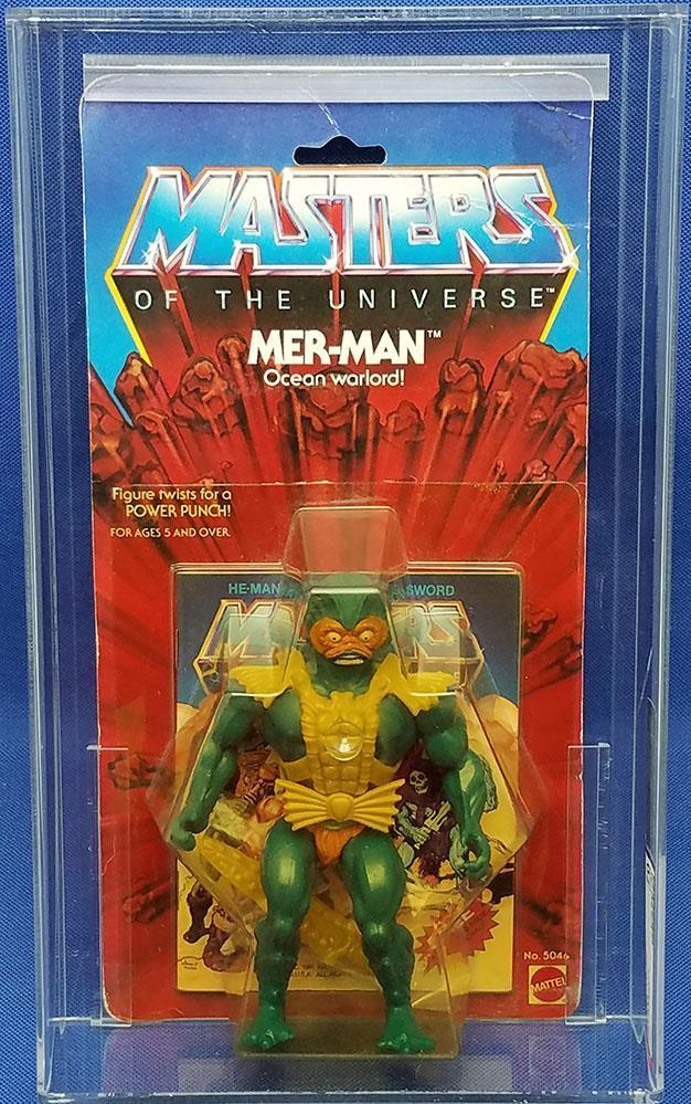
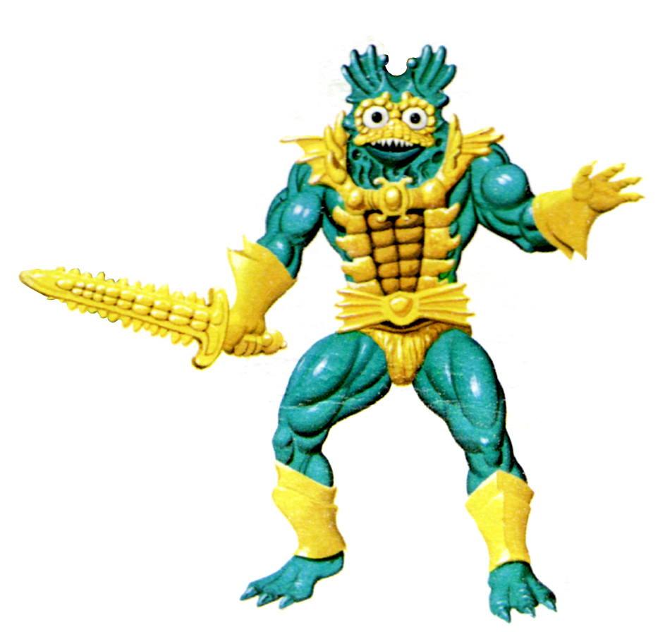
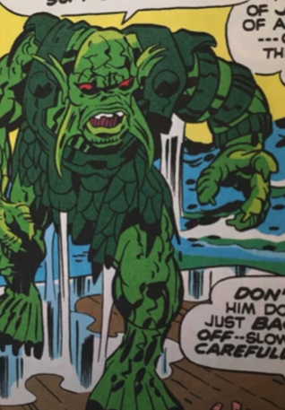
  • Mer-Man:  Bernie Wrightson’s Swamp Thing
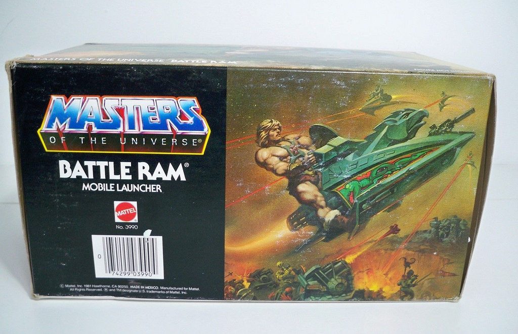
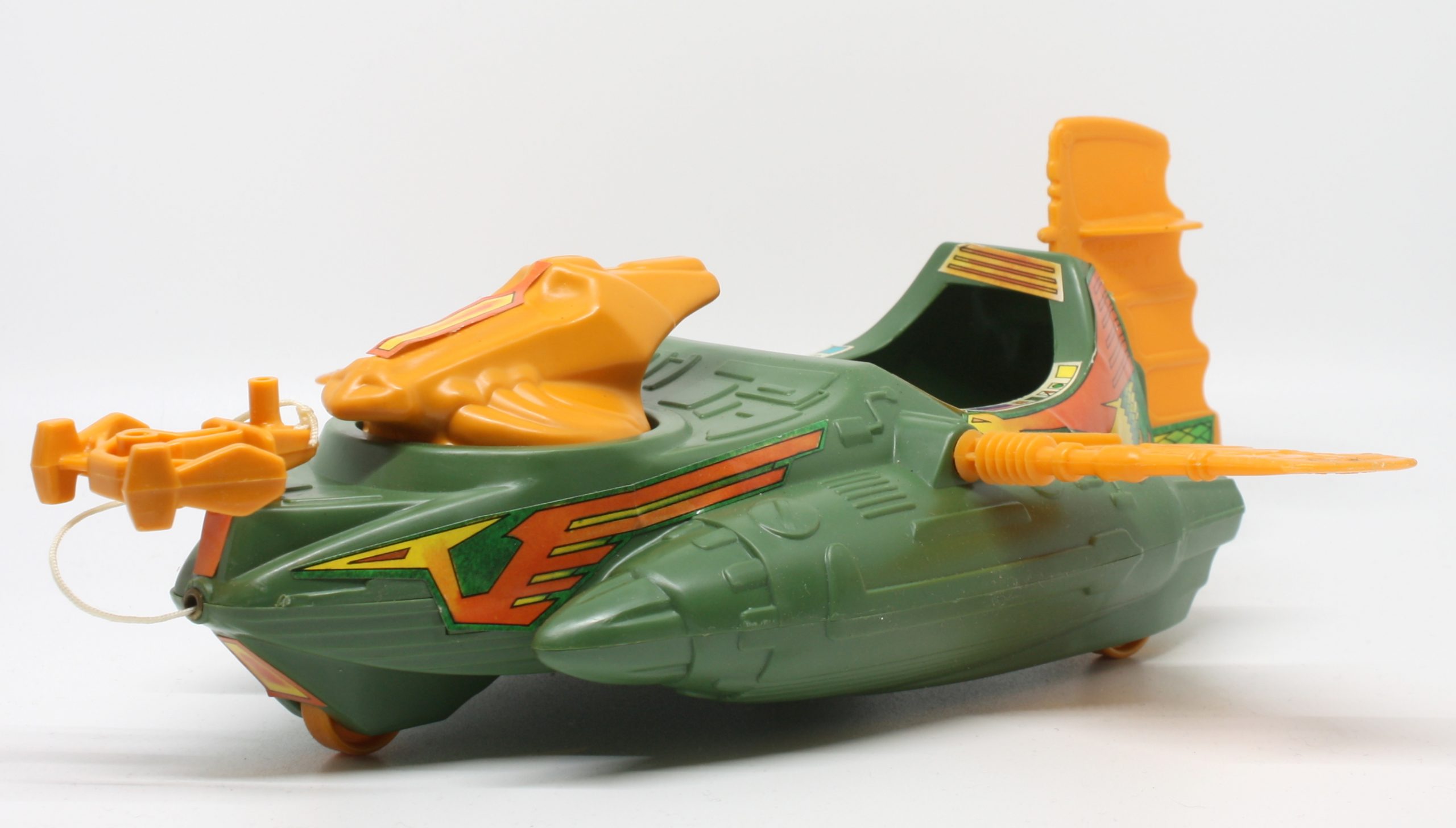
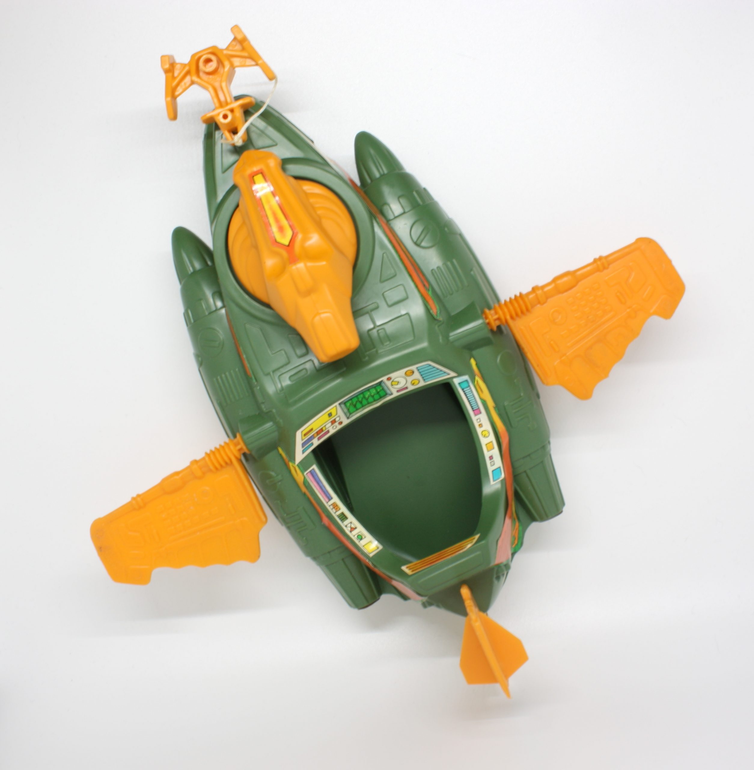
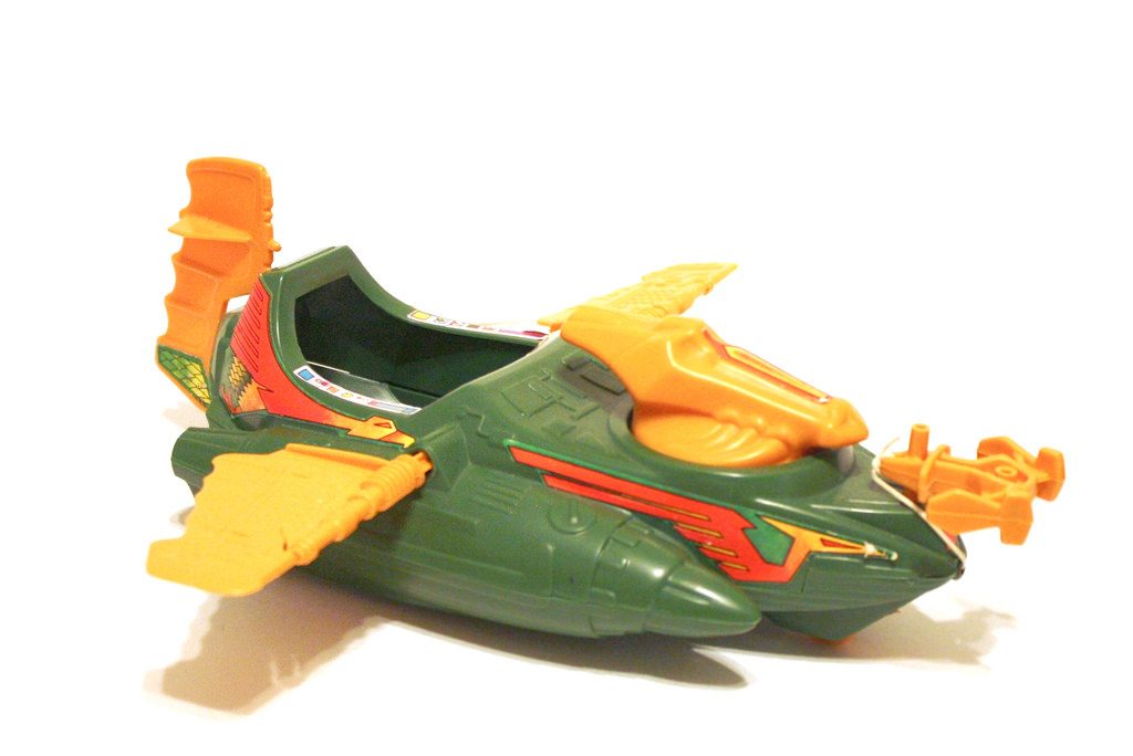
  • Battle Ram: muscle cars, Star Wars, classic architecture
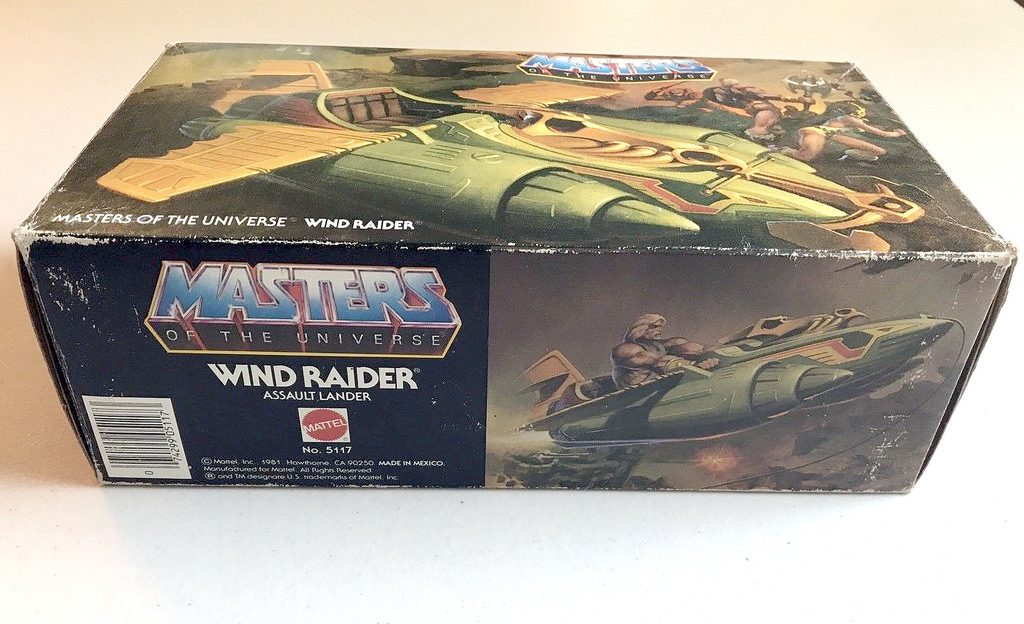
  • Wind Raider: Viking ships (1st version), vintage military aircraft (final version)
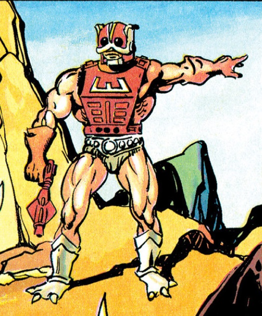
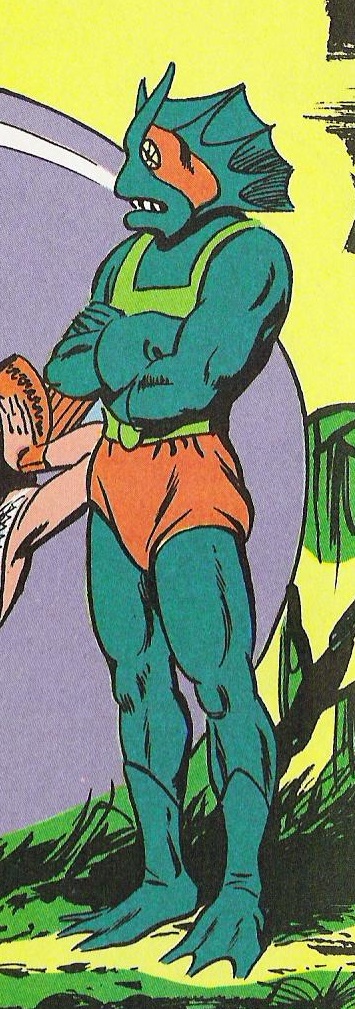
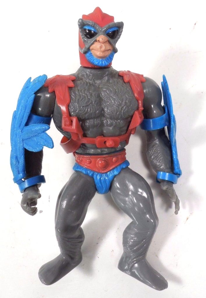
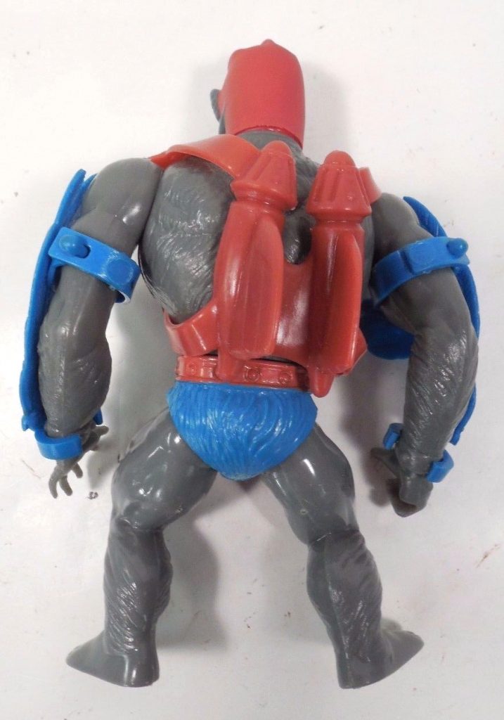
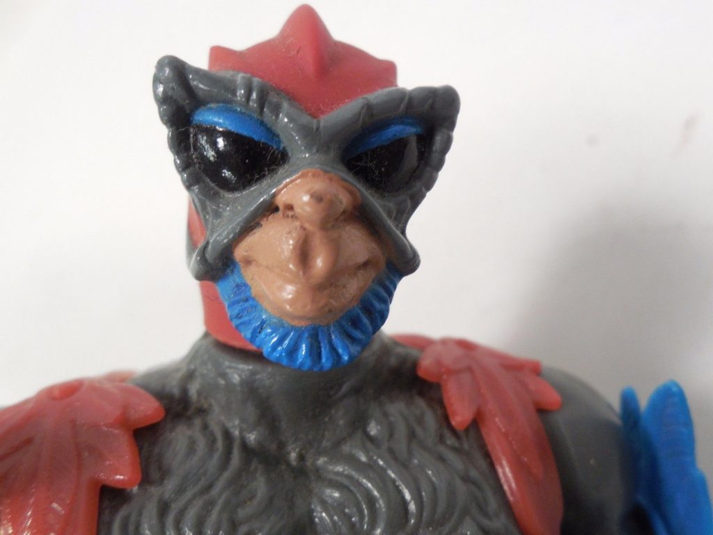
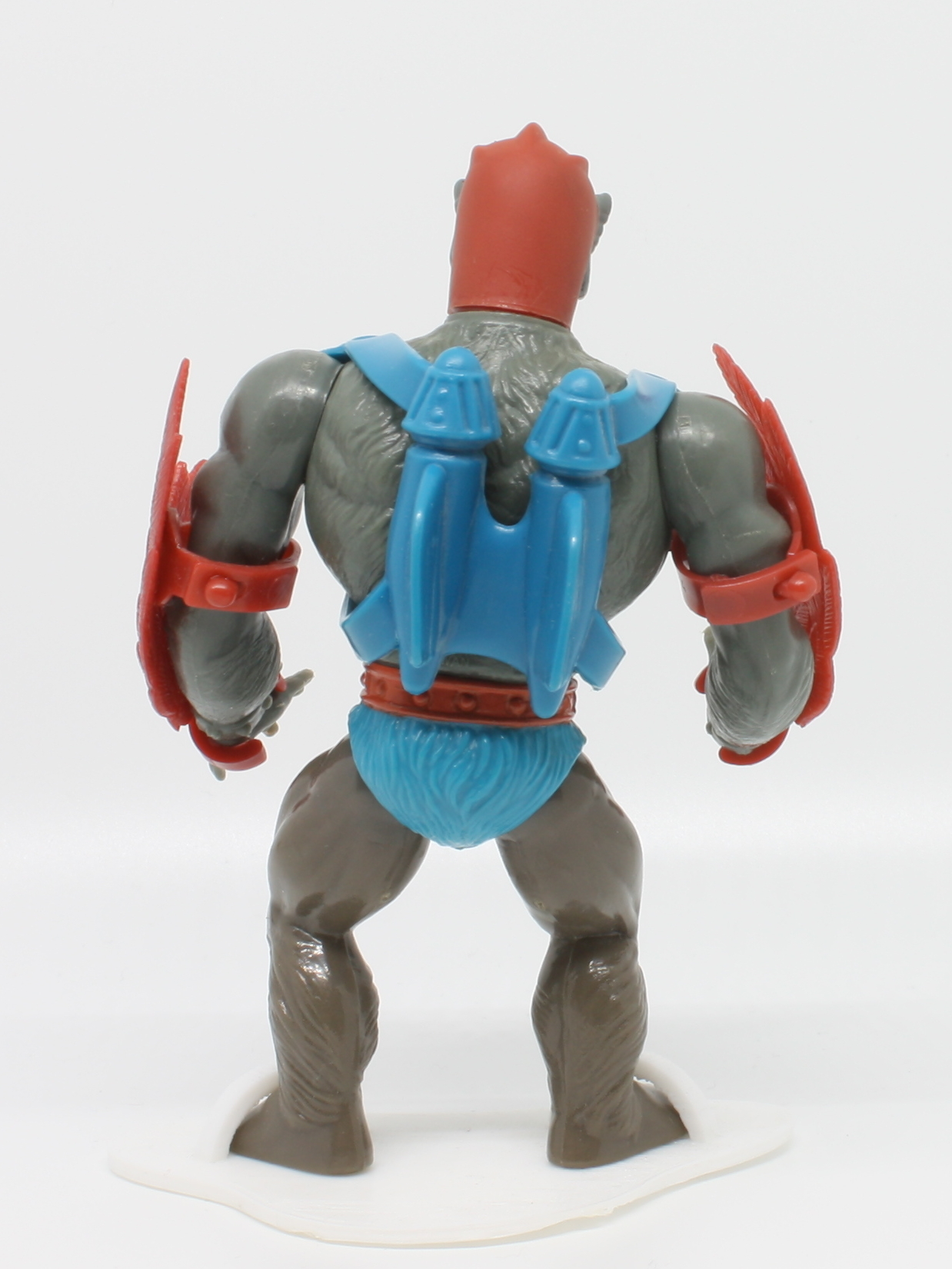
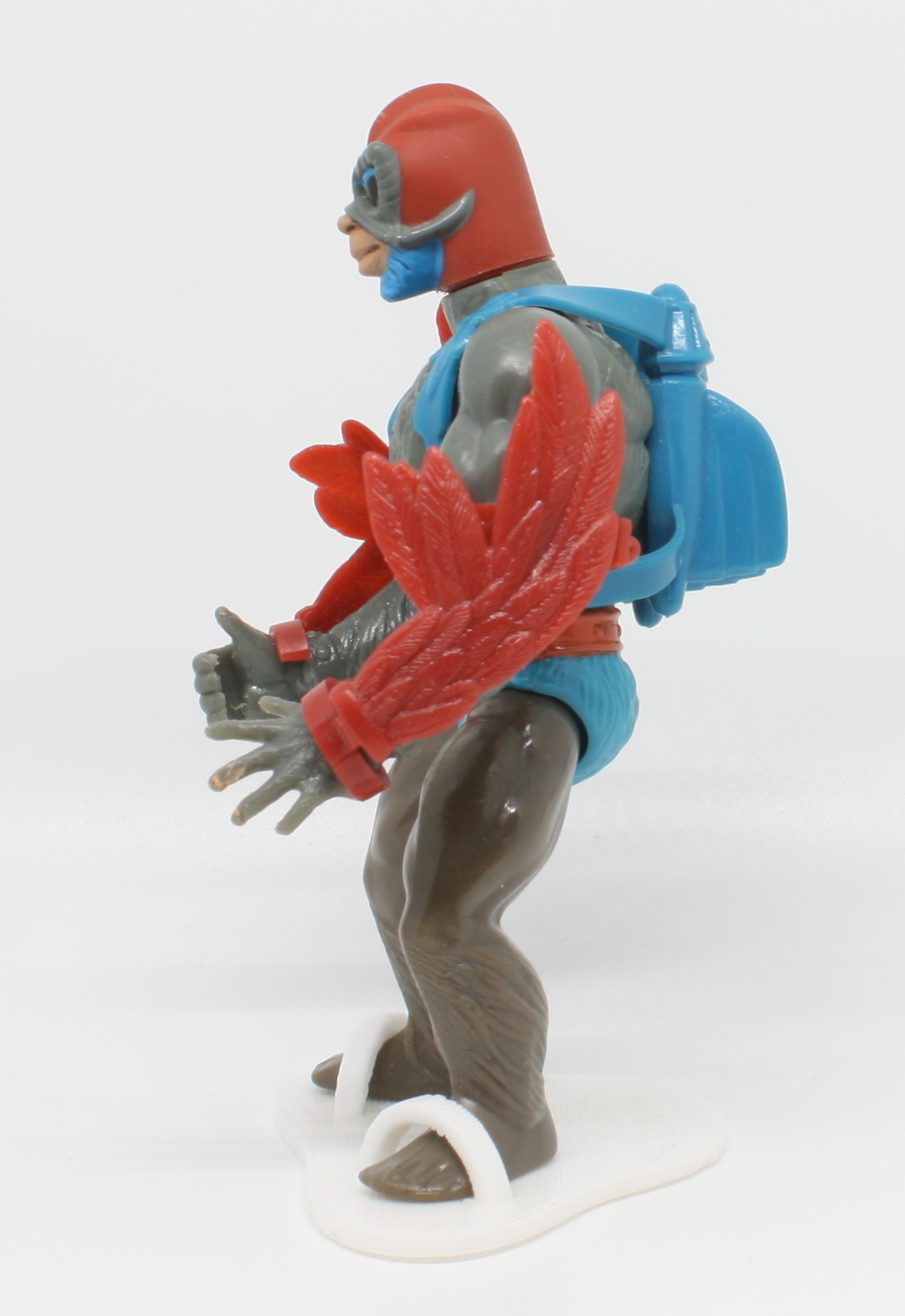
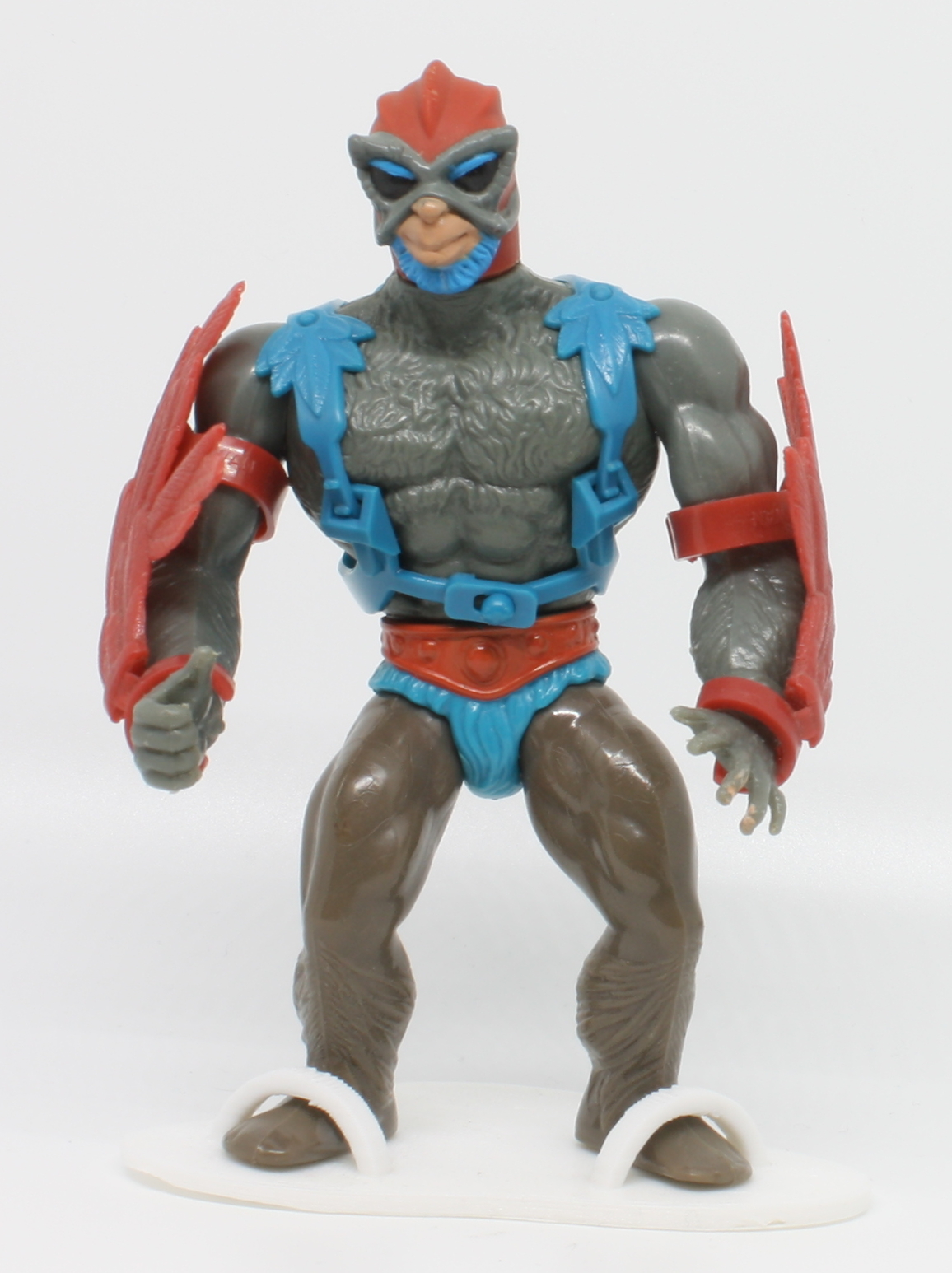
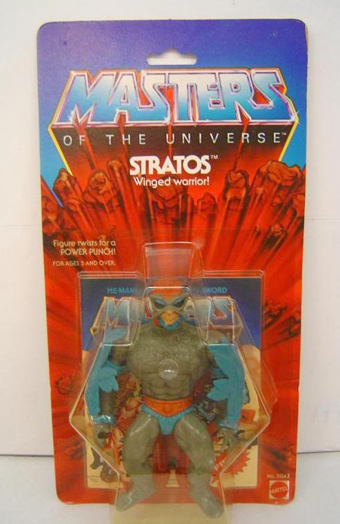
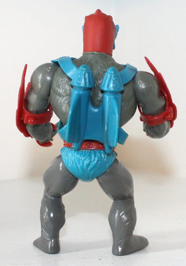
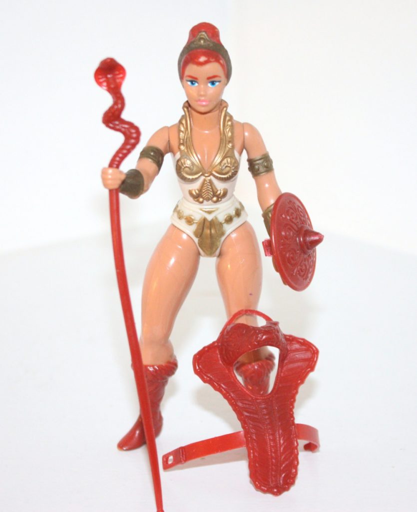
  • Zodac: Flash Gordon
  • Man-E-Faces: Aztec warriors (visual design), and recycling an action feature from Big Jim
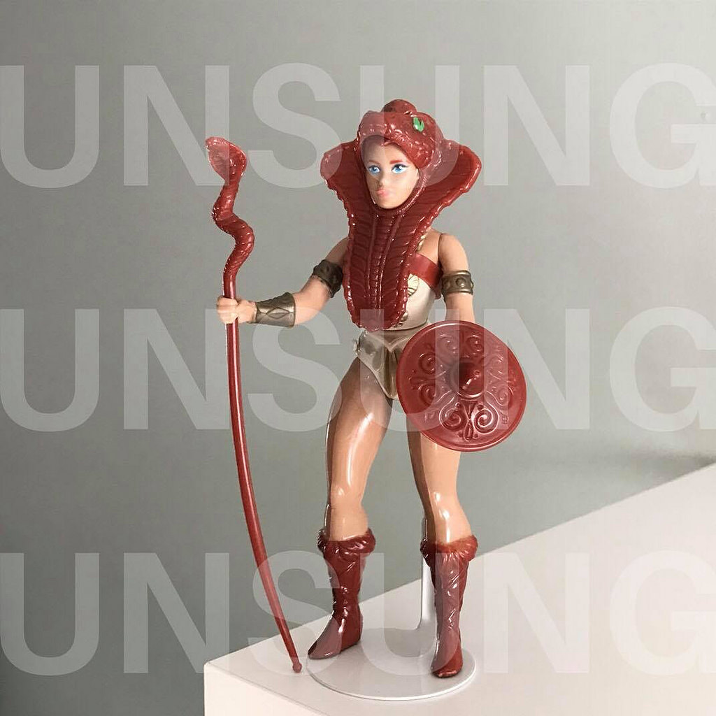
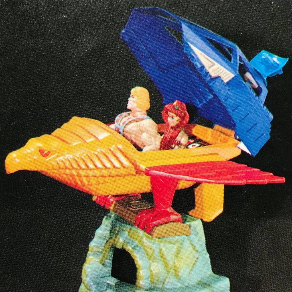
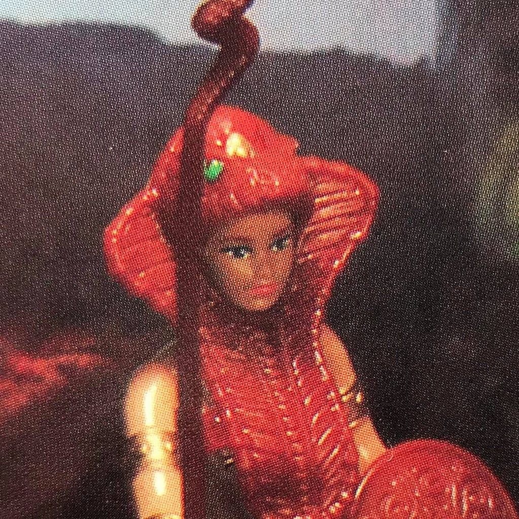
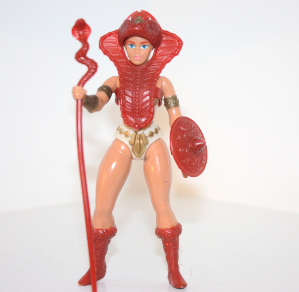
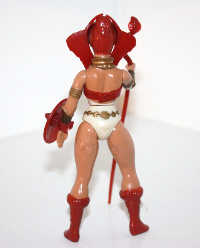
  • Teela: inspired by Mark’s wife Rebecca as well as this costume
  • Man-At-Arms: conquistadores and gladiators
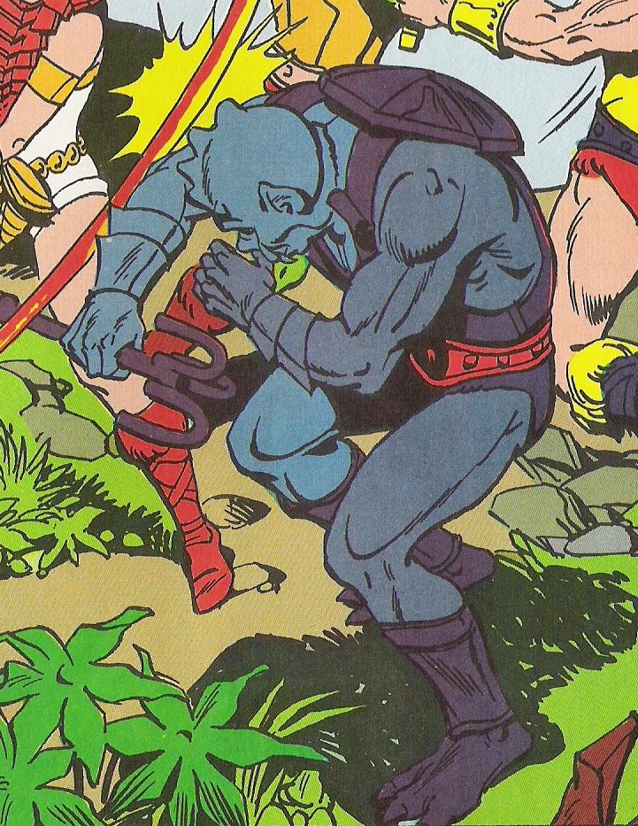
  • Beast Man: Chewbacca, existing Big Jim gorilla tooling
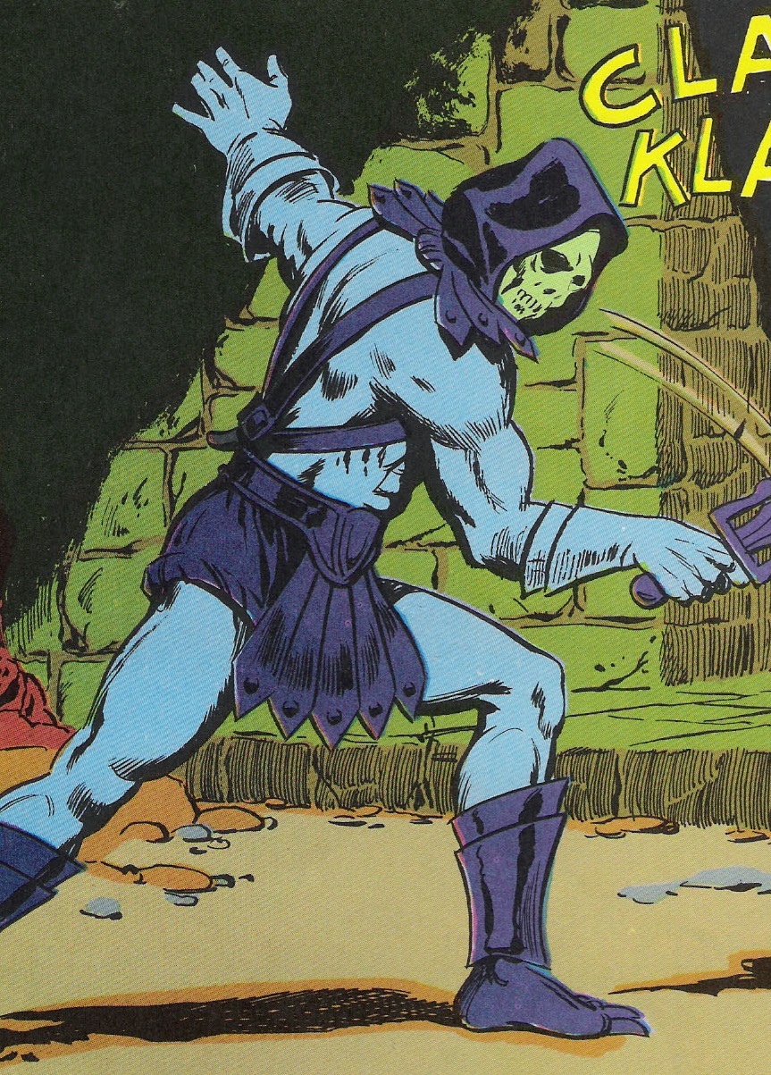
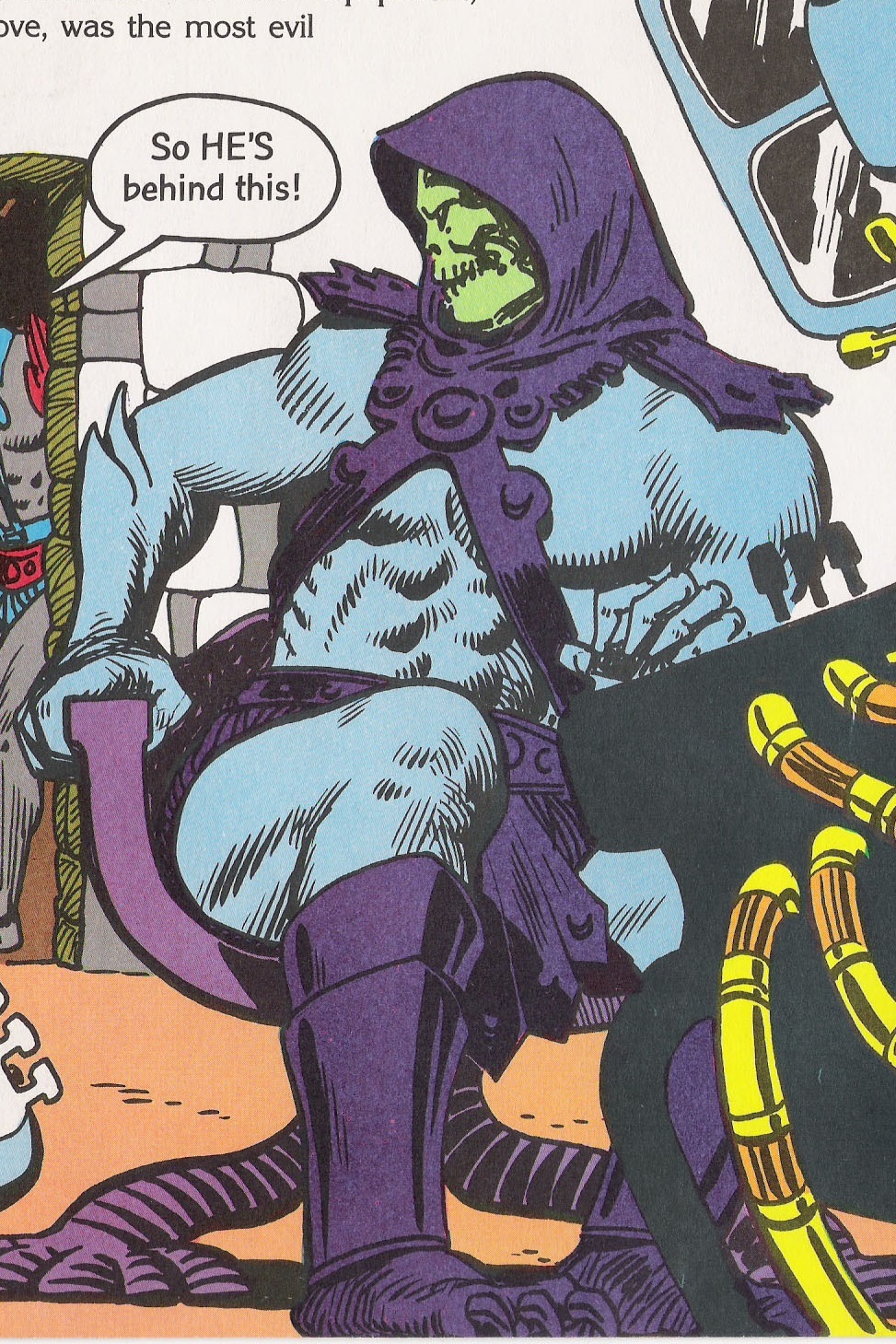
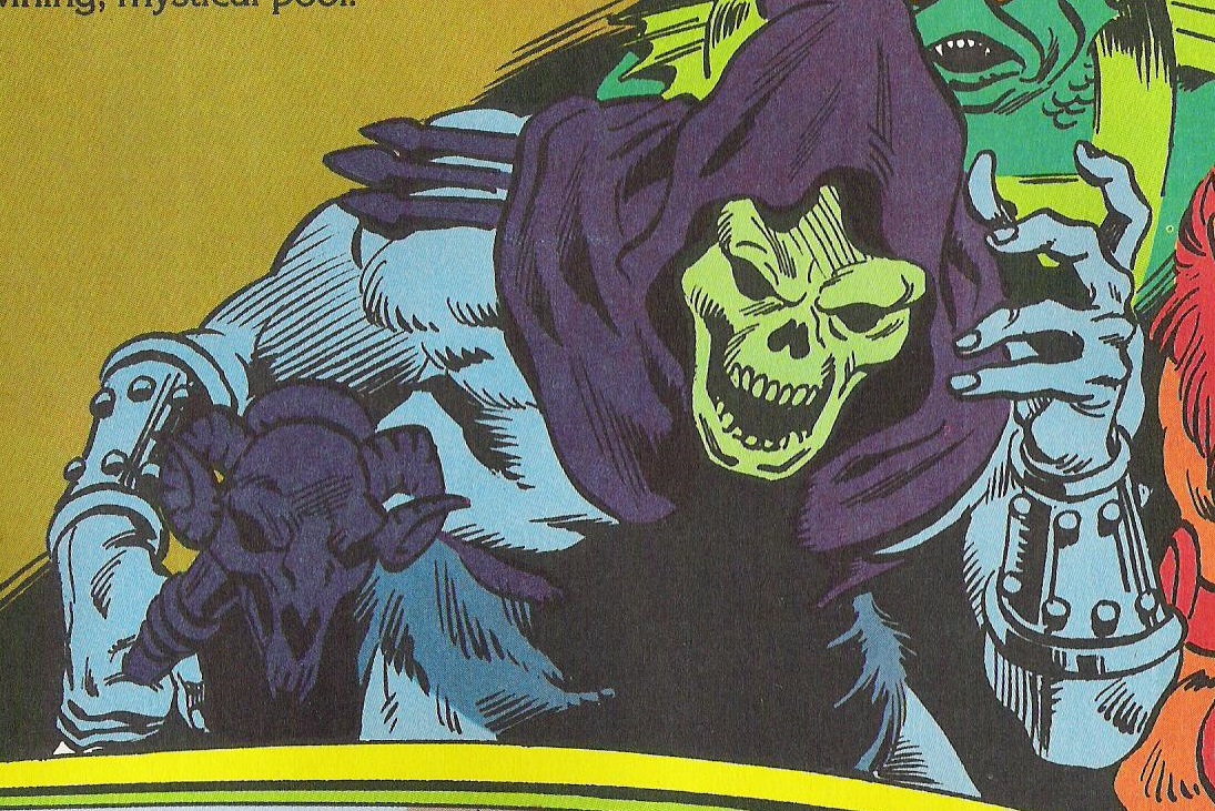
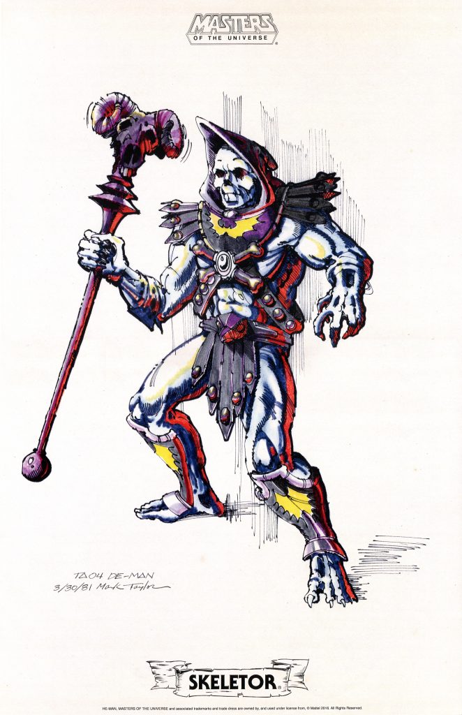
  • Skeletor: Dia De Los Muertos art, the corpse of Elmer McCurdy at Pike Amusement Park
  • Battle Cat: just a creative way of reusing an existing tool (driven by budget and convenience, not by Jack Kirby). Armor inspired by Mark Taylor’s own childhood drawings and redesigned for Battle Cat.

We know Masters of the Universe had a number of visual designers. I thought I’d put together a rough, incomplete timeline of which visual designers ultimately designed the various toys that were released each year. Note that Roger Sweet took the lead in pitching the line to Mattel in 1980, so he did have some influence on the 1982 line, in terms of action feature and the stance of the figures. However, he didn’t come up with the visual design for He-Man, but rather based his barbarian prototype on Mark’s illustrations. When Roger took over the line after Mark Taylor left Mattel, he would often come up with a very basic figure or action feature idea, just a few words on a page (what he calls a “seed idea”), and leave the visual design to members of his team. However, he also designed some figures himself, including Tri-Klops, Mekaneck, Spikor, Two Bad and Sy-Klone.

Visual Design Teams

1982 Series: Mark Taylor, Ted Mayer
1983 Series: Mark Taylor, Ted Mayer, Roger Sweet, Martin Arriola, Colin Bailey
1984 Series: Ted Mayer, Colin Bailey, Roger Sweet, Martin Arriola, Ed Watts
1985 Series: Ted Mayer, Roger Sweet, Martin Arriola, Ed Watts
1986 Series: Ted Mayer, Roger Sweet, Martin Arriola, Ed Watts, John Hollis, Mike Barbato, Mike McKittrick
1987 Series: David Wolfram, Martin Arriola, Mark Jones, Alan Tyler, Ted Mayer, Richard Lepik, Patt Dunn
1988 Series: David Wolfram, Martin Arriola, Alan Tyler

So, as you can see, it’s not just a case of “some Mattel designers worked on a Jack Kirby toyline.” To even begin to make some kind of case for a Kirby influence, we’d need to know who those designers were, just to start. But even that wouldn’t definitively make the case without more positive evidence.

I will say that I also have an extensive archive of Roger Sweet interviews, and he never mentioned a Jack Kirby influence either. I know Martin Arriola came on in 1982 just after Mark Taylor left, so of course he didn’t work on the late-70s Kirby line. David Wolfram didn’t start at Mattel until He-Man had already been going for years.

There’s just no evidence that any aspect of the MOTU toyline was influenced by New Gods. If there was some kind of influence, it would have to be relatively minor. As always, I’m open to any additional evidence that may surface!

Thank you to the following individuals who are current Patreon supporters!

  • Philip O.
  • MOTU Origins Cork
  • Bryce W.
  • Ben M.
  • Matthias K.

Comics

Are Skeletor and Zodac wearing gloves?

Special thanks to Jukka Issakainen for adding a few observations to this article.

This is probably another one of those esoteric micro topics that only I am actually interested in exploring. But it is something that’s been rolling around in the back of my head for years, so I’m finally going to write about it. To those few obsessives who have the same ailment as me, join me, won’t you?

The origin of this topic starts with the cardback images on the packaging of the vintage Masters of the Universe figures. The backs of the 1982 figure cards showed the eight figures available that year, rendered in beautiful detail that in many cases exceeded the detail of the figures themselves. Most of these images were based on evolving concept art and prototypes for the figures.

Skeletor, Mer-Man and Zodac all feature what look like “double glove” forearms – as if the figures were wearing two sets of superhero gloves, with the edges of the gloves flaring out near the elbow. Only on Mer-Man were these features painted as gloves. On Skeletor the design looks somewhat altered to give it a more anatomical look, as if it’s part of his flesh. On Zodac, the design looks a bit more clearly like gloves, just unpainted. Also note that He-Man is shown with unpainted, flesh-colored wrist bracers, just like the actual figure.

As an aside: one of the things I love about the 2008 MOTU Classics line is that they released Skeletor and Zodac with the “double glove” forearms, with no attempt to add scales or anatomical irregularities, and left them unpainted. I love the boldness and audacity of saying, yes, look at these arms. They look like gloves, but they aren’t. This is just how Skeletor and Zodac look, and you have to accept that. Their anatomy is so alien that they have these clean lines that go out to points. Embrace the weirdness. We’re following the source material wherever it leads us.

MOTU Classics Skeletor and Zodac

On the vintage figures, this “double glove” look wasn’t actually used – instead the arms were sculpted with a single gloved look that also featured some subtle scales. This made them a bit more ambiguous – they could be anatomical or they could be gloves, depending on if they were painted over or not.

However, it was the cross sell art that was often used as the reference for many comic and storybook illustrators (especially in the first years of the line), and it’s interesting to see how they interpret Skeletor and Zodac’s forearms, as gloves, as anatomy, or just plain ambiguously. Discerning which was the intent is sometimes clear, sometimes not. So without any further ado, let’s begin!

Fate is the Killer (August 26, 1982):

In DC Comics’ Fate is the Killer, both Skeletor and Zodac are seen to be wearing gloves. The colorist even goes so far as to add shading not present in the source material. But even without the shading, the presence of lines all the way across the forearms reads as gloves.

The Key to Castle Grayskull (October 14, 1982):

In the follow-up story, The Key To Castle Grayskull, the lines across the forearms still suggest gloves, although the additional coloring is dropped, perhaps based on feedback from Mattel:

Within These Walls Armageddon (November 11, 1982):

In the final story in this DC series, we get the clearest depiction yet of these characters wearing flesh-colored gloves (single rather than double gloves here):

DC Minicomics, 1983:

Moving onto the 1983 series of DC-produced minicomics (all illustrated by Mark Texeira), we see Skeletor again wearing gloves in most instances (Zodac makes no appearances until the larger Point Dread comic book that came with a record):

He-Man Meets Ram Man:

The Ordeal of Man-E-Faces:

The Terror of Tri-Klops:

The Menace of Trap Jaw:

The Tale of Teela:

The cover of this comic gives Skeletor ambiguous or anatomical fins, but in the story they are drawn like gloves:

Cover

The Magic Stealer:

The cover of this comic gives Skeletor ambiguous or anatomical fins, but in the story they are drawn like gloves:

Cover

The Power of… Point Dread:

This comic seems somewhat more ambiguous for some reason, even though we do usually get a full line across the forearm where the gloves would terminate. But they do seem a bit more fin-like here than in previous minicomics.


The Power of Point Dread:

In the Alfredo Alcala-illustrated Power of Point Dread, Skeletor lacks the cross sell art style arms (as is the case in every minicomic illustration done by Alcala), but Zodac has them. In one panel they are clearly gloves, but in another they are gone altogether:

Look! A sale on Isotoners!
Come back, gloves!

The other minicomics tend not to reference the cross sell art look. In fact, as the series went on, the animated look for Skeletor tends to dominate, while Zodac doesn’t appear at all. Temple of Darkness does depict Skeletor with dark purple gloves, but it’s not drawing from the cross sell art look, but instead mixes the concept art look with the animated cartoon look.

However, the Golden series of books draws upon the cross sell art very frequently, so I’ll cover those as well:

Caverns of Fear:

In this story I’d say the Skeletor on the cover (by Gino D’Achille), has ambiguous arm fins while the version inside the pages (illustrated by Al McWilliams) is clearly wearing gloves. In both cases the artists are drawing from the cross sell artwork, but they both color the character’s feet like the vintage toy.

Another fun thing to note: some of the artistic choices here seem based on misinterpretations of the source material. Everyone’s wearing striped underwear, Trap Jaw is wearing wading boots, and Skeletor’s armor lacks the cross bone design. On the inside pages, Skeletor’s face looks closer to B-sheet art by Mark Taylor.

Thief of Castle Grayskull:

In this tale, illustrated by Fred Carrillo, Skeletor seems to actually be wearing flesh tone bracers – his hands read as bare to me.

The Sword of Skeletor:

On the cover (D’Achille) Skeletor’s arm fins seem to clearly be a part of his anatomy, although they look strangely like gills here:

Skeletor’s appearances inside the story (again illustrated by Fred Carrillo) usually look like bracers again, although in one panel they are colored like gloves:

Zodac also appears in this story, and it looks to me like he has flesh tone gloves or bracers:

The Trap:

The cover of The Trap gives Skeletor smooth forearms, with no gloves or strange anatomy. However, in the internal story (illustrated by Dan Spiegle) features a Skeletor with clearly anatomical forearm fins:

Golden Oddities:

The later Golden stories don’t always draw from the cross sell art, but the conceit of flesh-colored gloves or other costume elements pops up randomly across the various books:

In a couple of cases, Webstor is given the flesh colored gloves, despite him not having that design in his own cross sell art. Mer-Man in one case is drawn using the lines from his cross sell art, but the coloring from his toy, giving him flesh-colored double gloves as well:

Webstor cross sell art

The Magic Mirror:

In The Magic Mirror, Skeletor has the forearm fins in both his regular costume (cover by Earl Norem) and in his Battle Armor costume (illustrated by Fred Carrillo). The Battle Armor Skeletor cross sell art didn’t feature that design either. In both cases, the illustrator makes these look like metallic bracers.

Skeletor Cross Sell Art

Years later of course Skeletor would stop messing around with ambiguous-looking gloves and get serious about handwear:

I hope you enjoyed this rather weird journey. Until next time!

Post script: it occurs to me that some might wonder what the designer of Skeletor actually intended? From a 2006 Q&A with Matt Joswiak and Mark Taylor:

Matt J: Are the ridges on the toy’s forearms meant to represent gloves?

Mark T: No, they are part of his unnatural sub structure showing through his hide.

We don’t actually know who illustrated the cross sell artwork for the first wave of figures, but the “double glove” look may have been influenced by the original Skeletor B-sheet, which had drooping, rotting flesh on the forearms, in a similar shape to gloves:

However, Zodac’s B-sheet doesn’t have the double glove look – his design was based on Mark’s knowledge of the existing sculpted parts for the line, so the double glove look must have come from the anonymous cross sell art artist:

Want to support the blog? Consider becoming a Patreon supporter. You’ll also gain access to exclusive content and early access to posts on the blog. Alternatively, you can do your toy shopping through my Entertainment Earth affiliate link. Thank you!

Production Variants

1982 MOTU Figures: The First Production Run (Part 2)

Continued from Part 1!

Because Masters of the Universe figures were produced over many years in a number of different countries, there is no shortage of production variants, some subtly different and some radically different from the norm. In my own collecting, I’ve always gravitated toward the earliest figures released in the US, particularly for the first wave of figures. They tend to have the nicest paint and plastic applications, in my opinion. All of the 1982 lineup was manufactured in Taiwan, except for Castle Grayskull, Battle Ram and Wind Raider, which were initially manufactured in the US. A common term for the very earliest figures in the line is “test market figures”, although the term isn’t usually used for the vehicles or Castle Grayskull.

Much assistance for this article was given by John Oswald, who runs the Lords of Power blog on Facebook. The research of Mantisaur82 and Tokyonever has also been invaluable.

Broad Characteristics

The early Taiwan figures tend to have the sharpest detail and the finest paint applications compared to later reissues. Subsequent releases tend to cut down on the paint applications and sometimes on the sculpted detail. The earliest figures tend to have boots that are painted on using spray paint and a paint mask, which sometimes shows up as unevenness at the boot tops. Later figures seem to use a dipping method. Since this seems to apply to all the early figures (or at least those with painted boots), I won’t mention this when I talk about each individual figure.

On the lower backs of the figures (or in Teela’s case, the lower part of the back of the head) they are stamped © Mattel Inc. 1981 Taiwan. This stamp can also be found on the undersides of the male heads. These figure were released in 1982, but most MOTU figures are stamped the year before they were sold in stores, when the tooling was being created. However, as these Taiwan figures were released in subsequent years, they often retain the 1981 date, albeit sometimes with a slightly larger font.

Stratos

V1: Blue Beard

The earliest Taiwan Stratos figures have the following characteristics:

  • Blue beard and eyelids
  • Gray goggles
  • Three tabs each strap
  • Short straps

Commonly referred to as “Blue Beard” Stratos, this figure is quite rare and difficult to find. The reason that it’s rare is that it seems to be a factory paint error – early Stratos prototypes all have blue goggles and a gray beard. It seem that the error was caught very quickly, which is why so few of these figures are around. From the beginning, Stratos was available with either blue wings and a red backpack, or red wings and a blue backpack. This continued throughout the production run.

Image source: Carlo. Per Tokyonever, the back of this card is the first release 8-back “test market” card, with no warranty or SKUs listed under the figure names.

V2: Short Strap

The next early run of Taiwan Stratos figures have the following characteristics:

  • Gray beard and eyelids
  • Blue goggles
  • Four tabs each strap
  • Short straps

Even this version of Stratos is a little difficult to find – the subsequent versions with elongated straps seem to be much more numerous. V2 can also be found on the first “no warranty” cards, so the run of Blue Beards must have been VERY limited. Like all US-release versions of Stratos, this one was available in both red and blue wing variants.

“Test market” cards. Image source: Asher99
Short strap (top) vs long strap

Mer-Man

The first Taiwan Mer-Man figures have a couple of distinguishing characteristics that are easy to spot:

  • Green belt
  • Short straps on the back of the armor

Subsequent Taiwan releases added the longer straps and eventually omitted the painted belt.

Green (top) vs unpainted orange belt
Short straps (top) vs long straps

Teela

Taiwan Teela figures don’t have a ton of obvious variations during the first two years they were produced. The general characteristics are deep red hair and boots and dark red accessories in the figures released from 1982-1983.

However, an extremely rare first issue Teela has recently been discovered by John Oswald, who runs the Lords of Power blog on Facebook. Like the Striped Tail Battle Cat, this variant was probably an early sample used for catalog photographs (and indeed this version shows up in several of them.

V1: Green Snake Eyes Teela

Characteristics include:

  • Painted green eyes on snake armor with “v” pattern
  • Accessories seem almost translucent, like hard candy
  • Dots in eyes are hand painted (uneven)
  • Dark red accessories and deep red hair/boots
  • Marked “© M.I. 1981 Taiwan” on back of neck.
  • Shield slightly deformed on one side
Images via John Oswald
Image from the 1983 Mattel dealer catalog, via John Oswald
Image from 1983 Mattel Department Store Division catalog, courtesy of John Oswald

More common early Taiwan Teela figures generally have the same characteristics as the above example, minus the green snake eyes and the deformed shield.

Zodac

The earliest Taiwan release of of Zodac has a rather unique looking latch in the back of the armor, in addition to short straps. Subsequent reissues lengthened the straps and gave him a more conventional-looking latch.

First release (top) vs second release

Castle Grayskull

The very first release of Castle Grayskull has a much neater paint pattern on the face, with black applied only within the eyes, nose, and down the center of the helmet. You can see this version in Mattel’s 1982 Wish List catalog. The teeth, helmet, and towers have some green spray applied to them. It’s not clear if this very first version (below) ever made it to consumers, or if it was only made for in product photography.

Image courtesy of John Oswald

It’s also possible this early version came with black string for the elevator, rather than the usual white (first brought to my attention by John Oswald). That’s what’s shown in early catalogs, anyway. The early release castle was manufactured in the USA, and has the following codes stamped on it.

  • Under the entrance: 1162C2
  • Near the handle: © Mattel Inc 1981 USA 3991-2139
  • On the back side of the helmet: 3991-2129 © Mattel Inc 1981 USA
Notice the black string on the elevator.

The next (but still very early) release of the castle, as near as I can tell, is similar to the first release, except the black paint around the eyes and nose is not so carefully applied, and it has a less structured paint pattern on the helmet. Overall there is more overspray across the face and towers.

Both early versions were manufactured in the USA, and have similar codes. The second release castle has the same codes as the first, with the exception of the marking under the entrance. The one in the image above is coded 1812C2.

Both early versions also have a flat turret floor in the shorter of the two towers. On later versions, the floor piece had slots added to hold the laser cannon in place:

As we learned in the MOTU documentary, The Power of Grayskull, factories initially were looking to use some kind of paint mask for Castle Grayskull, but they were instructed by Mattel to do the painting free-hand (presumably to save time and therefore money). As a result, the paint applications seem to be rather haphazard, especially in later editions of the castle.

Early versions of the castle came in a box that featured only the 1982 figures on the back. The artwork here was traced directly from a photo used in Mattel’s 1982 Dealer Catalog:

Starting in 1983, the back of the box was altered to feature cross sell art from both the 1982 and 1983 figures:

Image source: Hake’s Americana

Update: I have some additional information about the first release castle in a separate article.

Battle Ram

The first release Battle Ram was manufactured in the US. I haven’t noticed much if any variation in the US-release Battle Rams other than country code. The first release vehicles are stamped “© Mattel Inc, 1981 U.S.A.”, as shown below:

The first release Battle Ram box shows only the 1982 figures on the back of the packaging:

Starting in 1983, Battle Rams were manufactured in Mexico as well as the US. The Mexico versions omit the country of origin on the copyright stamp, as shown below:

The back of the 1983 packaging features contemporary figures like Trap Jaw and Man-E-Faces. Starting in 1983, the box also features the Rudy Obrero artwork on the bottom as well as the front of the box:

Wind Raider

Like the Battle Ram, the first release Wind Raiders were produced in the US. The back of the packaging shows cross sell art from only 1982 figures. This holds true for both the single release Wind Raider and the He-Man/Wind Raider gift set.

Mexico reissue
Wind Raider box
He-Man/Wind Raider giftset box

The wings on first release Wind Raiders have the following markings (the tail and underside of the vehicle are also stamped USA, and orange plastic is darker than made in Mexico versions of the vehicle):

Starting in 1983, Wind Raiders were manufactured in Mexico as well as the US. The Mexico versions are stamped “Mexico” on the wing tips and the underside of the vehicle. 1983 boxes also feature the Rudy Obrero art on the bottom of the box, and include 1983 figures in the cross sell artwork on the back.

Want to support the blog? Consider becoming a Patreon supporter. You’ll also gain access to exclusive content and early access to posts on the blog. Alternatively, you can do your toy shopping through my Entertainment Earth affiliate link, below. Thank you!

Super7

My Super7 MOTU Wish List, Part 2.5

Wouldn’t you know it, in my second and “final” Super7 Wish List, there was one more thing I neglected to mention. One of my biggest wants in fact. I’d really love to see 5.75″ scale figures based off the vintage cross sell art. I did cover a few of these, where they happened to coincide with early prototype designs. But there are a few more cross sell-based designs I’d like to see.

The 7″ Masters of the Universe Classics line drew heavily from this well, and it would be great to see the same thing in vintage-style figures, particularly for the following characters:

Mer-Man

Teela

Skeletor

Man-At-Arms

Zodac

Stinkor