Several months back I was looking for He-Man information via Google’s French, Italian and German search engines, just to see what fans are talking about and sharing outside of my own U.S. bubble. I stumbled upon a French blog called Super Shogun, with quite a lot of great Masters of the Universe material, some of which I hadn’t seen before.
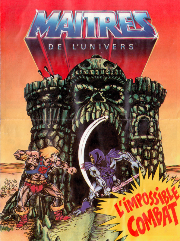
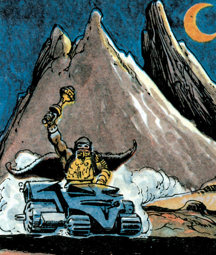
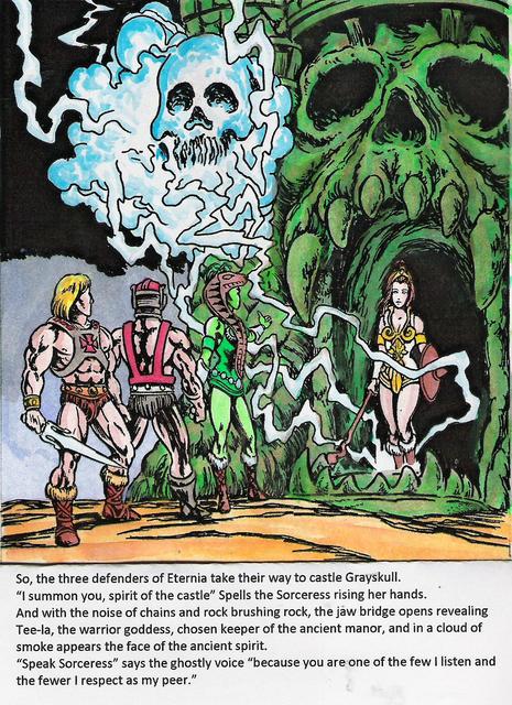
One post in particular caught my eye, about a short French minicomic called L’Impossible Combat. According to Super Shogun, this was given out with registration for Club Des Maîtres De L’Univers in 1984.
Image source: Super Shogun
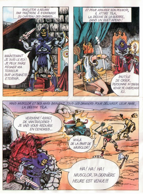
Image source: Super Shogun
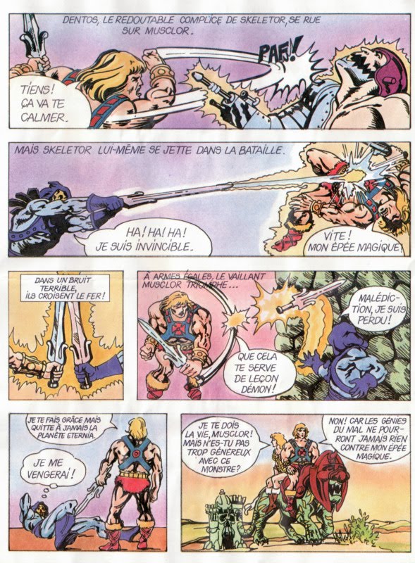
Image Source: Super Shogun
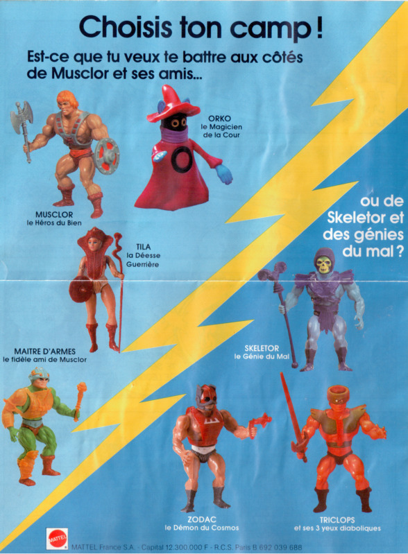
Back cover, which includes an image of the prototype version of Tri-Klops. Image source: Super Shogun
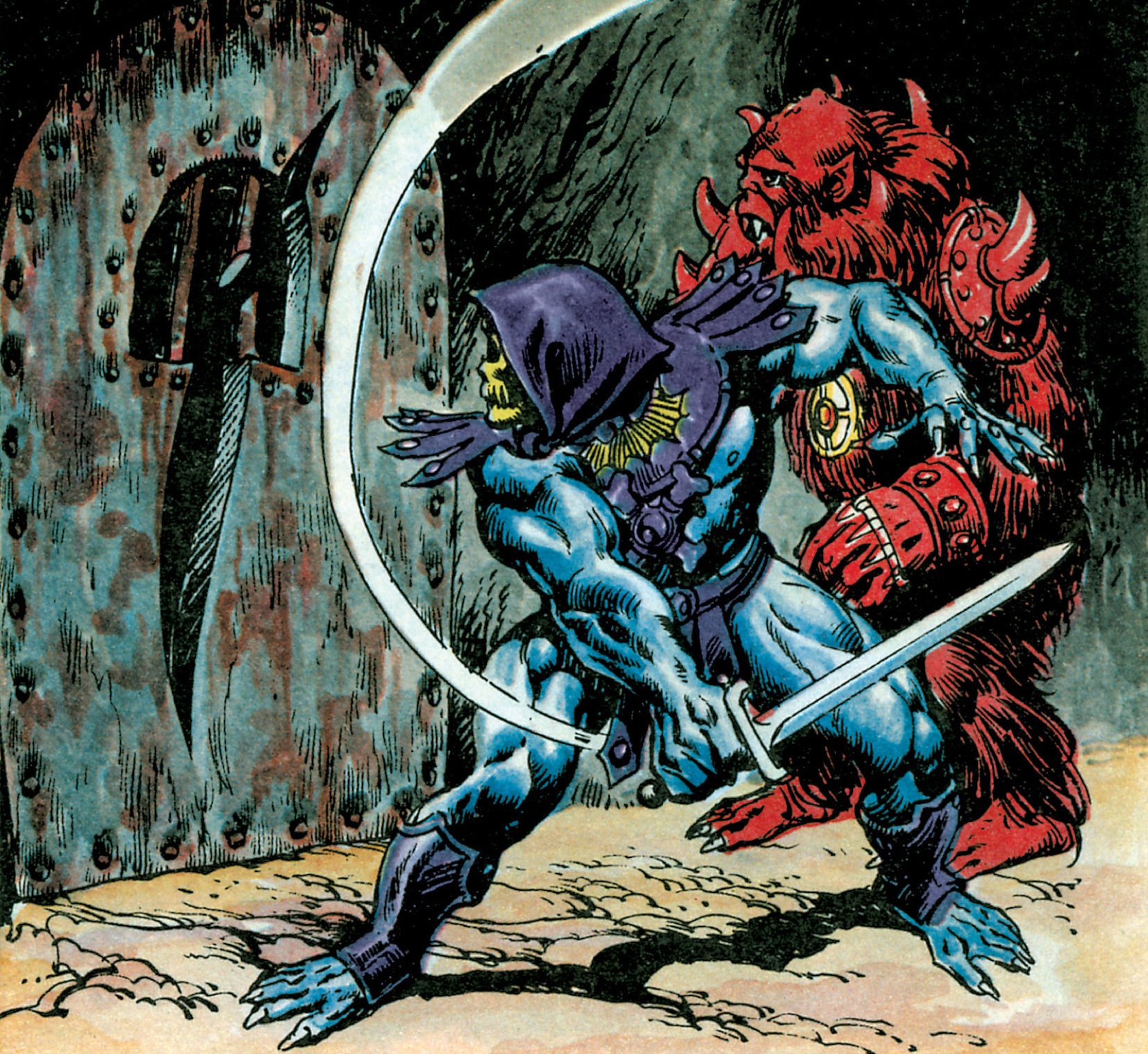
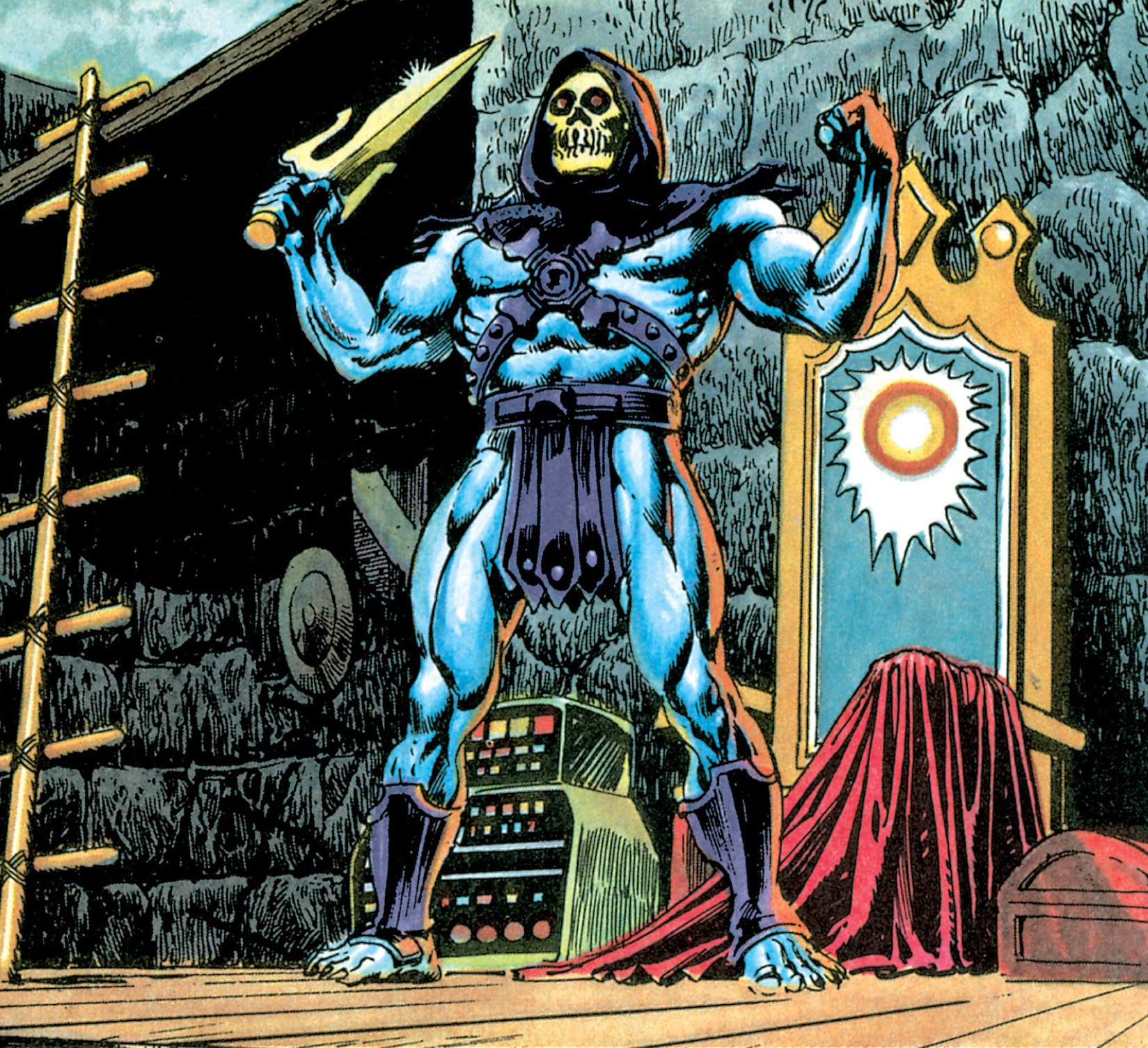
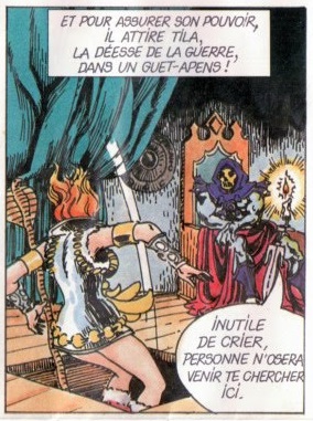
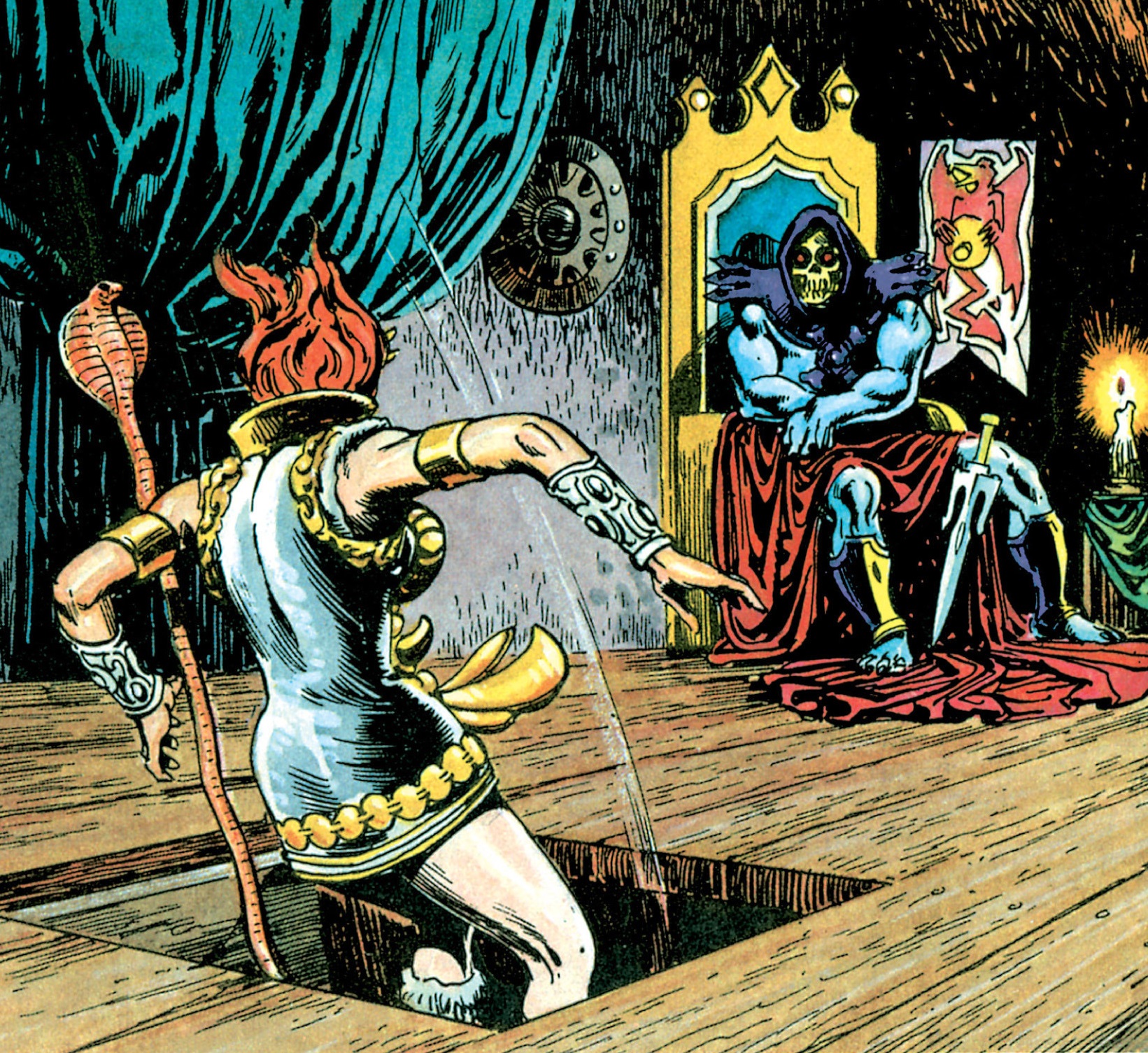
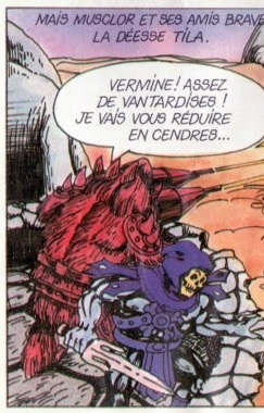
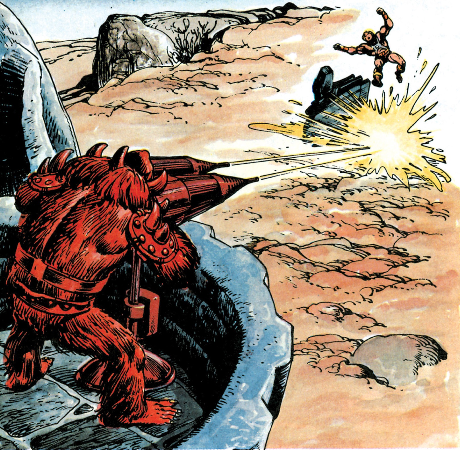
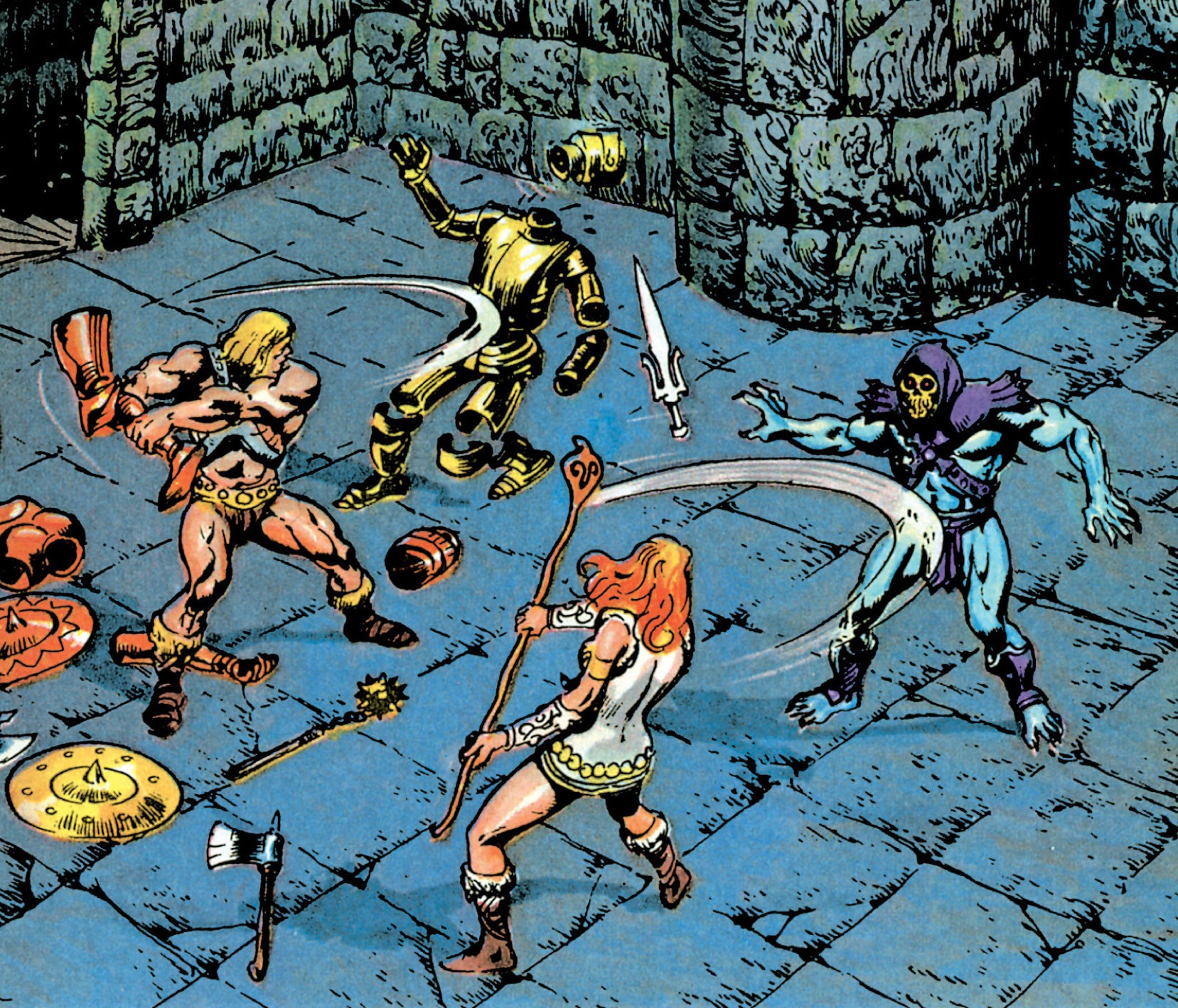
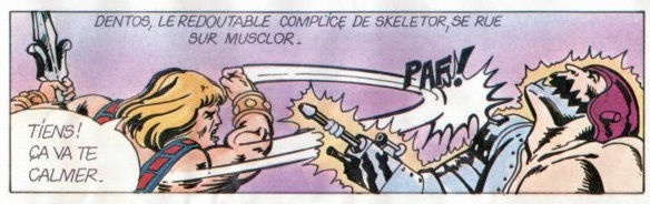
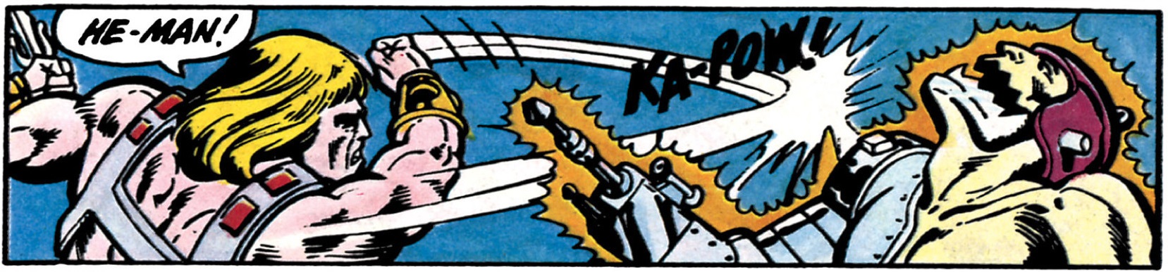
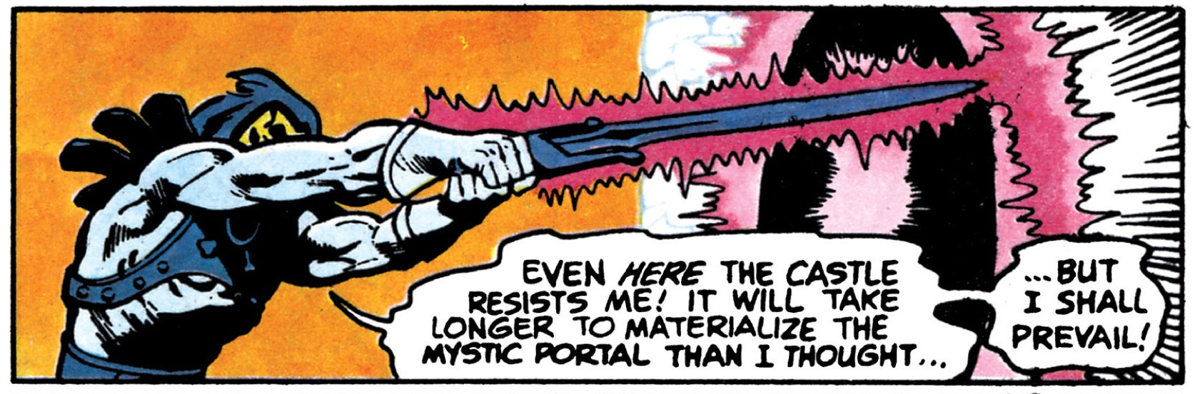
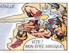
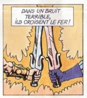
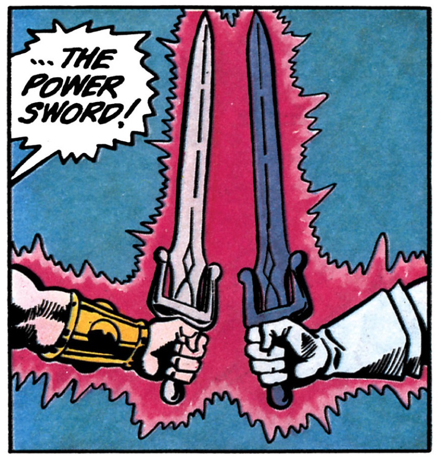
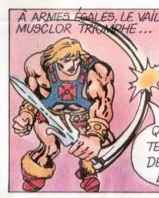
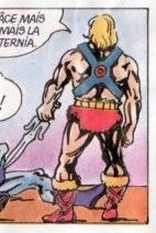
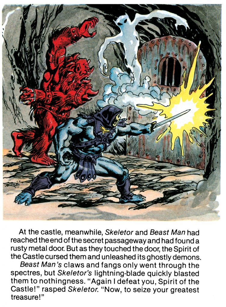
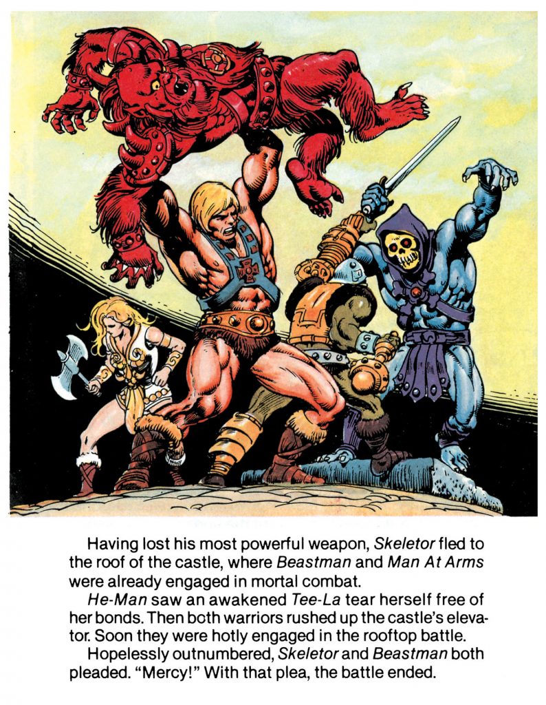
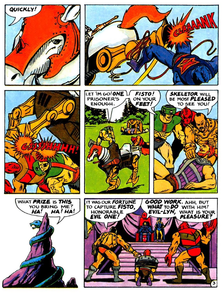
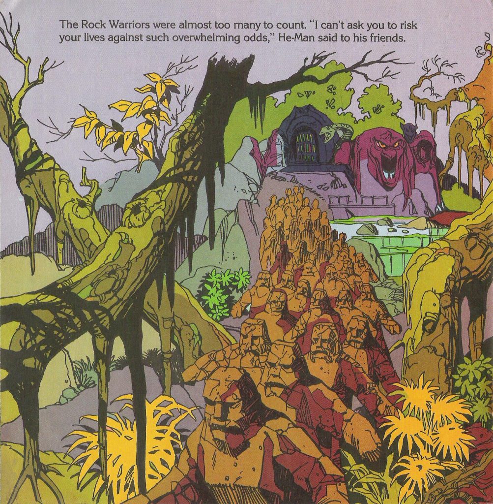
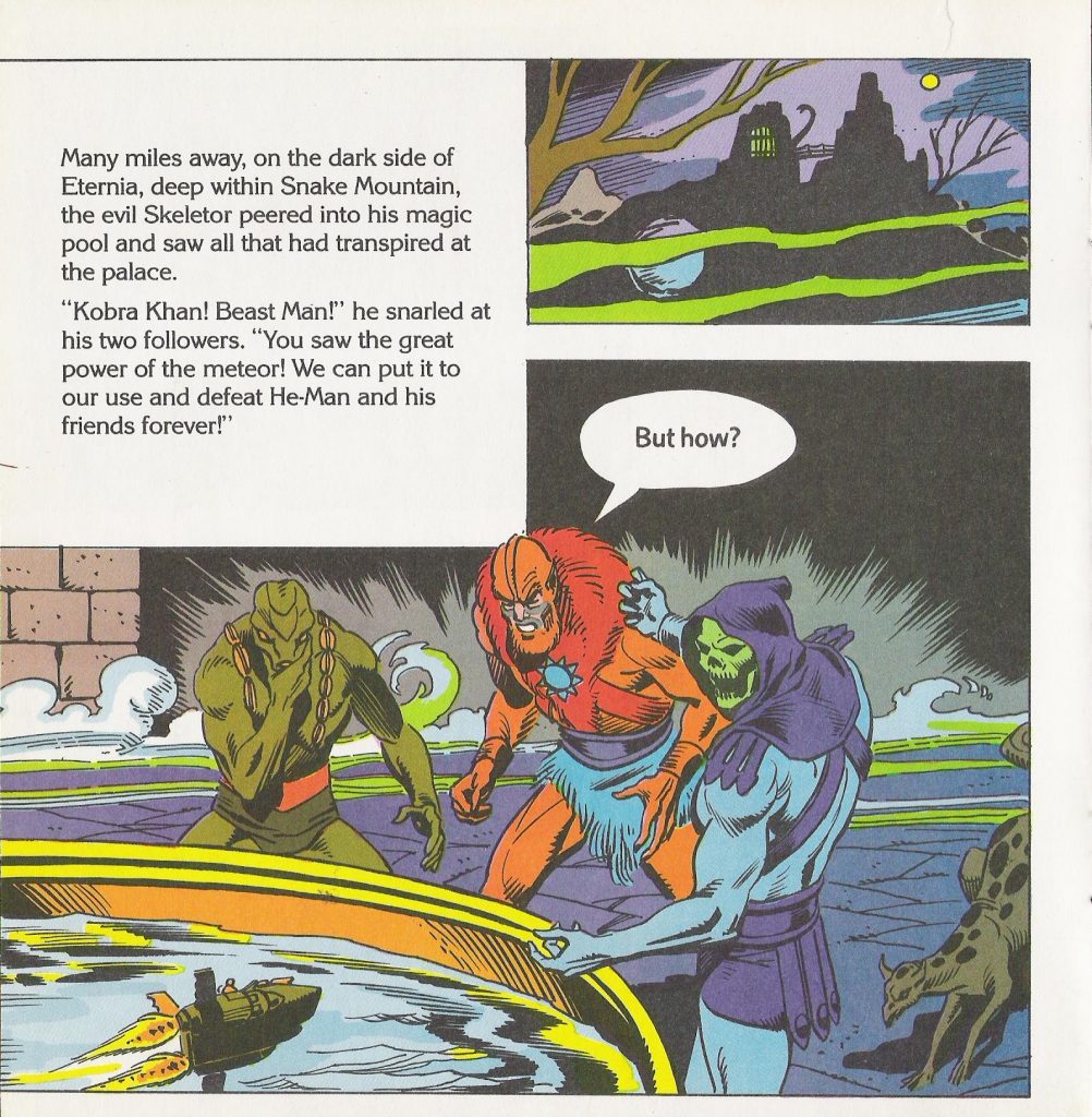
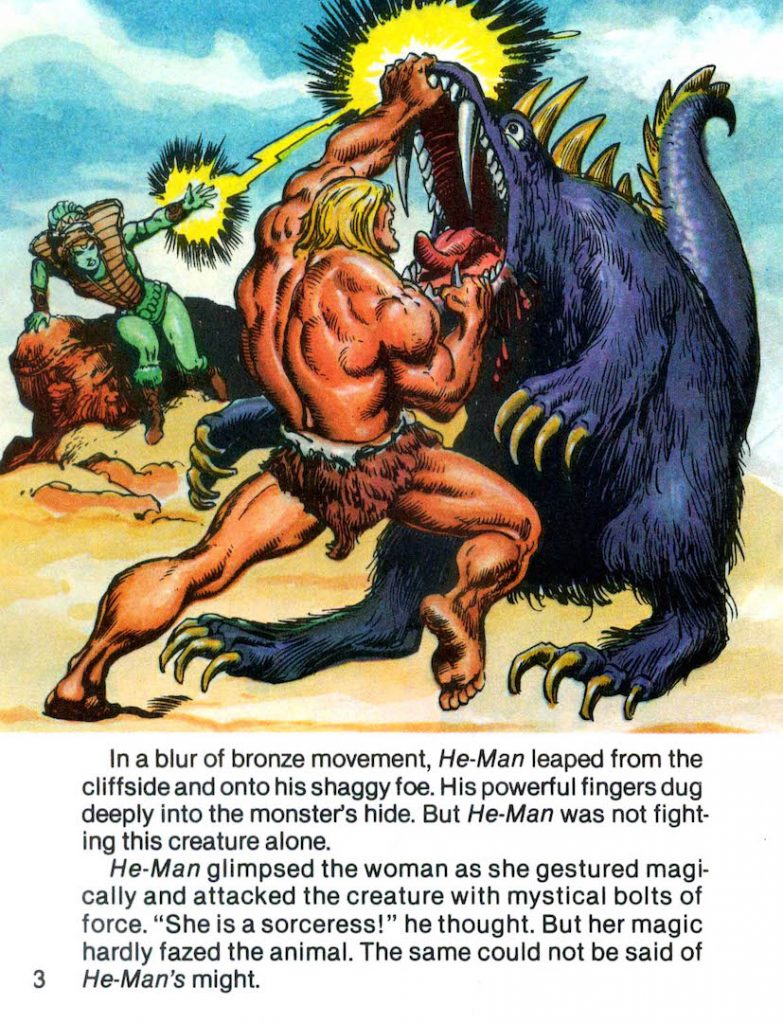
Like the Italian Più series of He-Man comics, this very short issue was clearly influenced by the artwork of Alfredo Alcala. Beyond that, there are several pieces directly taken from illustrations by Mark Texeira. It’s not just the style – distinct scenes and poses from He-Man and the Power Sword, King of Castle Grayskull, and The Menace of Trap-Jaw! are replicated in the story, like a minicomic mashup. In fact, almost 100% of L’Impossible Combat is borrowed material. Take a look:
Despite the comic’s dire lack of originality, it’s a fun piece of memorabilia, and I’m always happy to see more comics in the style of Alcala and Texeira (even if the artist’s reproductions can’t match the skill of the originals). I do have to give credit for the ingenuity of taking scenes totally out of their original context and constructing a new story from them.
Update: ManicMan has kindly put together a “scanlation” (a translation edited into the comic pages) of the story, below. Thanks again, ManicMan!
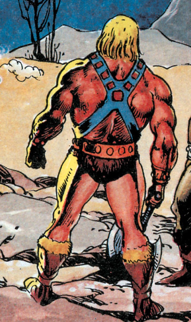
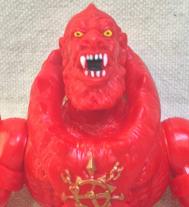
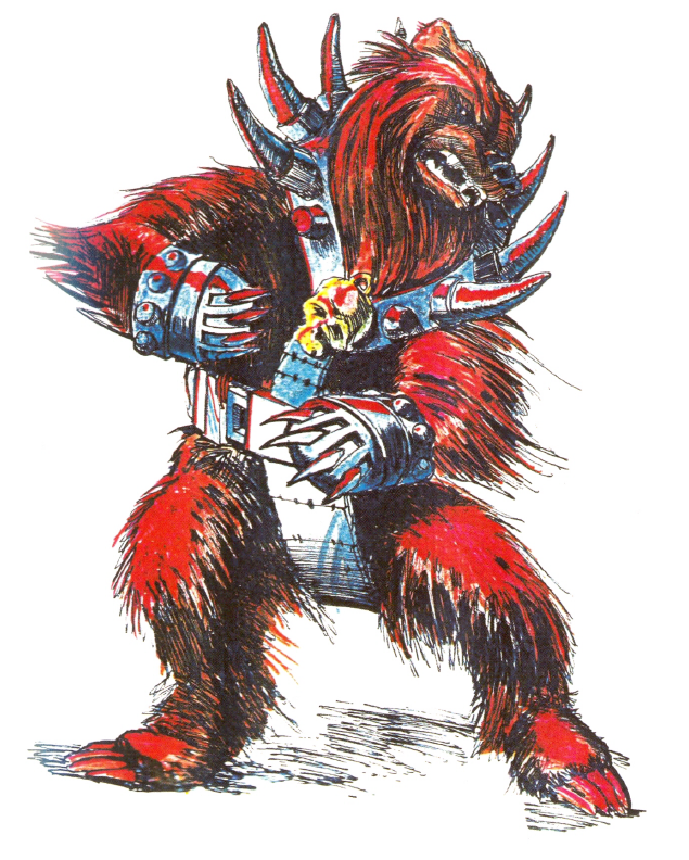
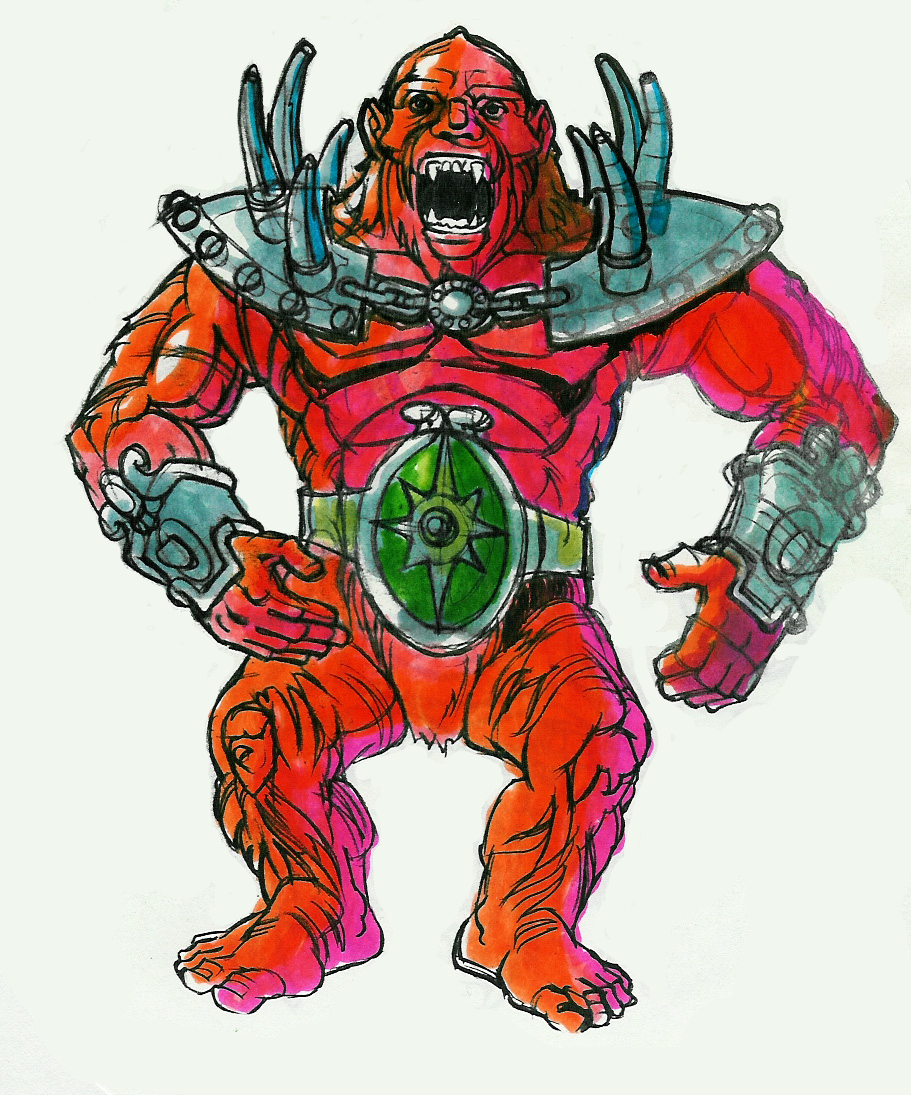
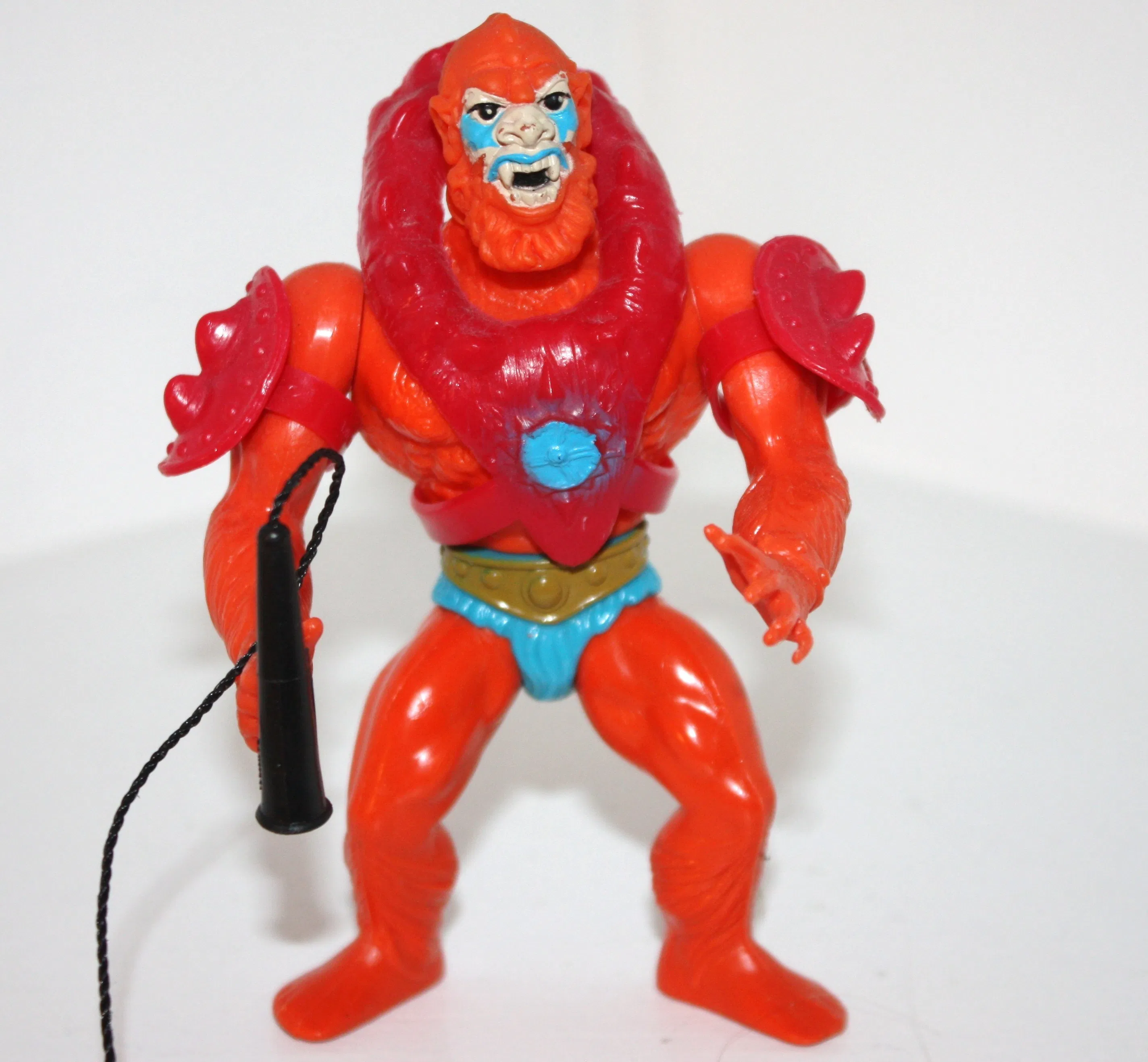
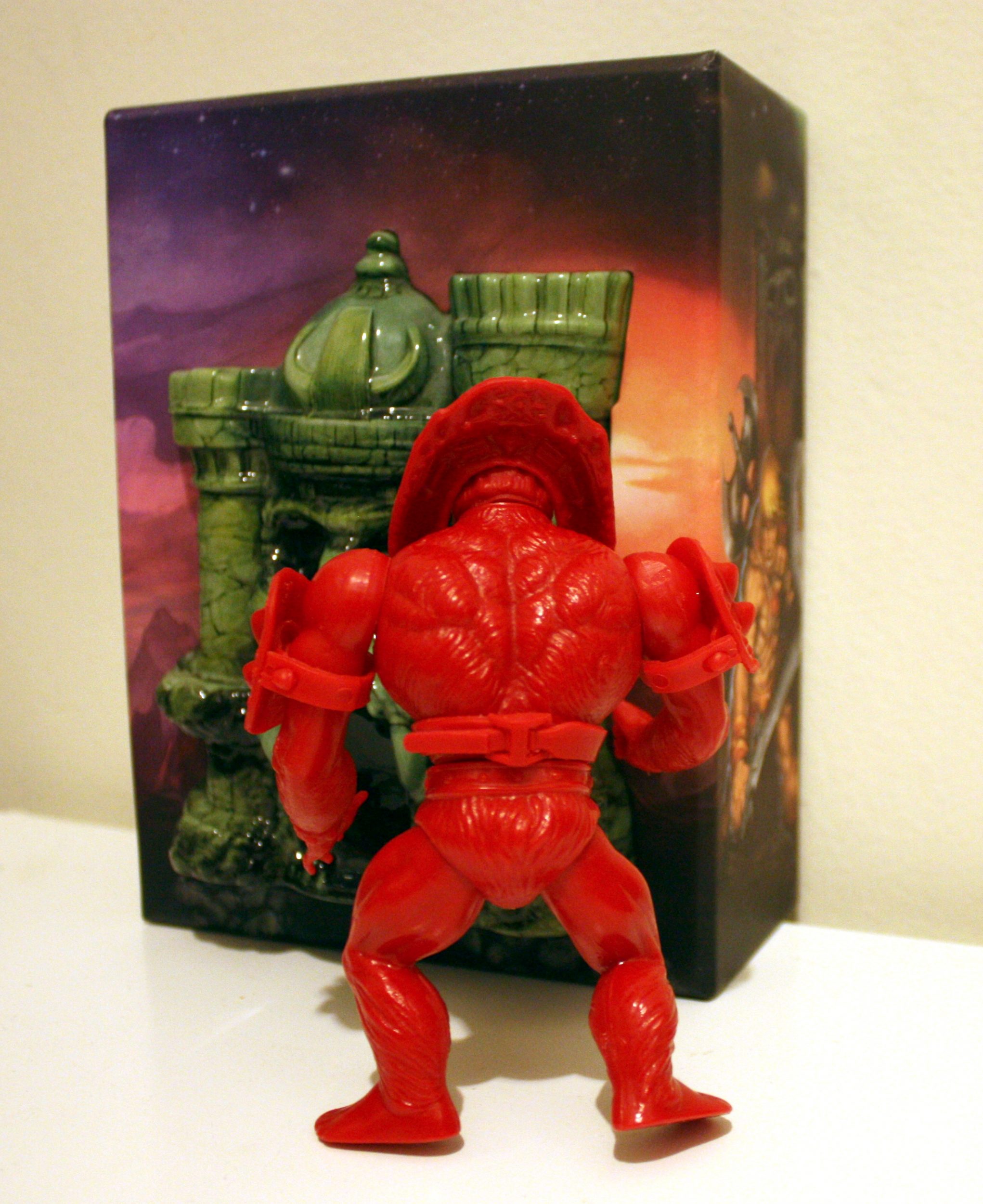
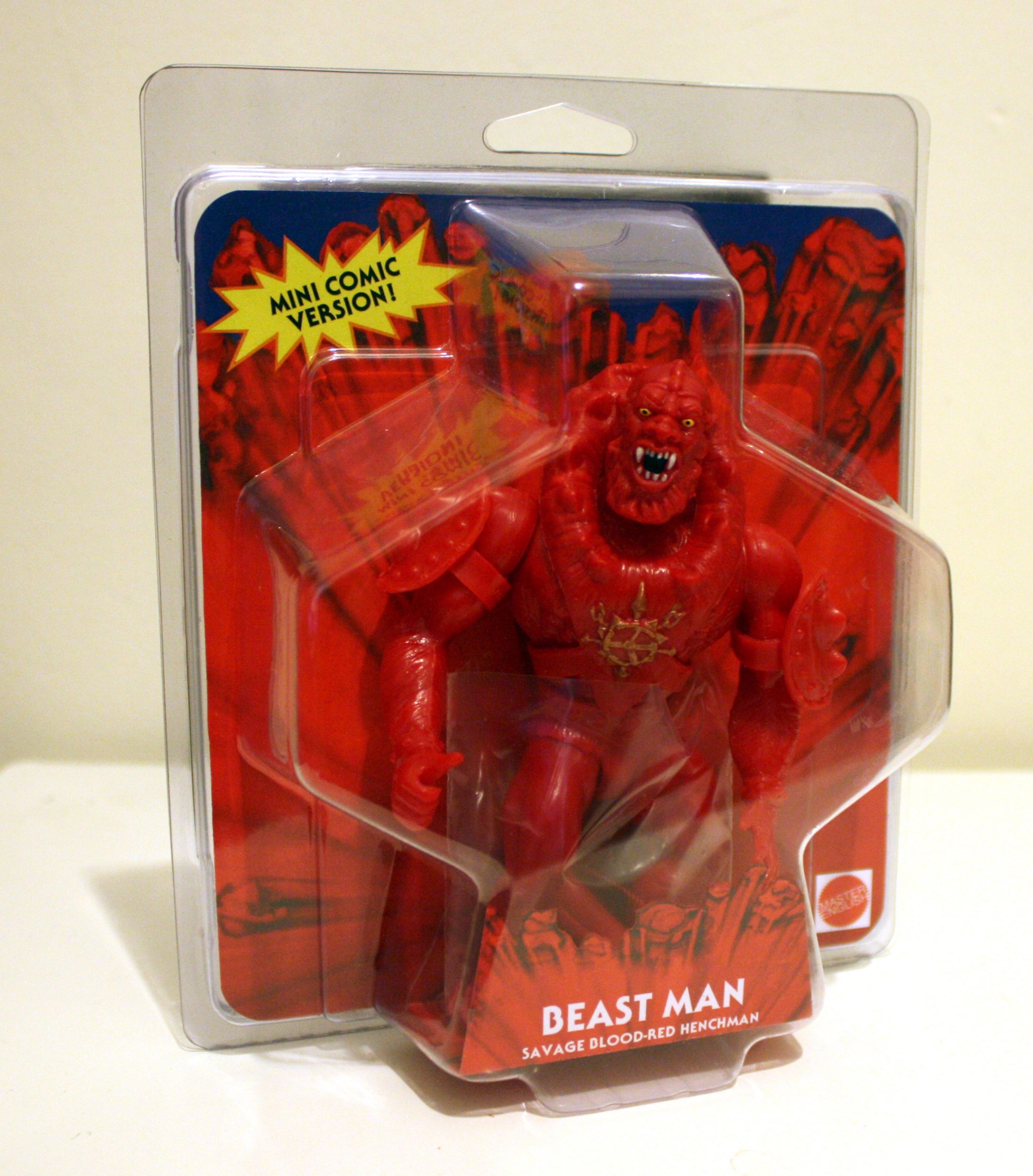
I recently purchased my first custom action figure by MasterEnglish customs. As a rabid fan of the early Masters of the Universe minicomics (particularly those illustrated by Alfredo Alcala), his take on the first appearance of Beast Man inspired me to sell off a few things so I could add this savage brute to my collection.
Early appearances of MOTU characters in minicomics often draw from unfinished concept art or prototypes. Often minicomics and toys were being developed simultaneously, and there was no time to go back and modify minicomics after the toy had undergone significant changes.
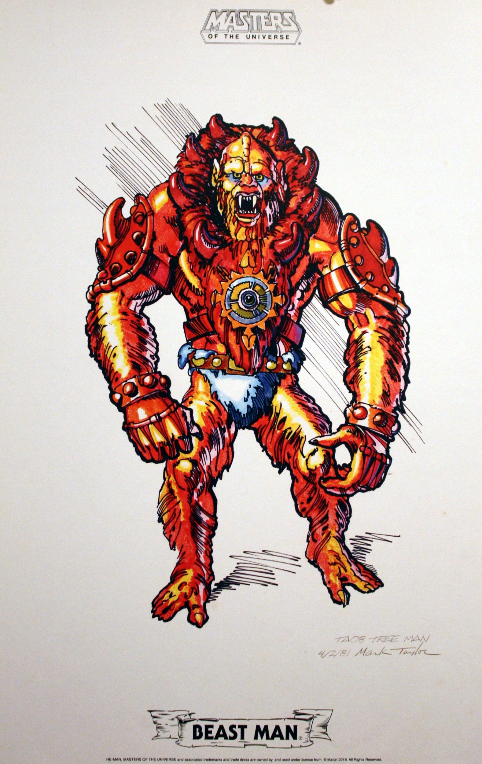
In Beast Man’s first appearance in He-Man and the Power Sword, he is colored entirely red, with the exception of the yellow medallion on his chest, as well as his teeth, eyes and claws.
That’s reflective of earlier iterations of the design, which were also dominated by red.
However, by the time the toy got released, Beast Man was given orange fur, a blue loincloth, and white and blue patterns on his face. That got reflected in later minicomics, but the change happened too late for He-Man and the Power Sword.
Mark Taylor’s b-sheet design, published by Super7/The Power and the Honor Foundation
MaterEnglish’s custom seeks to recreate the look of the first appearance of Beast Man, using the original vintage toy sculpt. It is cast in bright red plastic, with hand-painted gold, white, yellow and black details, expertly applied. Given the amount of red on this character, a new cast is really the only way to go. Trying to slather a vintage figure in that much red paint really wouldn’t work well.
Whatever material was used by MasterEnglish for the body, it’s very close to the look and feel of the original mass-produced made in Taiwan figure. The armor feels slightly more flexible than vintage, and the head of course is not the soft, hollow polyvinyl of the original, but I wouldn’t expect that from a custom. Unlike the late hard head releases in the original vintage line, the hard head on Red Beast Man remains as sharply detailed as the original soft head release was.
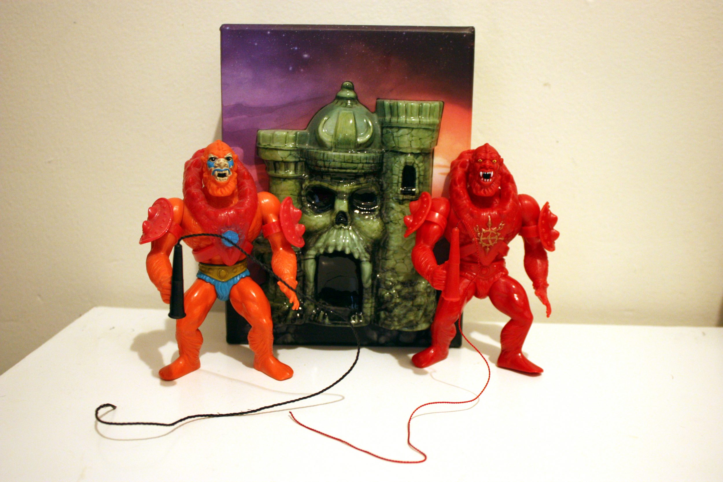
Red Beast Man does not include the original spring-loaded waist action feature, but this is again something I wouldn’t expect from a custom, hand-cast figure. The arm joints are a touch loose, but remain poseable. He comes with a red version of his signature whip, complete with red string, which is a nice touch. He is packaged on a resealable card that gets at the general feel of the original MOTU packaging without replicating it too closely.
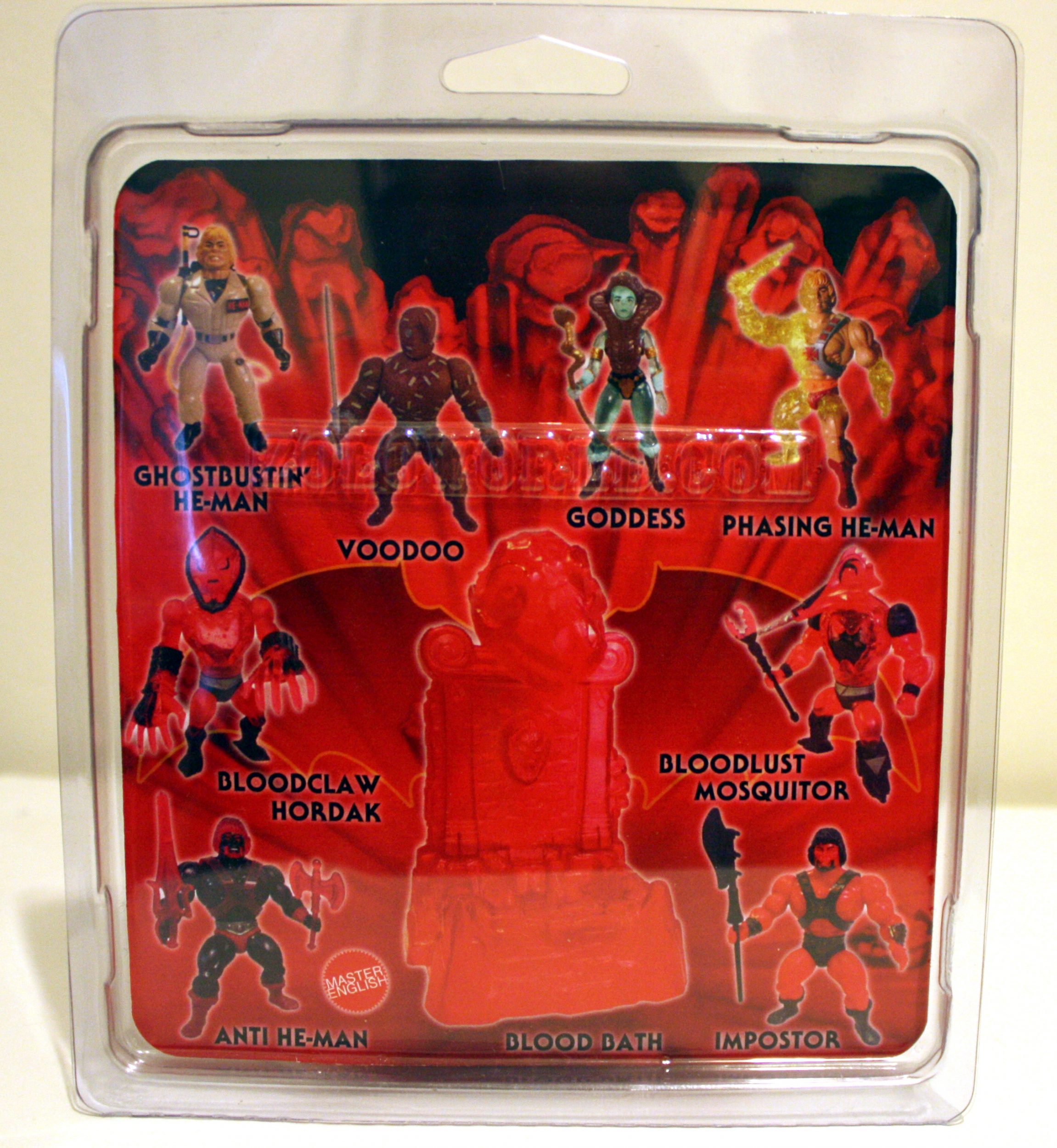
The back of the card shows off more vintage-style customs by MasterEnglish, including his (sadly) sold out, brilliant take on the Goddess/Sorceress character that also appeared in He-Man and the Power Sword.
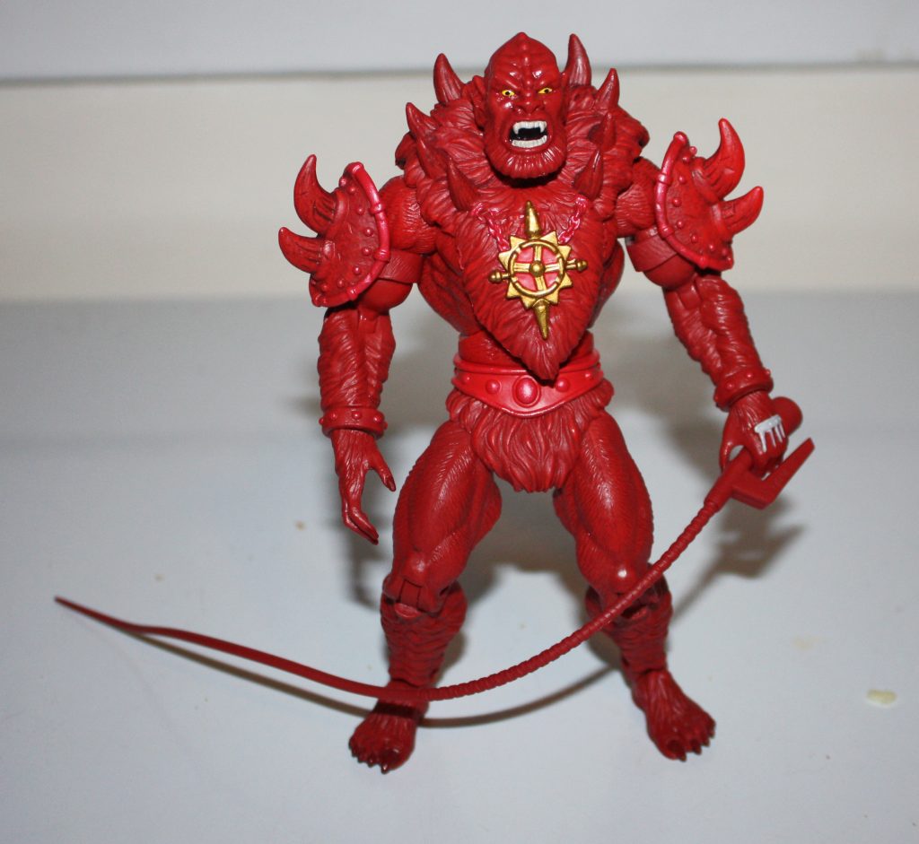
Red Beast Man works surprisingly well as an action figure, despite his monochromatic color scheme. I understand why the original designer (Mark Taylor) modified the colors of the figure before its release. Orange, red and blue work well together, and help break up the design. An almost universal design characteristic of MOTU figures is their bright complementary and contrasting colors. Still, a mostly-red Beast Man looks great in hand.
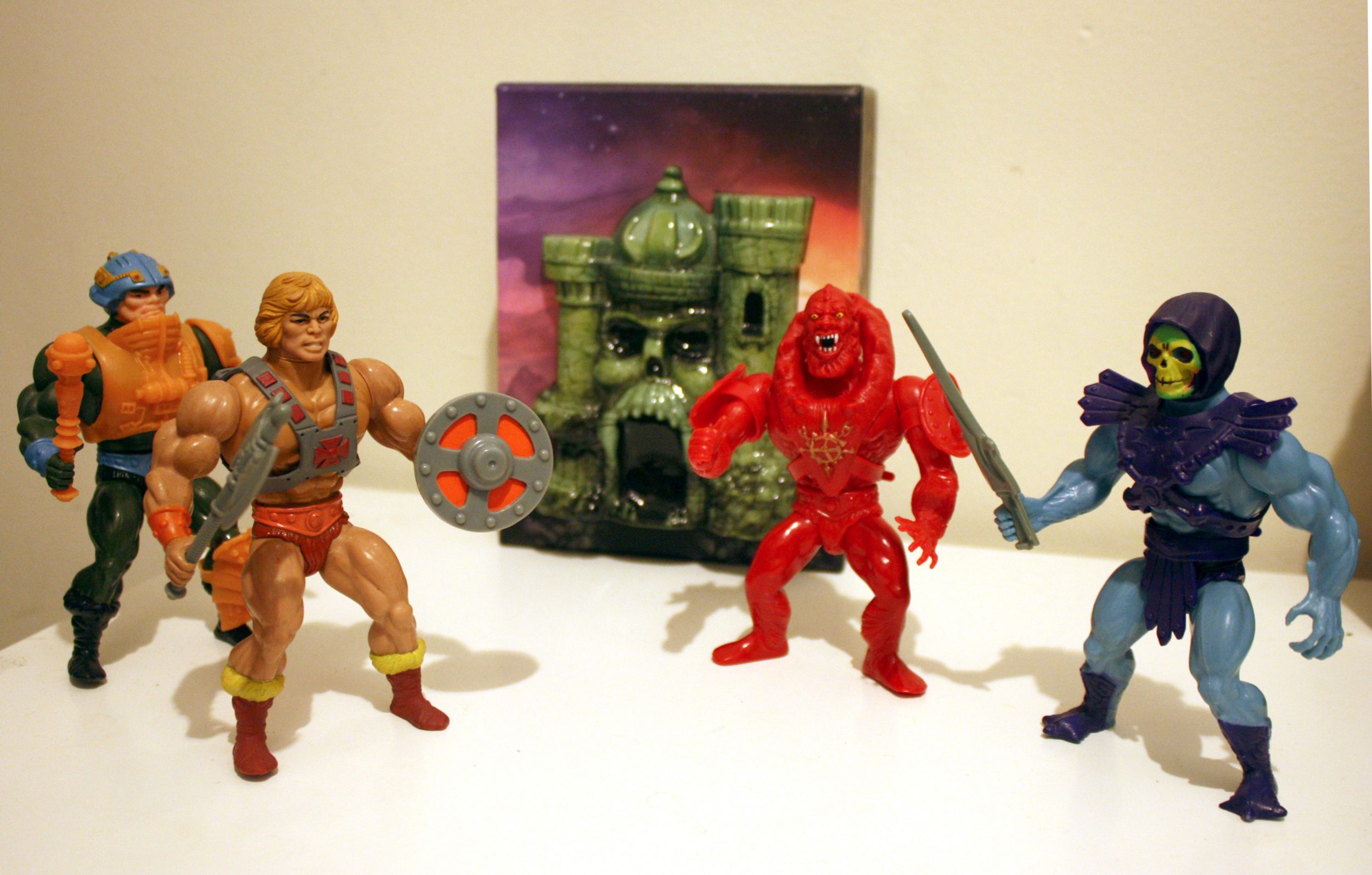
This is, of course, not the only take on a red Beast Man action figure. There are red variants of the character in the Masters of the Universe Classics line as well as the Loyal Subjects MOTU line, but I feel like the 1980s format most closely resembles the general body shape of Alcala’s depiction of the character.
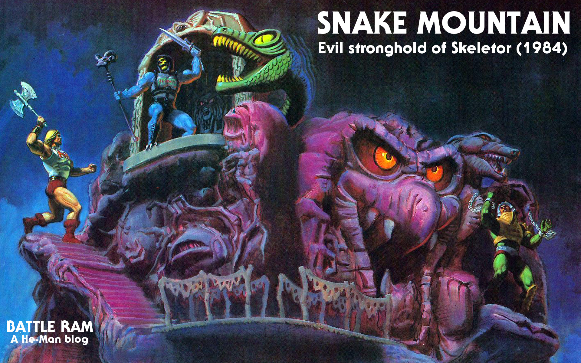
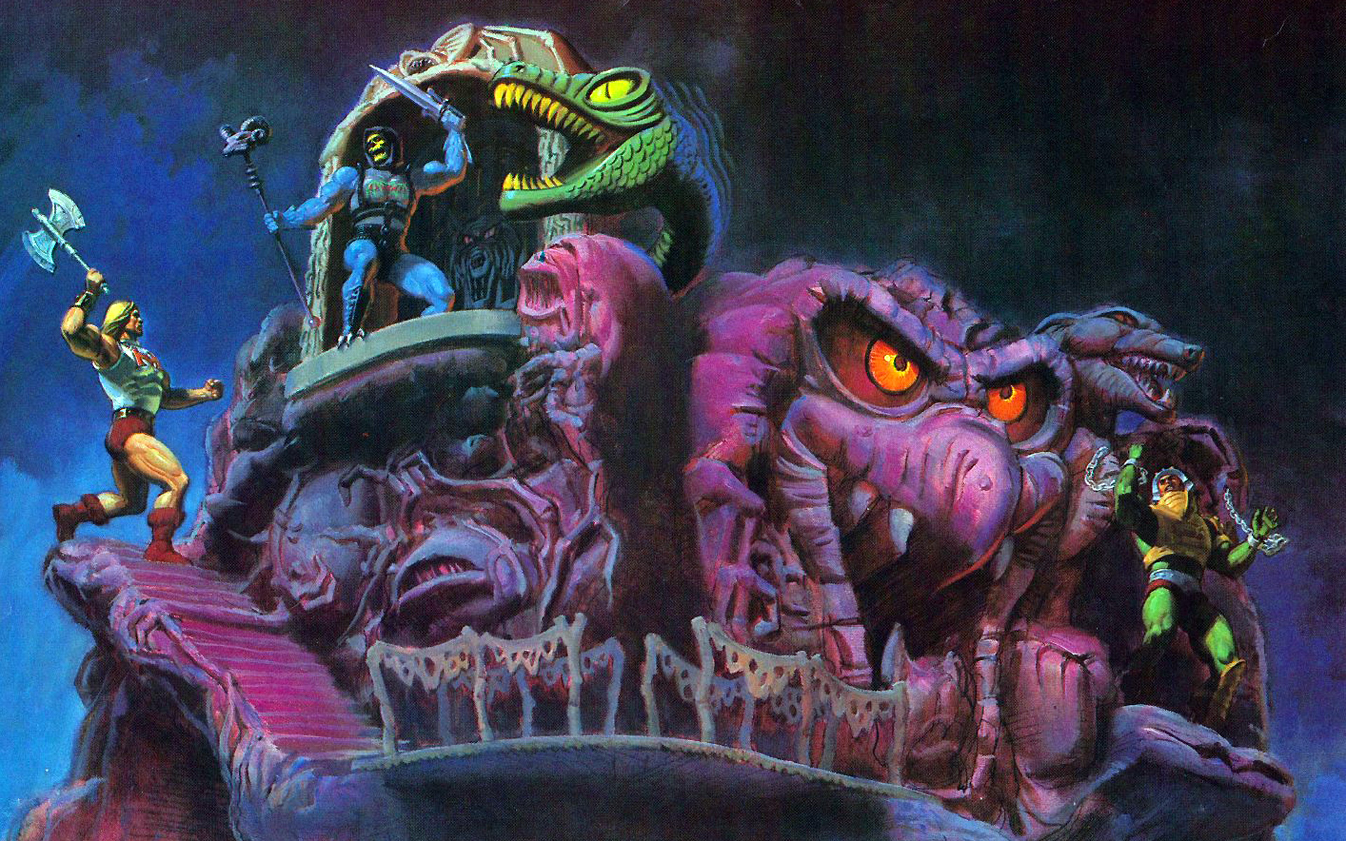
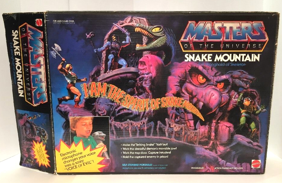
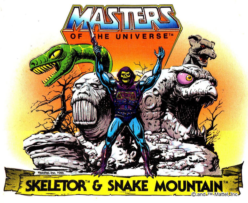
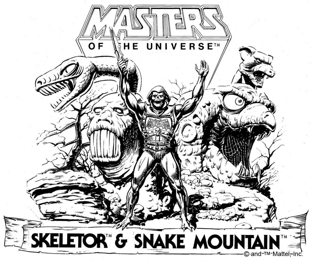
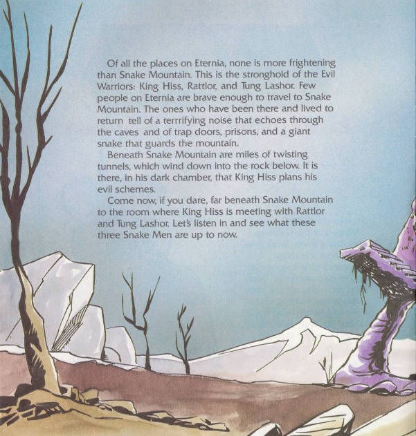
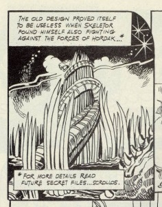
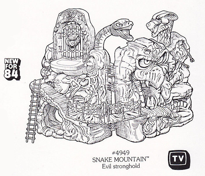
Snake Mountain was a toy I only ever saw twice as a kid. I never owned one, but I certainly admired it from afar. Up close it was perhaps not as exciting to play with as it looked (and certainly not as instantly memorable as Castle Grayskull), but as Skeletor’s evil hideout, it had undeniable evil charm.
The first known mention of Snake Mountain seems to come in the December 1, 1982 Masters of the Universe Bible by Michael Halperin. (Note: there is one episode of the Filmation cartoon (“Diamond Ray of Disappearance”) that was written a bit before that (November 30, 1982), but it was revised months later, and I don’t know if Snake Mountain was included in the original script.)
Skeletor led them to his lair beneath the twin peaks of SNAKE MOUNTAIN. Around one of the crags twisted a terrible carved snake. A portal along the snake’s back until it reached the fanged mouth. Entrance here entrapped the incautious stranger for once a person stepped into the snake’s jaws they snapped shut thrusting the trespasser into almost inescapable dungeon.
A footbridge connected one mountain with the other where a blood red waterfall cascaded over crags, past blasted trees and murky swamps. Skeletor’s chamber hid behind BLOOD FALLS and only he knew its entrance, its traps and snares. The lair itself was a dark cavern dripping with venom. In one corner, its eyes blazing red, its tail twitching, sat Skeletor’s pet and charger, the giant cat PANTHOR. Its purple fur glistened as its muscles rippled when it stretched out iron claws from the mighty paws.
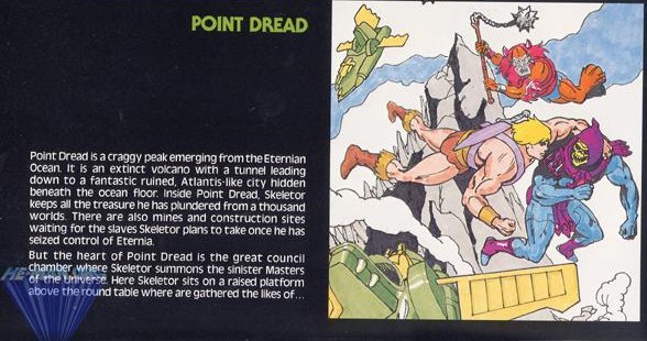
In other media, Skeletor’s stronghold was being called Point Dread. The 1983 Filmation Series Guide described it this way:
Point Dread is a craggy peak emerging from the Eternian Ocean. It is an extinct volcano with a tunnel leading down to a fantastic ruined, Atlantis-like city hidden beneath the ocean floor. Inside Point Dread, Skeletor keeps all the treasure he has plundered from a thousand worlds. There are also mines and construction sites waiting for the slaves Skeletor plans to take once he has seized control of Eternia.
But the heart of Point Dread is the great council chamber where Skeletor summons the sinister Masters of the Universe. Here Skeletor sits on a raised platform above the round table where are gathered the likes of…
Image via He-Man.org
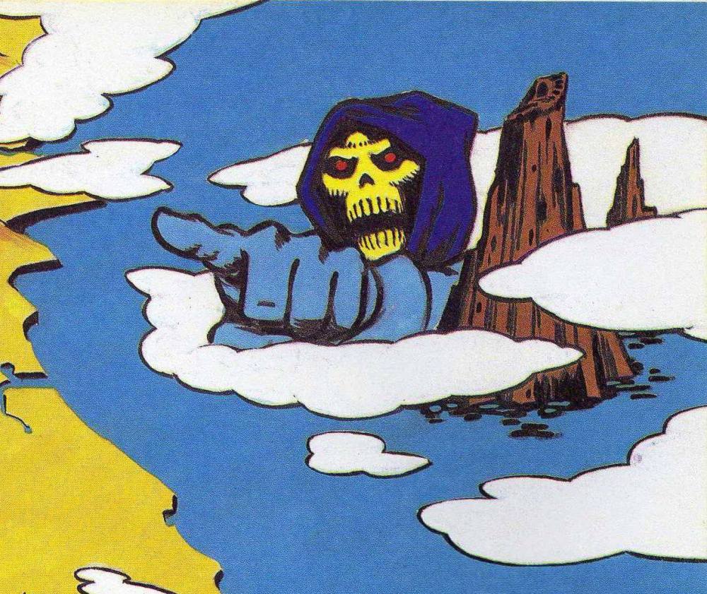
This idea was echoed in the 1985 UK MOTU Annual (the UK annuals seemed to consistently draw on older source material):
Image courtesy of Jukka Issakainen
In the end, Point Dread became the magical/technological moving perch of the Talon Fighter, which could relocate from the top of a mountain to the top of Castle Grayskull. Snake Mountain became the fortress of Skeletor.
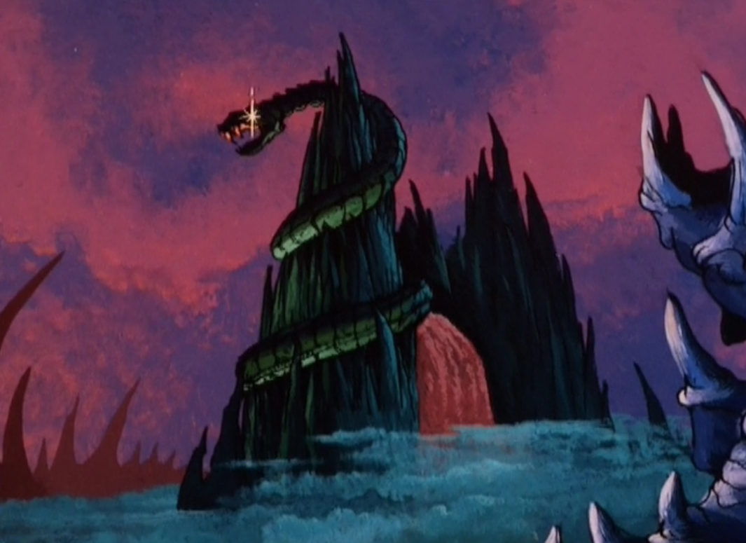
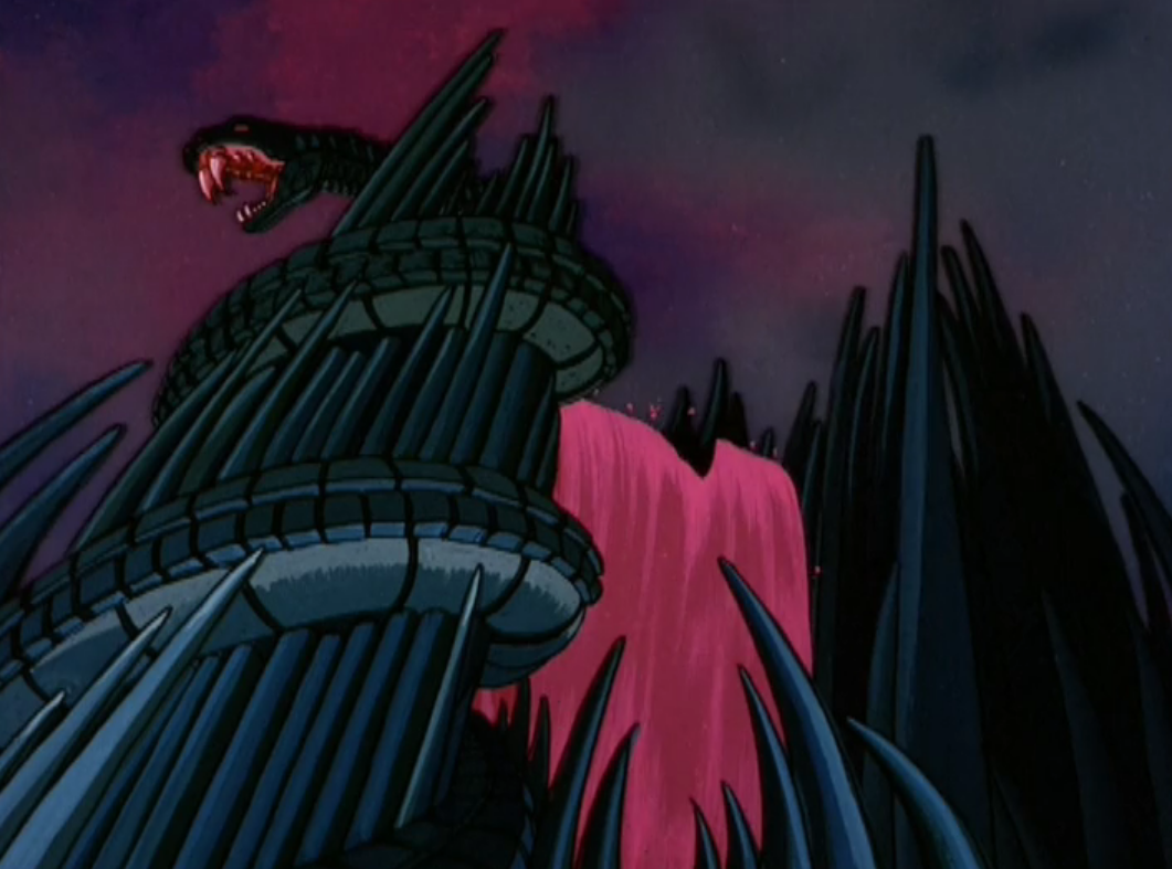
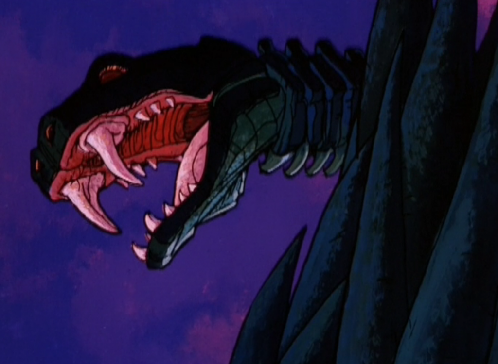
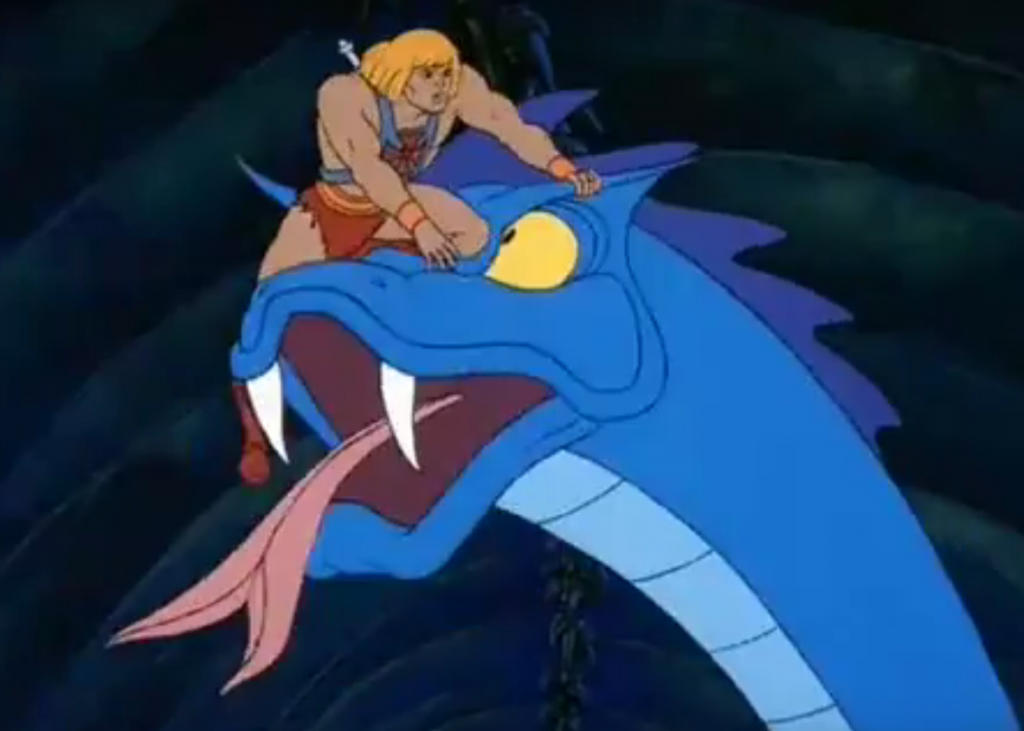
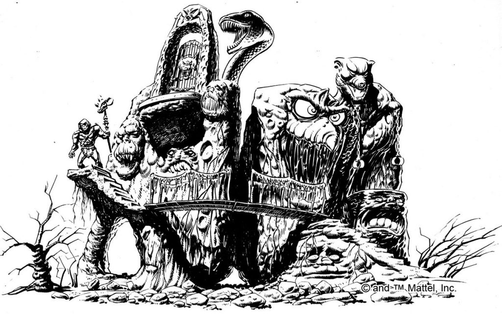
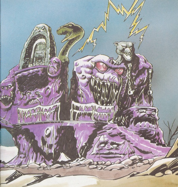
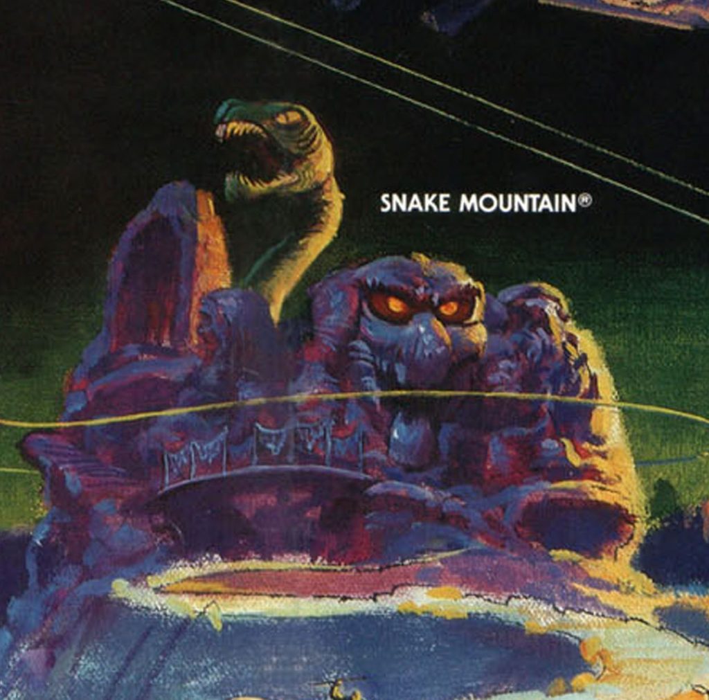
In September of 1983, when the He-Man cartoon debuted, kids were introduced to Snake Mountain for the first time. It was an imposing structure – a large pointed peak punctuated with jagged “teeth” and a giant snake carving wrapped around it. Nearby was another, smaller peak, and Blood Falls flowed in between them:
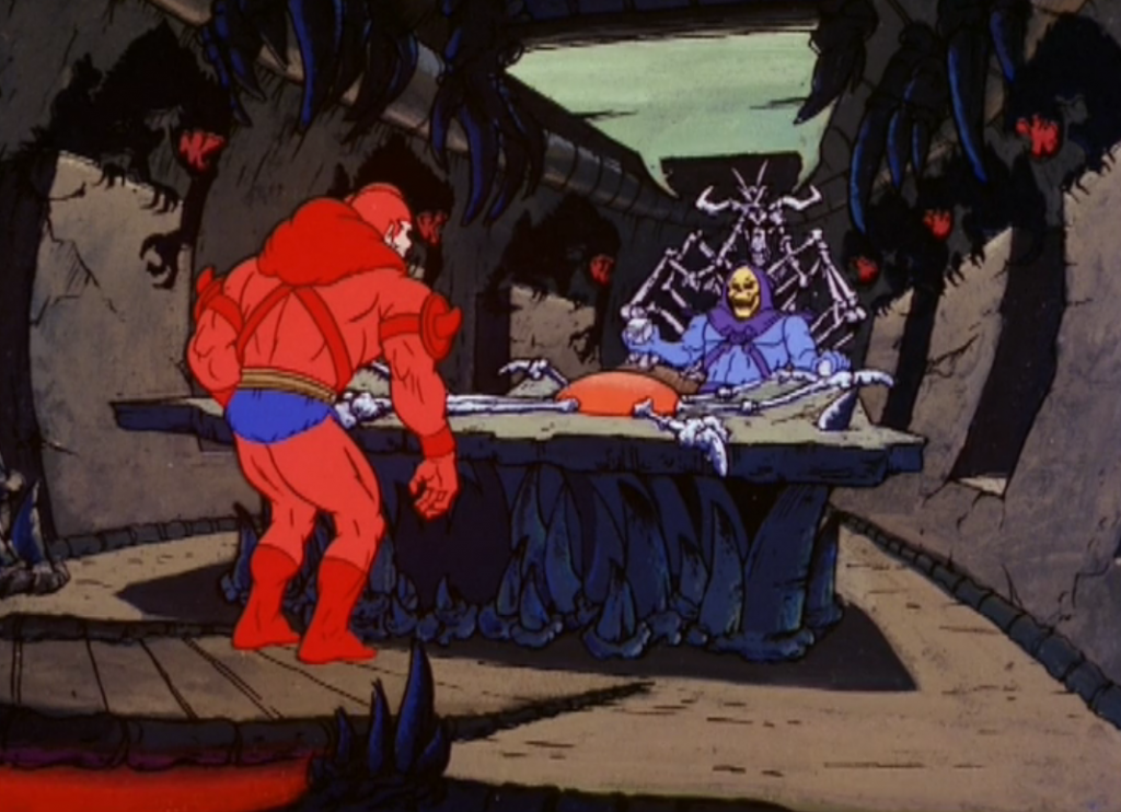
The interior of the mountain featured a bone throne and a table with a magical globe for spying on enemies, a docking bay for Skeletor’s fleet of vehicles, various creepy creatures, and myriad twisting passageways. The snake carving was also hollow, and Skeletor could stand in the open mouth and overlook his dark domain:
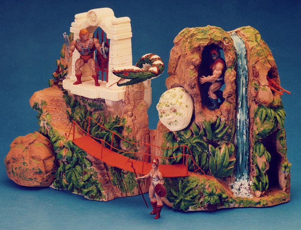
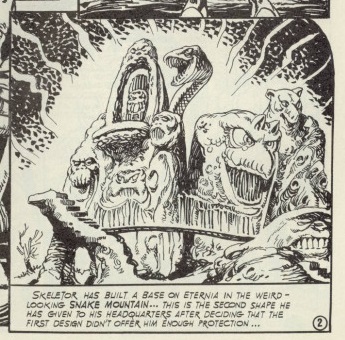
Snake Mountain was trademarked by Mattel on August 15 of 1983. At some point in 1983 Mattel started working on the playset design. Rather than basing the toy off of Filmation’s fortress, they elected to come up with a completely different look, based off of a previous jungle playset design that had been abandoned:
Image source: The Power and the Honor Foundation Catalog by way of James Eatock
Mattel wasn’t saving any tooling by reusing the idea, but perhaps it was a way to quickly re-sculpt a previous effort into a viable product.
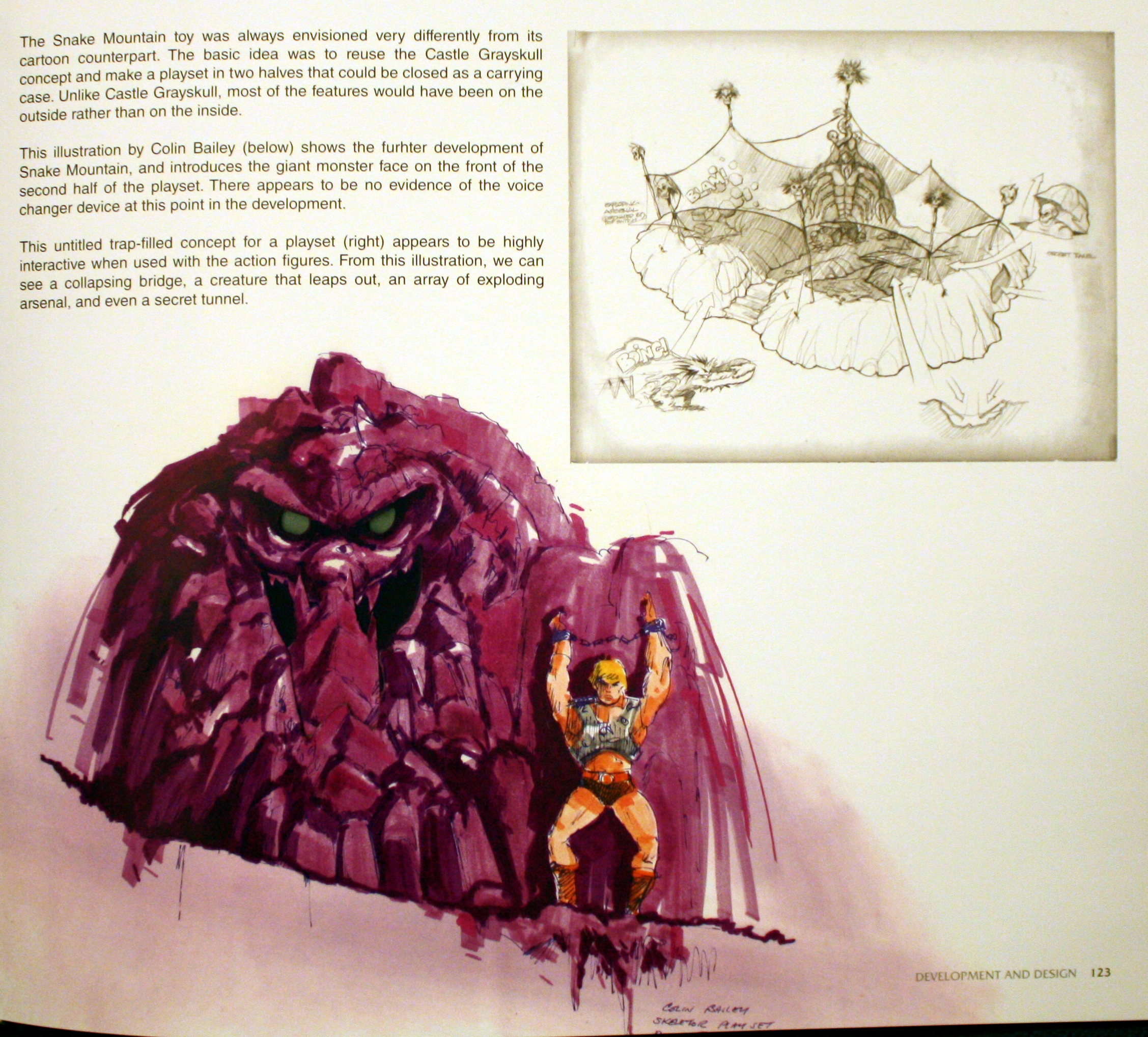
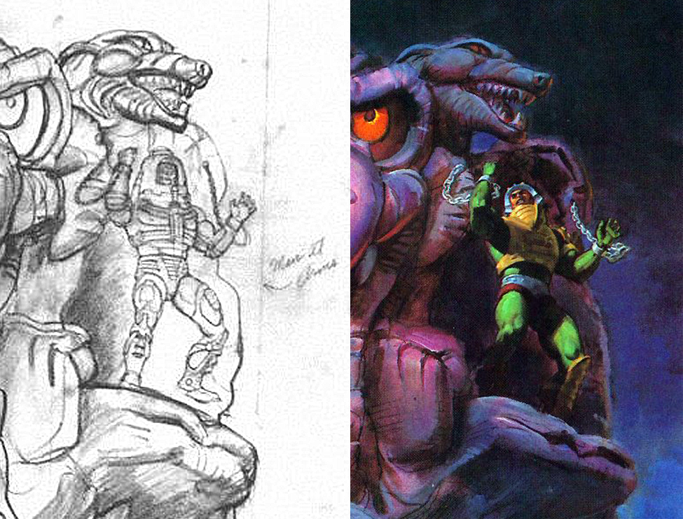
Colin Bailey did some of the preliminary design work on the toy, as is visible in this design drawing from The Power and the Honor Foundation Catalog:
His drawing is simply called “Skeletor Playset” and shows the goblin-like face and manacles that would be built into the right half of the design.
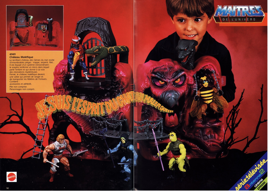
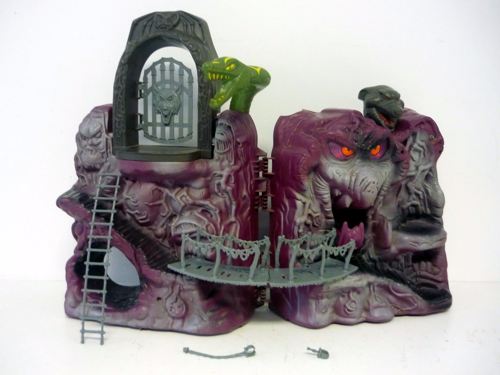
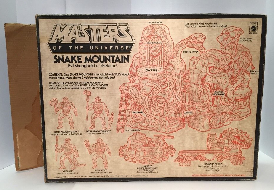
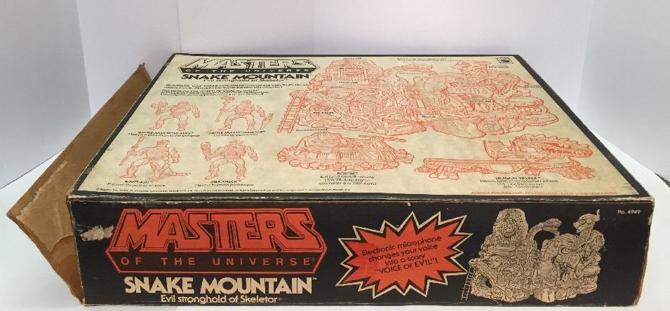
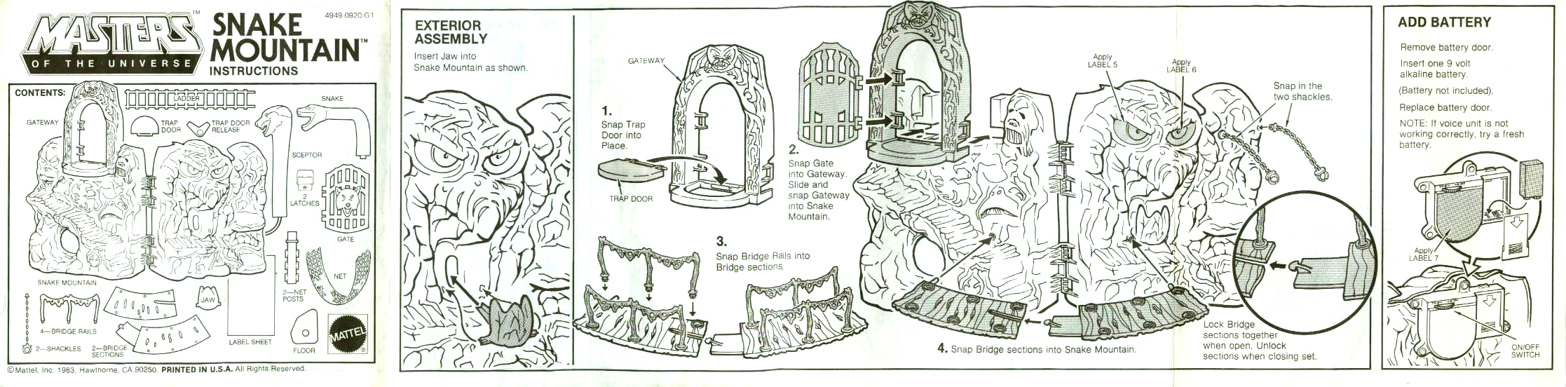
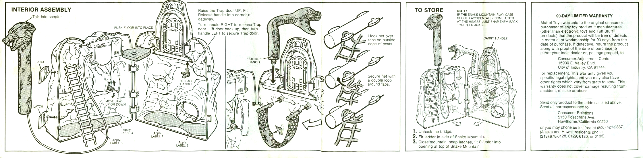
The main attractions of of the playset are clustered on the exterior – the shackles, the “talking” goblin face, the wolf echo microphone, the bridge (a fragile piece even in the 80s, and too narrow for figures to cross any way but sideways), numerous semi-hidden sculpted faces and claw-like root structures, the stairway, the gate and trap door, and the “striking” snake. There was also a scaling ladder, reused from the original Castle Grayskull playset.
1984 Mattel France Catalog. Image Source: Super Shogun Blog.
Cross Sell Art
Production Snake Mountain
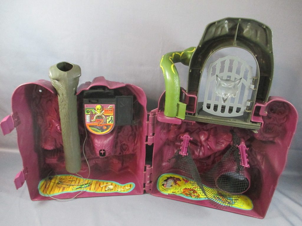
The interior was pretty bare bones by comparison. There was a net to catch warriors who fell through the trap door, there was a volume control/switch for the echo microphone, and a couple of stickers on the floor. The goblin mouth could be articulated from the rear.
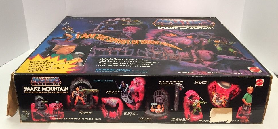
The box art was painted by William George. Early versions of the art, dated 1983, show Man-E-Faces in shackles, but the final artwork replaced him with Man-At-Arms. For more on that read this interview with Bob Nall, by Jukka Issakainen.
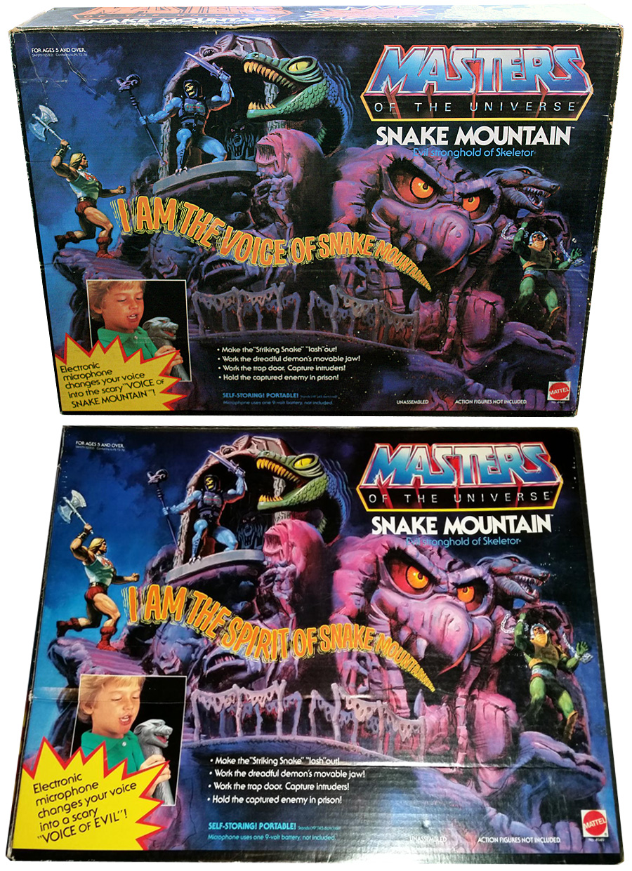
There were a couple of variations on the packaging. In some versions, the mountain is quoted as saying “I am the spirit of Snake Mountain” and in others it says “I am the voice of Snake Mountain.” I don’t know the reason for the change, but if I had to guess it would be because some parents might have objected to the “spirit” of Snake Mountain for religious reasons.
Image source: Tokyonever
As a playset, Snake Mountain felt a bit undersized compared to Castle Grayskull. It was technically taller, but only because of the archway. The rest of the playset was about 25% shorter, and the stairs were out of scale with the chunky He-Man figures. It was still an impressive and coveted item, but it paled in comparison to Grayskull.
According to the 1987 Style Guide, Snake Mountain was the “talking mountain of evil.” The style guide gives the mountain several characteristics that were never used in any canonical materials, to my knowledge:
Power: Ultimate evil power center, which commands and controls Skeletor and his minions.
Character Profile: Snake Mountain is the home base for the Evil Warriors. Within it resides the horrible spirits of the Lords of Destruction. It is from these wicked spirits that Skeletor and his henchmen draw their evil power. A baffling series of catacombs are built beneath Snake Mountain. Exploration there has been limited; even Skeletor is fearful of what may reside there.
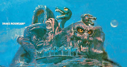
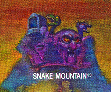
Errol McCarthy did the artwork for the Style Guide, and depicted Snake Mountain in several other illustrations as well:
Snake Mountain’s first several appearances in the minicomics follows the toy design. You can see that here in Siege of Avion and The Obelisk, illustrated by Alfredo Alcala:
Siege of Avion, illustrated by Alfredo AlcalaThe Obelisk, illustrated by Alfredo Alcala
In The Clash of Arms, illustrated by Larry Houston, a simplified version of Filmation’s Snake Mountain makes its minicomic debut:
With the advent of the Snake Men in 1986, Snake Mountain was reimagined as having been the fortress of King Hiss and his minions thousands of years in the past, before they were locked away in a pool of energy (the “Pool of Power”) in the caverns under the mountain:
In the 1986 Kid Stuff story book/record, Battle Under Snake Mountain, the fortress seems to be under the control of King Hiss, with no mention of Skeletor at all:
When Snake Mountain appears in the Golden Books stories, it is typically modeled after the toy:
The UK Masters of the Universe comic series (issue 22, 1987) tried to harmonize the toy and Filmation designs, although the reasoning used (Skeletor needed more protection, and so rebuilt the mountain) seems to require more explanation – I don’t quite follow the logic here:
Snake Mountain, in its toy form, makes an appearance in all of the posters illustrated by William George for the toyline:
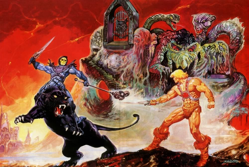
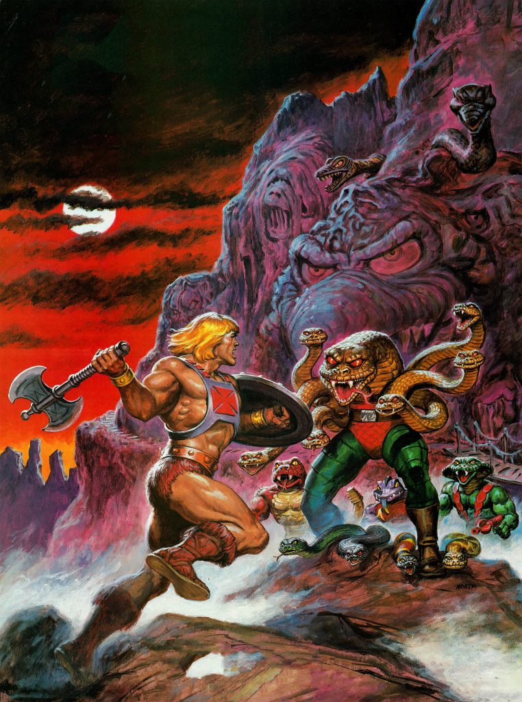
The fortress also appears in posters by Esteban Maroto and Earl Norem:
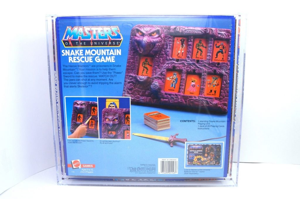
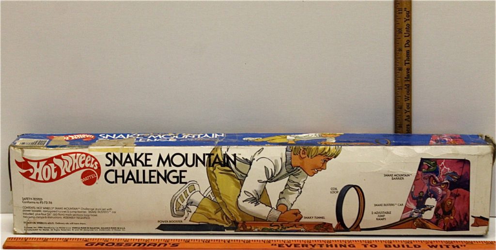
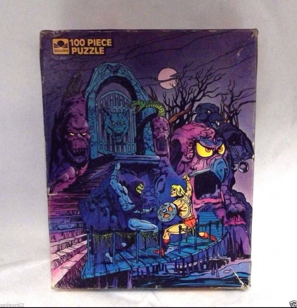
Skeletor’s stronghold was also used to sell other Masters-related merchandise, including games, puzzles, and even a themed Hot Wheels stunt set:
Snake Mountain had a lot to live up to, following Castle Grayskull. It could never quite measure up to it, but it wasn’t for lack of trying. The design itself was certainly creepy, although perhaps in a more childish kind of way compared to Grayskull. It gave you a lot to look at and a lot to play with, but lacked the depth and archetypal pull of its predecessor.
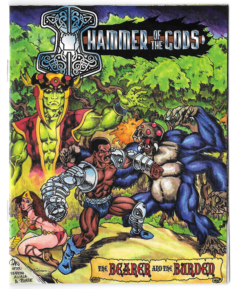
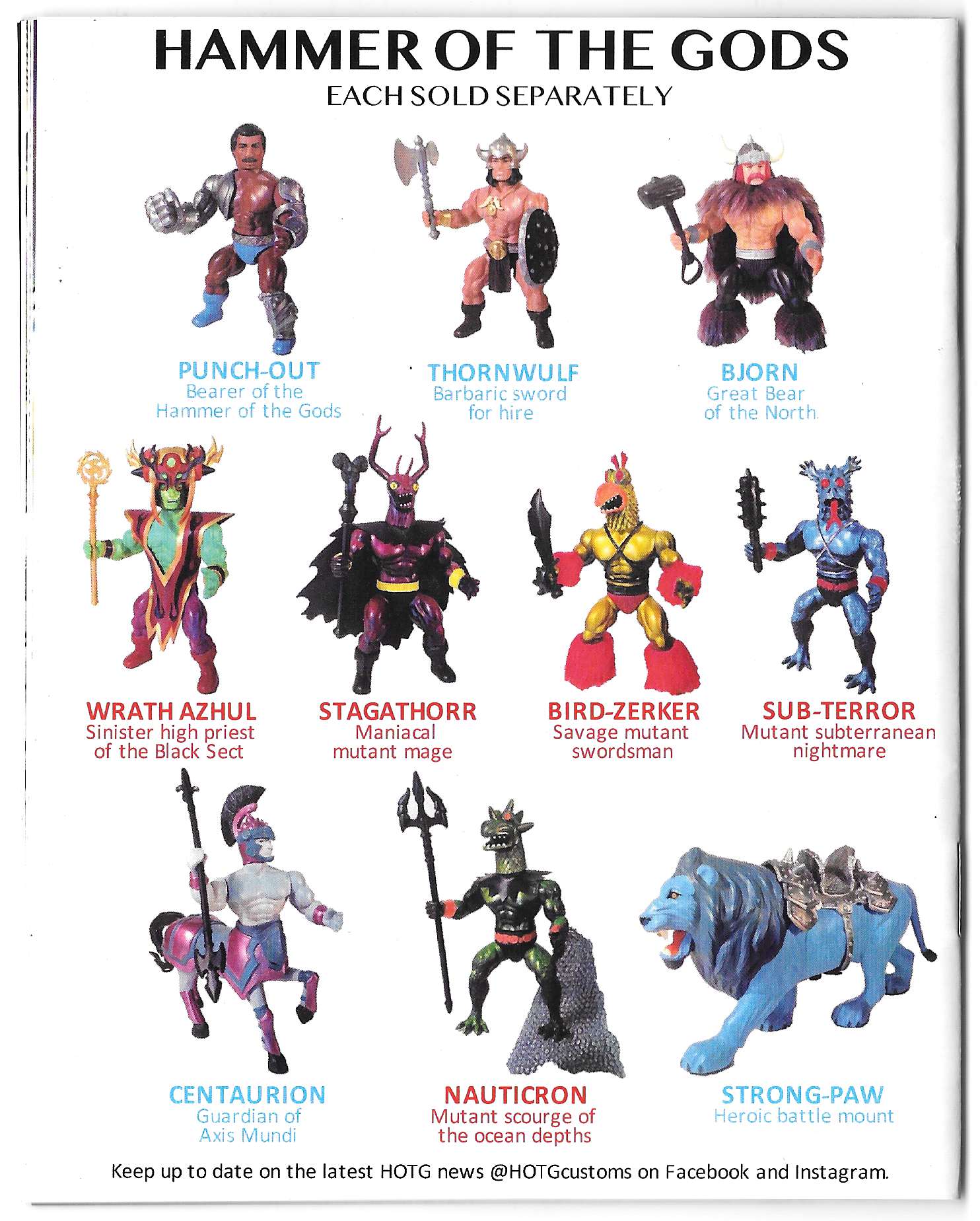
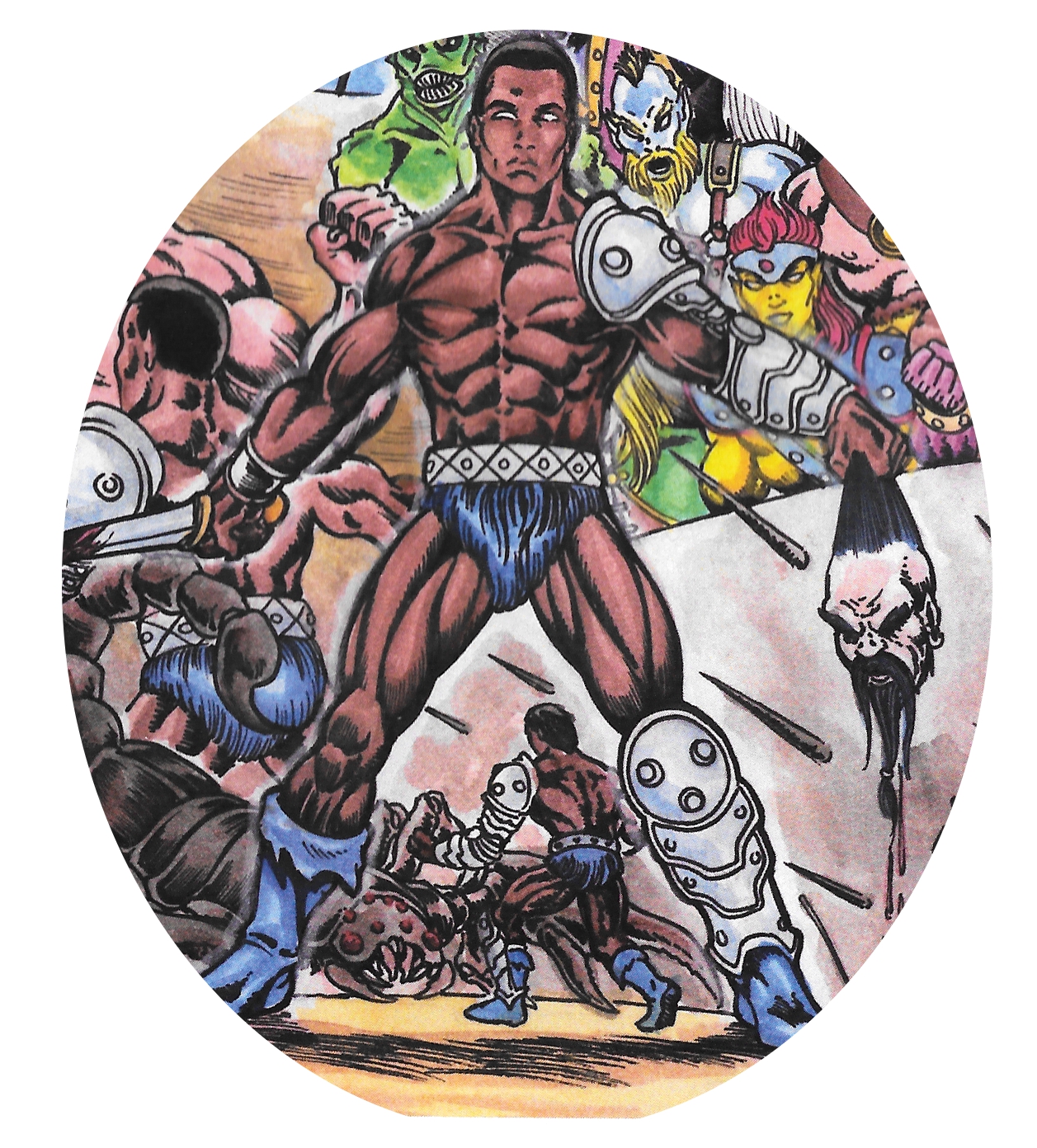
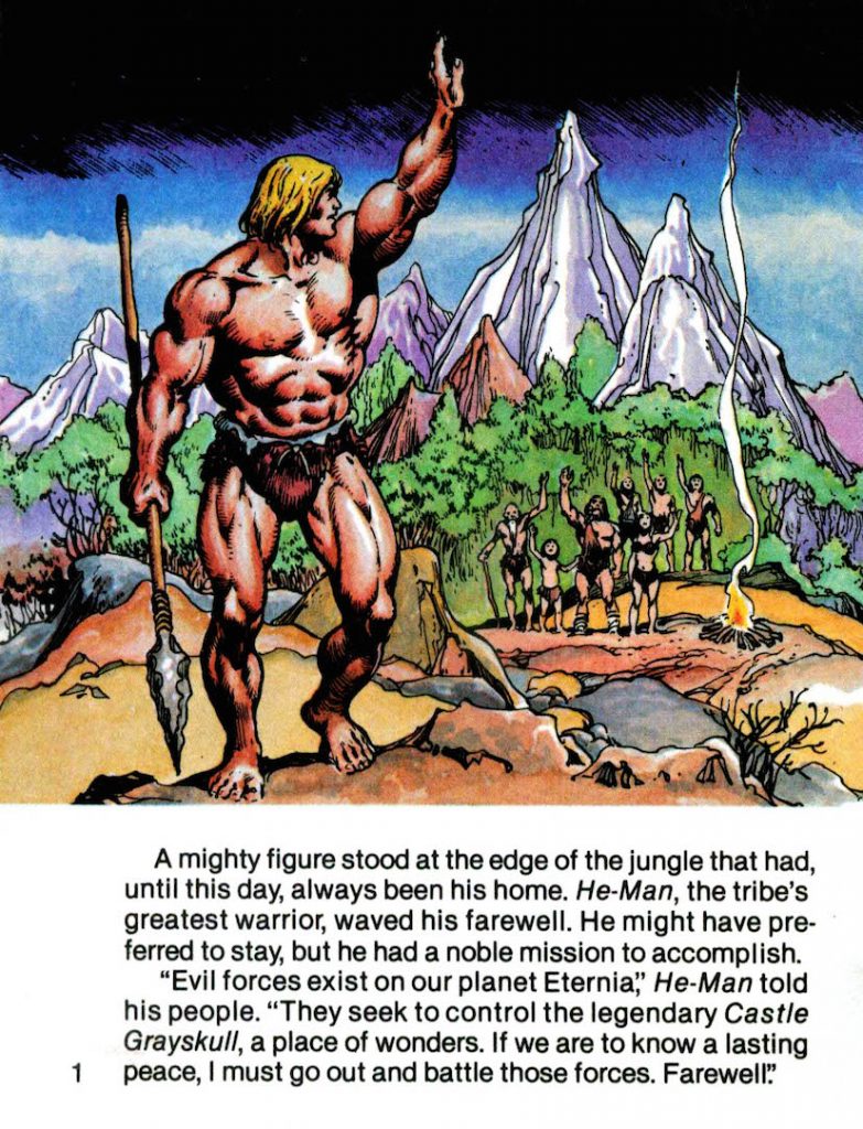
Masters of the Universe was a unique blend of classic barbarian sword and sorcery high adventure crossed with the high-tech drama of Flash Gordon and Star Wars, with a splash of color and gimmickry to make it irresistible to six-year-olds. So what happens if you take Masters of the Universe and peel away the science fiction elements while keeping the colorful characters? You get something very much like The Bearer and the Burden, a new He-Man inspired minicomic from Hammer of the Gods.
The world of Hammer of the Gods is not simply Masters of the Universe minus the techno-gadgetry, however. He-Man bears the unmistakable influence of Conan the Barbarian, but He-Man’s morals were totally different. He-Man was always a selfless protector, even from his earliest “savage” minicomic days. Conan, driven mostly by id, was ever looking out for number one, even if he grudgingly got pulled into solving other people’s problems.
Punch-Out, the protagonist of Hammer of the Gods, splits the difference between the He-Man and Conan – that is to say, he is a tireless protector of the innocent, but he is frequently driven by ego.
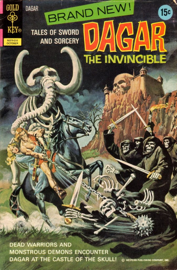
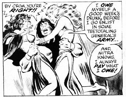
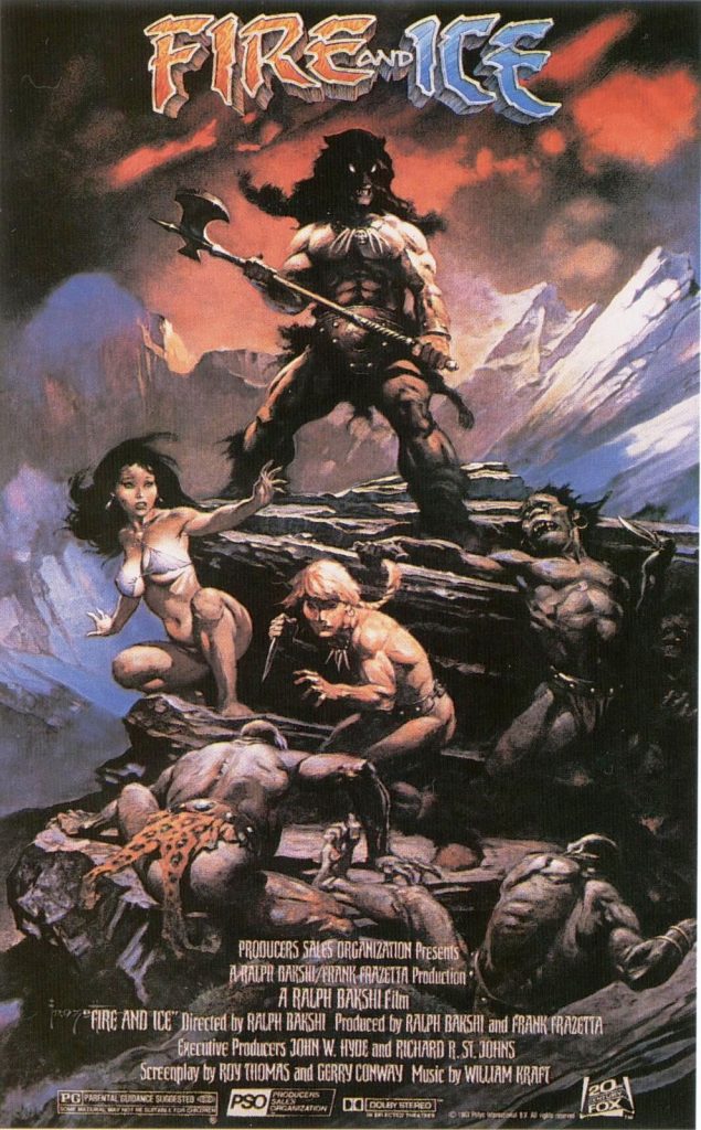
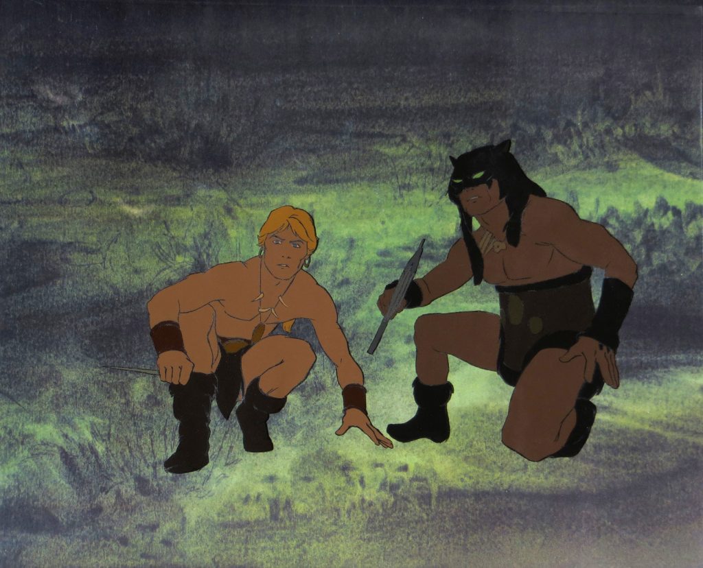
In that way, Punch-Out is also a little like Dagar the Invincible. He-Man is perhaps a bit closer to Larn from Fire and Ice.
The Bearer and the Burden was written by Hammer of the Gods creator Walter Harris, and illustrated by Daniele Danbrenus Spezzani. Harris is best known for his custom HOTG and Thundarr the Barbarian action figures. Danbrenus is known for his original minicomic illustrations done in the style of the legendary comic book artist, Alfredo Alcala. (Alcala actually worked on both He-Man and Conan, among other properties.) Danbrenus, like Alcala, works in inks and water colors rather than digital media, and the extra effort toward greater authenticity really pays off here.
From Danbrenus’ The Triumph of Skeletor
The Bearer and the Burden is formatted like the original “adventure books” (illustrated by Alfredo Alcala) that came packaged with the first wave of He-Man figures. Each page has a single illustration and about 75 words of text at the bottom. Unlike conventional comic books, there are no word balloons.
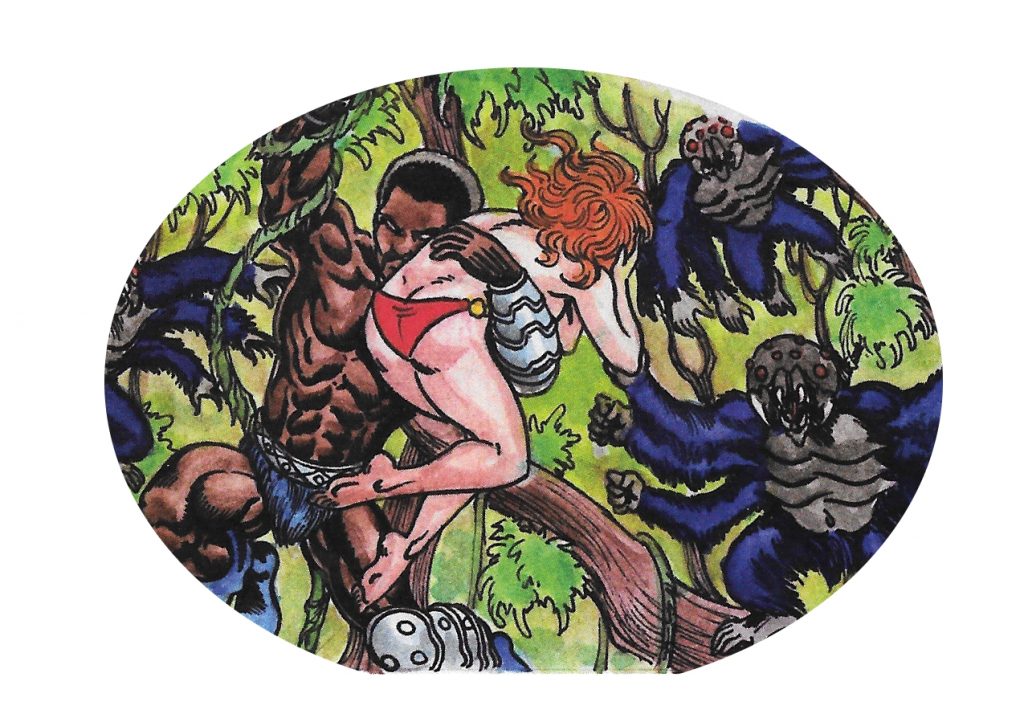
We begin with Punch-Out, whose real name is Cestus, a gladiator fighting to win his freedom. Already we see a tonal shift away from the kid-friendly He-Man comics, as Cestus is pictured holding the severed head of one of his opponents.
In his post-gladiatorial life, Cestus relentlessly seeks purpose by throwing himself into danger, in a sequence with some amusing nods to Tarzan and Indiana Jones. The comic doesn’t take itself too seriously, but the humor is subtle enough that it doesn’t take the reader out of the story or erase the stakes in our hero’s journey.
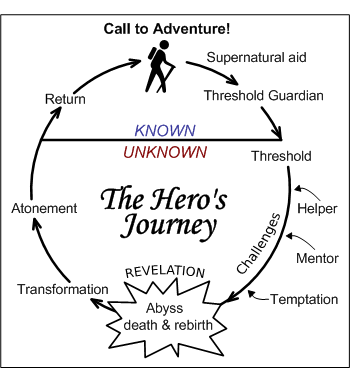
When I say hero’s journey, I mean that quite literally. The Bearer is a pretty textbook example of Joseph Campbell’s monomyth in action, which is why I think it works so well.
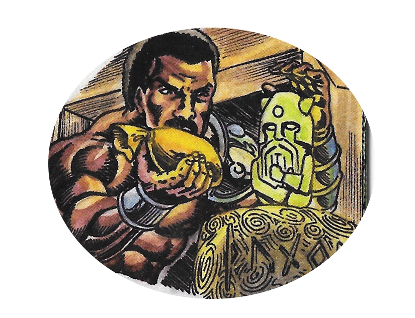
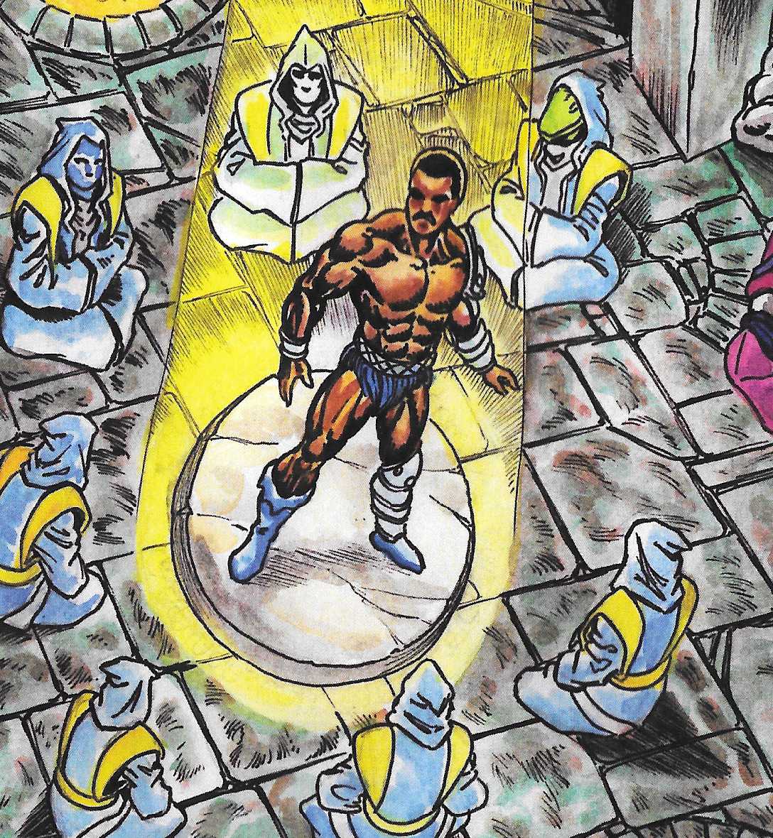
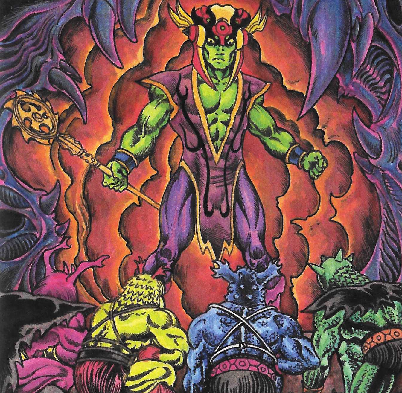
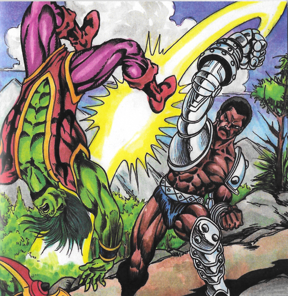
Meanwhile, a dark threat surrounding rumors of a demonic sorcerer (Wrath Azuhl, the Skeletor to Punch-Out’s He-Man) and his cultic followers begins to grow. The Monks of Axis Mundi, who guard a legendary weapon forged by the gods, identify Cestus as the champion worthy to wield the Hammer of the Gods.
Through an intensely painful process, Cestus is fused with the Hammer, which is a metal gauntlet and sleeve imbued with divine magic. Now endowed with power from the gods, Punch-Out, as he is now called by the monks, goes to train with his new weapon. Of course, it doesn’t take long before the inevitable conflict with Wrath Azuhl and his colorful minions.
Incidentally, if there is something familiar about Punch-Out, it’s because the action figure he’s based on is made up of parts from an Apollo Creed figure, as well as bits from Man-At-Arms, Fisto, Trap-Jaw and Roboto.
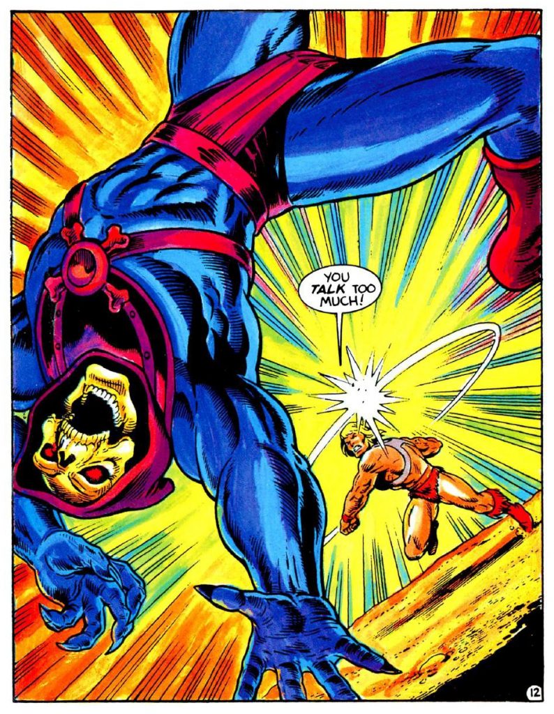
I don’t want to spoil the climax or the ending, as the comic just went on sale. I will say that I didn’t know what to expect when I started reading The Bearer and the Burden, but I was pulled into the story from the first couple of pages onward. It’s a well-balanced blend of classic sword and sorcery story-telling with just enough pulpiness and humor to keep things fun. Harris’ skillful narration combined with Danbrenus’ charming Alcala-esque illustrations make for a very enjoyable read. Fans of Masters of the Universe will get what this is about instantly, and those familiar with the vintage minicomics will be delighted with the little Easter eggs that Danbrenus has left for them.