While we are still waiting for season 2 of the Masters of the Universe Revelation (the upcoming 5 episodes under new title Masters of the Universe Revolution to arrive in early 2024), here is an interview with the person behind the secrets of the Netflix He-Man and Revelation logos!
Hello and thank you so much for taking the time for an interview! Tell us about yourself.
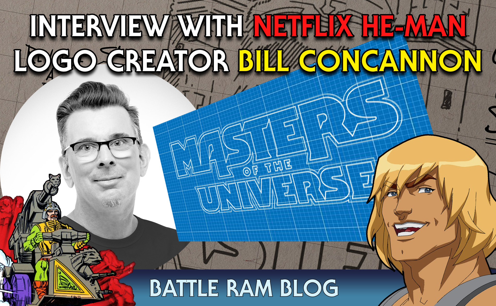
My name is Bill Concannon, I am a graphic designer, owner and creative director for Concannon Art, a new graphic arts company in LA. I have been designing in the toy and game space for the past twenty two years and have had the pleasure of designing for many iconic brands. In particular Im proud to have completed the re-designs for Hot Wheels, circa 2010, Transformers, circa 2014 and the latest Masters of the Universe including ‘He-Man’ and ‘Revelation’, circa 2019. These iconic logos represent brands with great stories to tell. Recently their stories were illuminated in features like ‘The Toys that Built America’ (History Channel, HULU) and ‘The Toys That Made Us’ (Netflix).

Did you grow up with Masters of the Universe?
I was twenty when they came out but would have loved to have had them in my days of GI Joe.
Do you have a favorite character?
I dig Man-E-Faces and Battle Cat of course!
Your company Concannon Art has many functions. Can you describe your work to someone unfamiliar with it?
Brand development is what we do as a graphic arts company. Identities, packaging, merchandising, licensing guides are the bread and butter of our work. I do the majority of the graphic design along with a team of other designers and illustrators. The packaging work that I have done for ‘Star Wars’ and ‘Transformers’ properties helped to establish a reputation within the industry. I’m very proud of the recent logo work I completed for the Masters of the Universe franchise.

Can you describe your work process in general? What is a typical day look like?
Running your own shop requires a process that balances time for the business and design work. I plan each day the night before. Some days are pure design work while others are maintaining client communication and project management. There is a lot of time dedicated to delegating and collaborating with other designers and illustrators. I enjoy it all tremendously but I really love the early days of design work where the initial ideas are being formed.
How did you get the job on creating the current Netflix MOTU logo-family?
I had done a lot of packaging work for Mattel which had included logo design work. I had worked on their Battle Force 5 property and in 2010 the significant refresh of the Hot Wheels brand logo.


How many designs did you go through and what was the process like?
The project began in March 2019 and included the Masters of the Universe, MOTU Revelation and HE-MAN MOTU logos. The project wrapped up a year later with the majority of the design work completed in December 2019 with about twenty iterations explored.


What designs are your inspirations? Or possible people in the field?
I am inspired by classic designers like Saul Bass. I recently watched a documentary that discussed the movie poster designs and 007 logo done by Joe Caroff. These classic poster designers are an endless source of inspiration. Seeing great design creates a kind of work energy that makes you raise the bar on your next project. The best project is always the one you’re currently working on because it’s unfinished and has limitless potential.
Were you given any specific guidelines? Or restrictions?
There were many considerations. The equity of the property was very important to Mattel while the studios wanted to ensure it could carry a cinematic feel. Cohesion between the three logos (MOTU, MOTU Revelation and HE-MAN MOTU ) was another key consideration. Netflix has very strict design and production specifications that entertainment logos need to adhere to. Many of these are in place to ensure quality assurance for the many production uses of the logos.


Of all your unused designs, which is your favorite and why?
The approved logo is shown straight on with an extruded base. The letterforms are perpendicular to the baseline. There was a version where the same logo is rendered in perspective to match the original 80’s logo. That version was deliberated over quite a bit.

When designing for something like MOTU that has so much nostalgia tied to it, how difficult is it to keep that nostalgic design while also pushing for something new?
Interestingly it was this aspect which drove the alternate logo in perspective. It was very important to design something that respected the past but could carry the logo into the future. Having the logo built in a straight on perspective allows for more variation in how it’s rendered going forward. Sometimes you can be too “on the nose” with a design and it won’t have enough of a fresh look. So although the logo in perspective was closer to the original the approved logo presents something new.

In the Poster reveal for REVELATION we got to see the new logo for the first time proper. In the MASTERS portion the ”A” and ”R” stand out in a curious fashion in particular. What was the thought process behind that?
The iconic nature of Castle Grayskull was a strong influence on me. I used paintings of the castle to create mock movie posters to test new logo designs. I like to see how a potential logo will look in use, in a layout. During one of those studies I saw a visual connection with the descenders of the “A” and “R”. I pulled them down into the layout as representations of the towers of the castle. Flipping the “A” also created better symmetry and matched the towers better. The flipped letter also created a unique and more own-able shape for the “A” which is always a plus for a new logo.


How do you feel about the original 80s logo design by Bob Nall?
It’s a classic for the time it was designed. A time before the advent of the Mac and Adobe. And I love that it was airbrushed by John Hamagami.

Is there anything you would have wanted to add or tweak of the final logo?
I would have wanted to explore more render and FX variations for theatrical branding. Similar to how the Star Wars logo is rendered differently for each cinematic episode – the new MOTU logo has a solid base that can be rendered to meet the needs of its many publications, products and entertainment.
How does it feel to see your logo design on toy packaging and on the TV screen?
It’s always a thrill to see your work published and you want to feel good that the mark is serving the story well. For MOTU I think it’s a mark that will strongly represent the franchise.


Do you have any advice for people looking to get into graphic/logo design?
It’s definitely a work of passion and love of typography. If you have the passion, always be sketching and archiving the work that inspires you. Remember that every logo is a visual expression of a story and you should make sure that all of your layout, type, graphic and color decisions serve that story.
Thank you very much for answering these questions!
Thank you!
BC
[special thanks to Adam McCombs and Colt Crane for helping with the interview questions]