Written by Adam McCombs & Jukka Issakainen
With the arrival of the new Mondo Goddess figure, we thought it would be a good time to take a look at the history of the character. We’ll cover her original concept design, her appearances in comics and toys over the years, and provide a look at the new 1/6 scale Mondo figure at the end of the article.
The name Goddess or Green Goddess, historically, did not apply to the character under discussion in this article, at least not originally. She appeared in exactly one comic and in one piece of concept art in the 1980s, and in both instances she was called the Sorceress. Nevertheless, since the name/title Sorceress has come to refer to the falcon-themed guardian of Castle Grayskull who appeared in the Filmation He-Man and the Masters of the Universe cartoon, we’ve used the name “Goddess” in the title to avoid confusion.
Mark Taylor’s Sorceress
The Sorceress/Green Goddess was created by Mark Taylor for the original Masters of the Universe line. In her original design, she was not green-skinned, but actually wearing a green body suit, similar to Man-At-Arms. Her allegiance isn’t specifically stated, but she does have a slightly evil or at least crafty look to her.

A black and white version of the above artwork with green Pantone stickers is dated June 8, 1981, shown below. Mark notes that she was to use the same basic body as “Female Warrior” (Teela). Note that Teela’s gold decoration on her white tunic was supposed to be a separate overlay rather than something sculpted to her torso. So this figure would have gotten the snake headdress but not the gold fleur-de-lis-esque costume elements.

Years ago, I asked Mark Taylor what his original intent was for the character:
Adam: Teela and the Sorceress/Goddess (the one with the snake armor) were originally separate characters. Whose decision was it to combine them into a single action figure? How did you feel about that? Did you intend the sorceress character to be a hero or a villain?
Mark: She was actually supposed to be a changeling but the comic book guys had a hard time with that. Also, the head of girls toys wanted to rip her off for Princess of Power (because now the line was very hot!). She was intended to be like a spy and play both sides with some magic but the “professionals” felt that was too complex (I guess they don’t get Game of Thrones either).

As Mark has explained in public appearances, he didn’t want to give up on the idea that Sorceress was a “bad person”. Her personality is perhaps mirrored in her stern, cold facial expression in Mark’s concept art. Mark has also said that, though initially “bad”, he had the idea that Sorceress could at times team up with either Skeletor or He-Man.
He-Man and the Power Sword
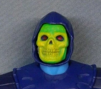
In the original Masters of the Universe mini comics, the green-skinned Sorceress appears only in the aforementioned He-Man and the Power Sword. Contrary to Mark’s conceptualization, she is unambiguously heroic, providing help for He-Man and defending the Power Sword and Castle Grayskull from Skeletor. Note that in this story her face is green, indicating that she’s not wearing a green body suit, as originally designed by Mark.

I’ve talked before about how Mattel elected to produce only one female figure for the 1982 Masters of the Universe debut, and so combined Teela and Goddess into one figure. In some early stories, when you are seeing what looks like Teela wearing her snake armor, it’s actually the Goddess (or often called the Sorceress). But in other early stories it’s just Teela with snake armor on. It could be quite confusing, and so the Sorceress character was redesigned by Filmation with a totally different look to make things clearer. You can read more about that in the two articles below. In this article we are focusing only on the green-skinned version of the character.
So, back to the Sorceress in her appearance in He-Man and the Power Sword. She appears in four pages in the story. She is the first person that He-Man meets when he leaves his home in the jungle, whereupon he saves her from a purple beast that had attacked her.

Interestingly in her first appearance in the story she is holding a staff topped with what looks like an animal skull with horns. Later in the story we see Skeletor holding this same staff, which is not quite the same design as his Havoc Staff. She is not holding this staff in her concept art, but instead holds a snake staff.


The staff in Alcala’s illustration above is somewhat reminiscent of the Skeletor’s prototype staff. However the version in the comic looks more like a cow’s skull than a ram’s skull.

On the page below, we see He-Man fighting the beast, aided by some “mystical bolts of force” from the Sorceress. In this panel we can see that she actually has the same tiara that Teela was supposed to have, poking out from the top of her snake helmet. Perhaps this was taken from another (lost) piece of concept art, because she has no exposed hair in the existing Mark Taylor B-sheet.

After He-Man defeats the monster, the Sorceress rewards him with some treasures she has been guarding. She explains that they were made centuries before the Great Wars by Eternian scientists. The treasures include his harness (which, depending on the model, give him augmented strength or a force field), an axe, a shield, the Battle Ram, and the Battle Chariot (an unproduced vehicle designed by Ted Mayer). We can also see a sword (not the Power Sword), some boots, and a spear.

The Goddess does not show up again in the story until near the end, where she disarms Skeletor by taking the Power Sword from him and splitting them into separate halves again. She disappears and is never seen again in any vintage stories, at least not with this coloring.

Just a note for those not familiar with this comic or this topic- Teela was definitely a separate character from the green-skinned Sorceress, and they both appear in He-Man and the Power Sword. In the story, Teela was a warrior character with apparently no magical abilities who was captured by Beast Man and Skeletor. In the end she escapes and helps He-Man and Man-At-Arms to fight off the Evil Warriors.

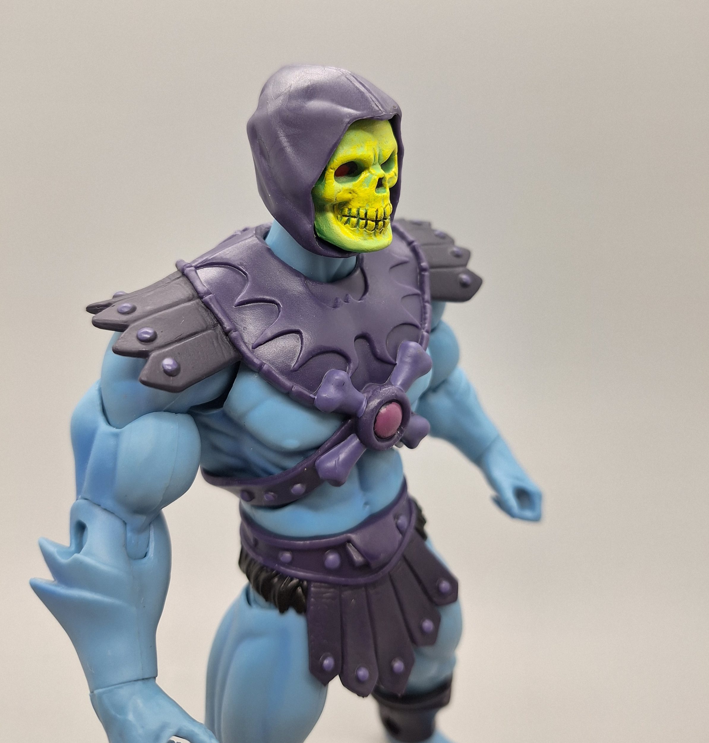
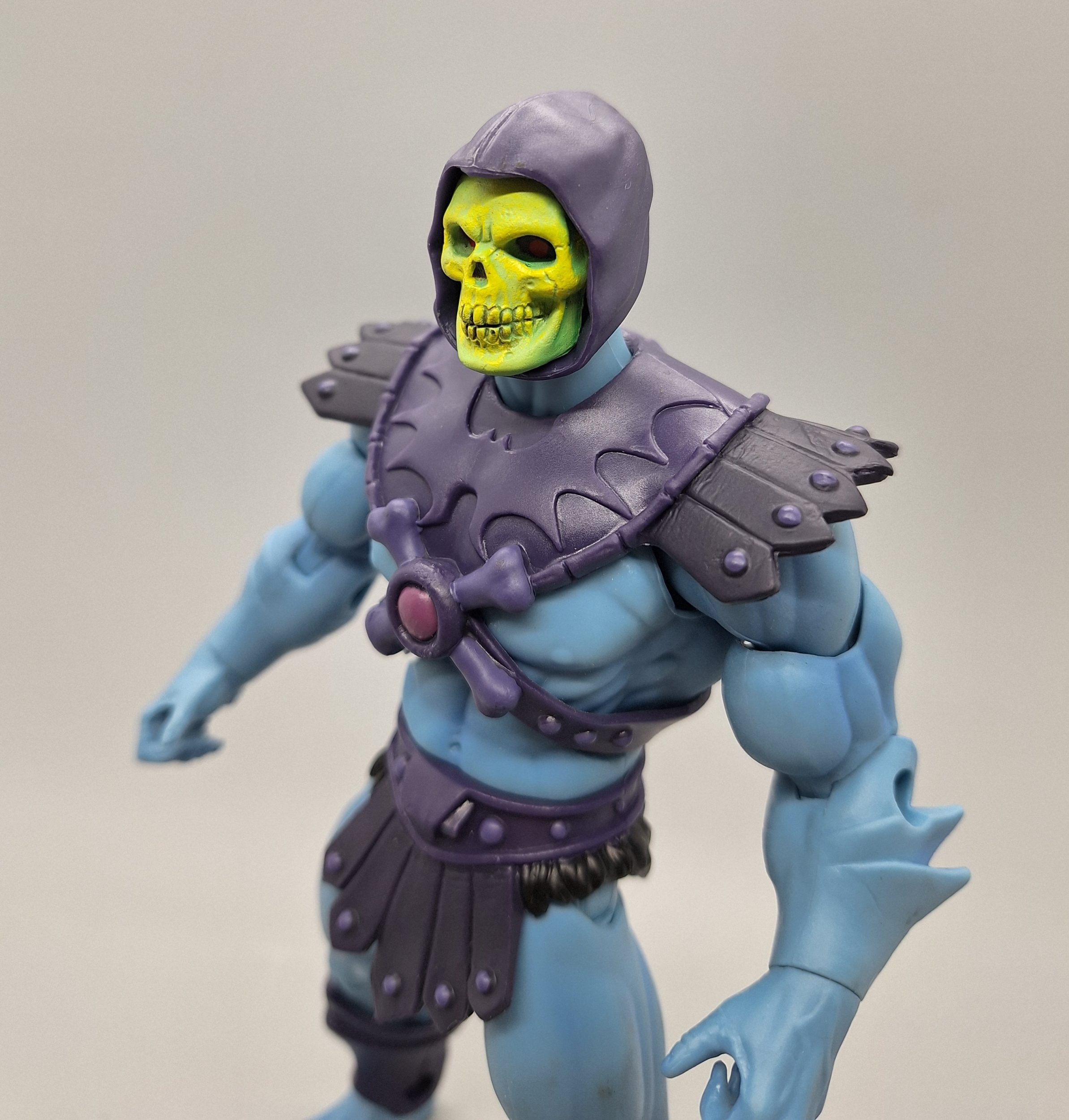
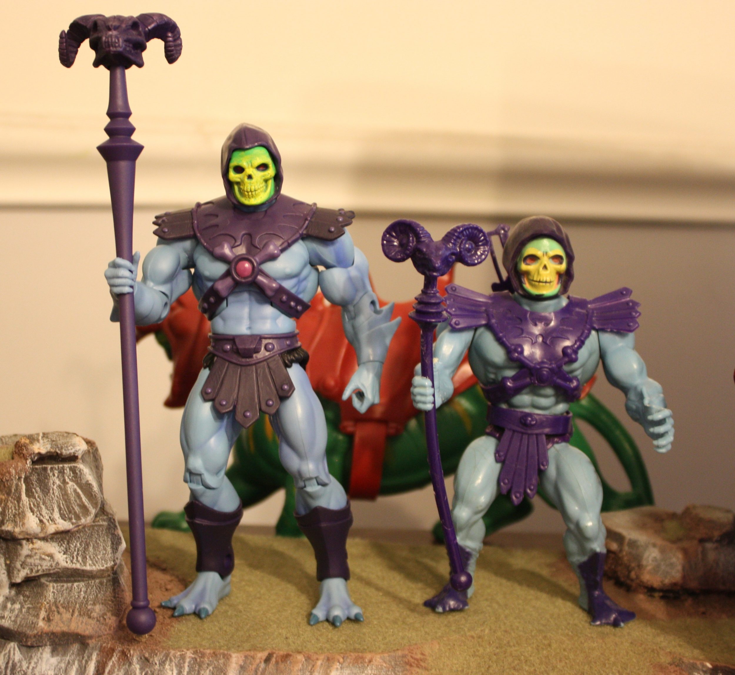
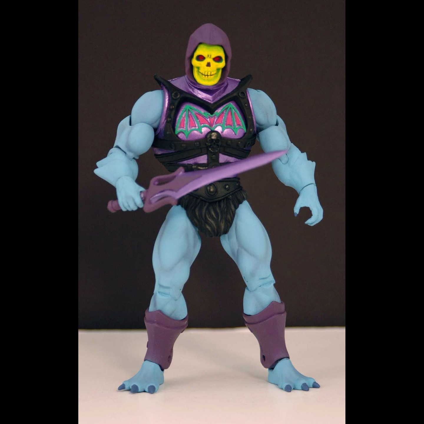
MOTU Classics The Goddess
The ethos of the Classics line was, for some reason, to retcon concept characters into completely new characters to “justify” their inclusion in the toyline. Or, sometimes two characters would be combined into one. How that would “justify” them is unclear. I suspect this was really done to maintain one consistent and harmonized story in the bios that went on the back of the packaging. The Goddess was released as a figure for the first time in 2009 in the MOTU Classics toyline. Originally she was supposed to have opaque skin, like the Sorceress character in the first mini comic, but Mattel design opted to make her translucent, which lead to problems with the figure cracking at the pelvis.
The color scheme was based on one particular panel in He-Man and the Power Sword where she had white bracers. The white was probably an oversight by the artist – in all the others her bracers were brown, and they are also brown in Mark Taylor’s concept art. She came with a spear that was really intended for Teela, allowing The Goddess to use Teela’s snake staff. She reused Teela’s tunic, which was the only major point of departure from Mark Taylor’s design (recall that she wasn’t supposed to have the gold leaf pattern on her costume). This was no doubt done to save money.


In her bio, she was given the real name of Sharella, a character from the Powers of Grayskull line. Originally there was no connection between these characters, and neither one was produced in the vintage line. This retcon was met with a mixed reception at the time.
The Goddess
Heroic Trainer of He-Man
Real Name: SharellaAfter the death of King Grayskull, the Power of the Universe was transferred from the Sword of He to the Council of Elders who hid it deep within his castle. Knowing the full sword was the key to channeling the power, they split it in two to prevent it from falling into the hands of evil. For five centuries they waited for a worthy heir to be born. During this time their spirit guide, the creature known as “The Goddess” of Eternia, trained secret heroic guardians to keep the two halves of the sword separated. Many of these brave warriors took the name “He-Man” in honor of the sword they protected – giving birth to many different legends of the protector of Eternia.

Classics had given the (green) Goddess a “real name” Sharella, and later they retconned the fan-theory about a nameless archer girl, who appeared in the background art for vintage Megator, as Sharella. Classics had a habit of taking elements created by fans, and inserting them officially in the bios (for example in the 2002 cartoon King Grayskull had a lion, which never had a name in the series bible or scripts, other than “Grayskull’s Lion”. Fans coined the term “Battle Lion”, and Classics used that).
Masters of the Universe Classics minicomic #8 gave us couple flashback panels, where we see Sharella (as archer girl in ancient times) get injured from an arrow by Quick Flix. Then given a blood transfusion from Moss Man. Implying that because of this, she’ll later turn into the green-skinned Goddess.


Modern DC Comics (2012-2016) – The Goddess Conundrum
When interpreting the world of Eternia for modern comic stories, Rob David took the approach that there was a life force that created the Universe. It was worshiped by different races, each calling it by different names and viewing it through their own lenses, if you will.
So in the stories by Mattel/DC Comics, the Star Seed is “the First Light” and has been called the Life-Force, the Goddess, Zoar, Serpos, Horokoth. The characters refer to the being as The Goddess in the story.

Some fans who may not have followed the comic series regularly may have remembered from the 1980s stories that there was a character called the Goddess or the Sorceress, and were naturally confused when the heroes in this comic were searching a way to resurrect the Sorceress, and needed to go to the Goddess [an entity, not a person] for help.

In He-Man and the Masters of the Universe #12, in a battle with King Hiss and the Snake Men, Teela is knocked into the Star Seed. There she learns that her mother was the Sorceress, and that the job of the Sorceress was to be the oracle of the Goddess. Each Sorceress takes a different form, and Teela is transformed into the Sorceress of Serpos. Like the original Sorceress/Goddess created by Mark Taylor, she has green skin and snake armor (although she shows much more skin in this comic). In this continuity, she is not the Goddess, but a servant of the Goddess.


Teela continued as the Sorceress of Serpos for most of the DC Comics He-Man the Eternity War series, which ran from 2015-2016.


In issue 14 of the series, when Teela in her Sorceress of Serpos form is on the brink of death, Man-At-Arms trades his life for hers. In the process she is restored to her human form.


Masters of the Universe Revelation & Revolution
The Masters of the Universe Revelation and Revolution animated series have utilized many aspects from the franchise’s long past, taking elements from existing media and putting them into new contexts. In the show, the concept of Preternia (Eternia’s distant past) becomes Eternia’s version of heaven. Or the underground world of Subternia (originating in 2002) with its caves and own inhabitants becomes a version of hell instead.
Revolution takes many cues from the He-Man the Eternity War comic series (thanks to executive producer Rob David). But it was never an animated adaptation of that story, as some fans thought when Revolution trailers arrived. In “Ascension,” Teela is transformed by the Staff of Ka into the green-skinned Sorceress of Ka, based on the Sorceress of Serpos from the 2014-2016 comics, but with several visual updates. Throughout the series we see Teela transformed by the ancient powers of the three primal gods of Eternia in the Revolution series: Zoar, Ka, and Ha’Vok. Eventually, with He-Man’s help, Teela is able to fuse all three powers into one, changing her appearance for a fourth time.


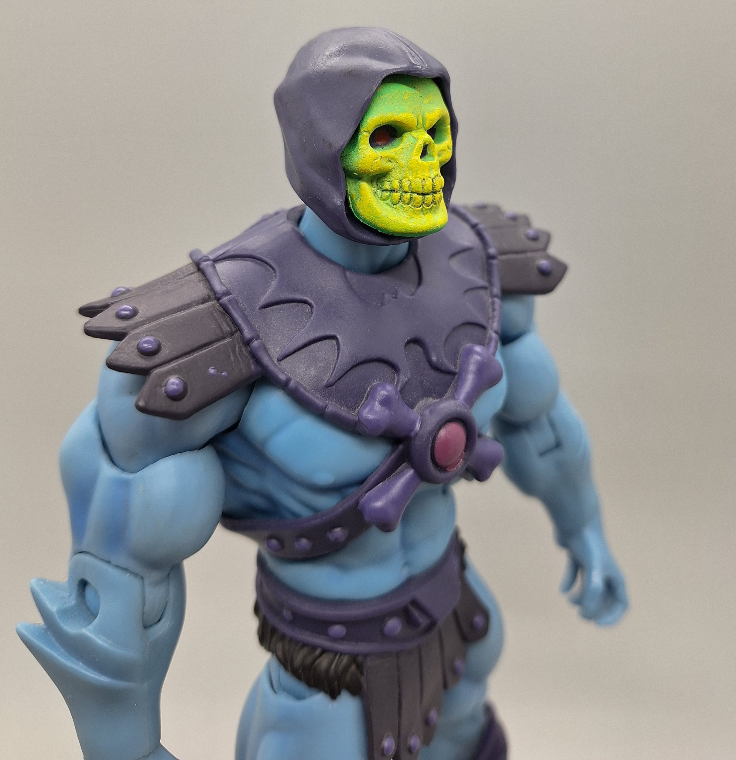
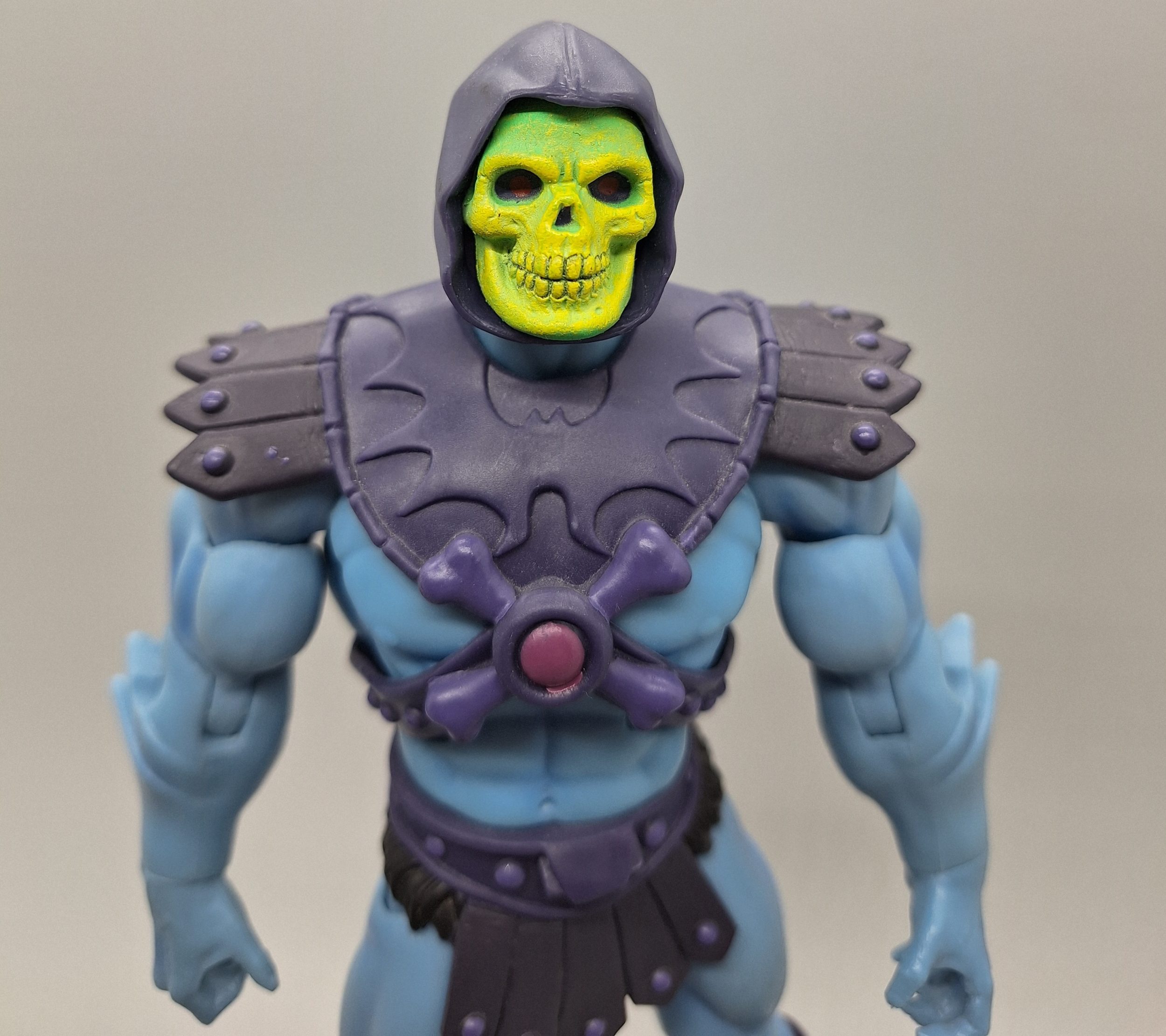
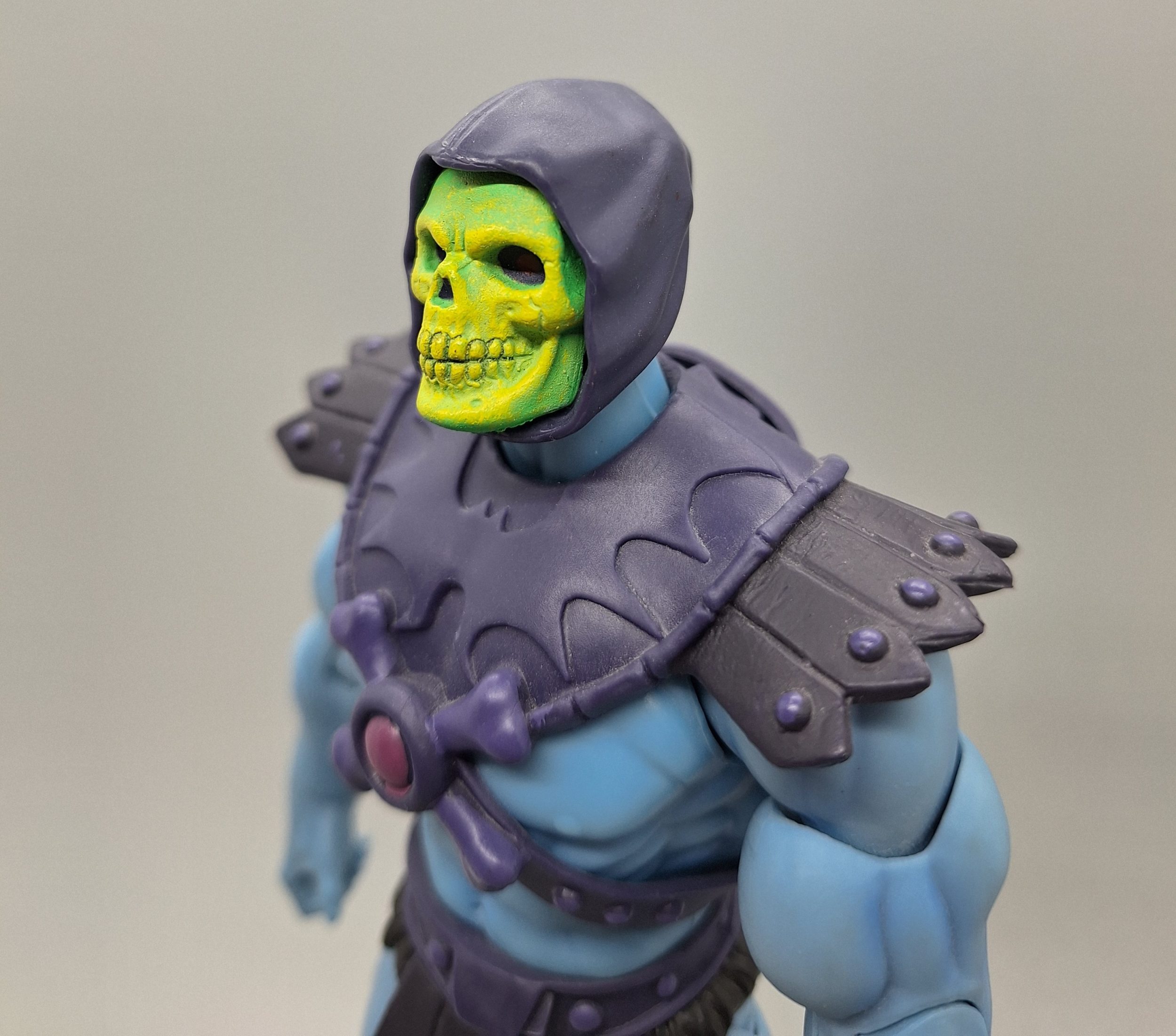
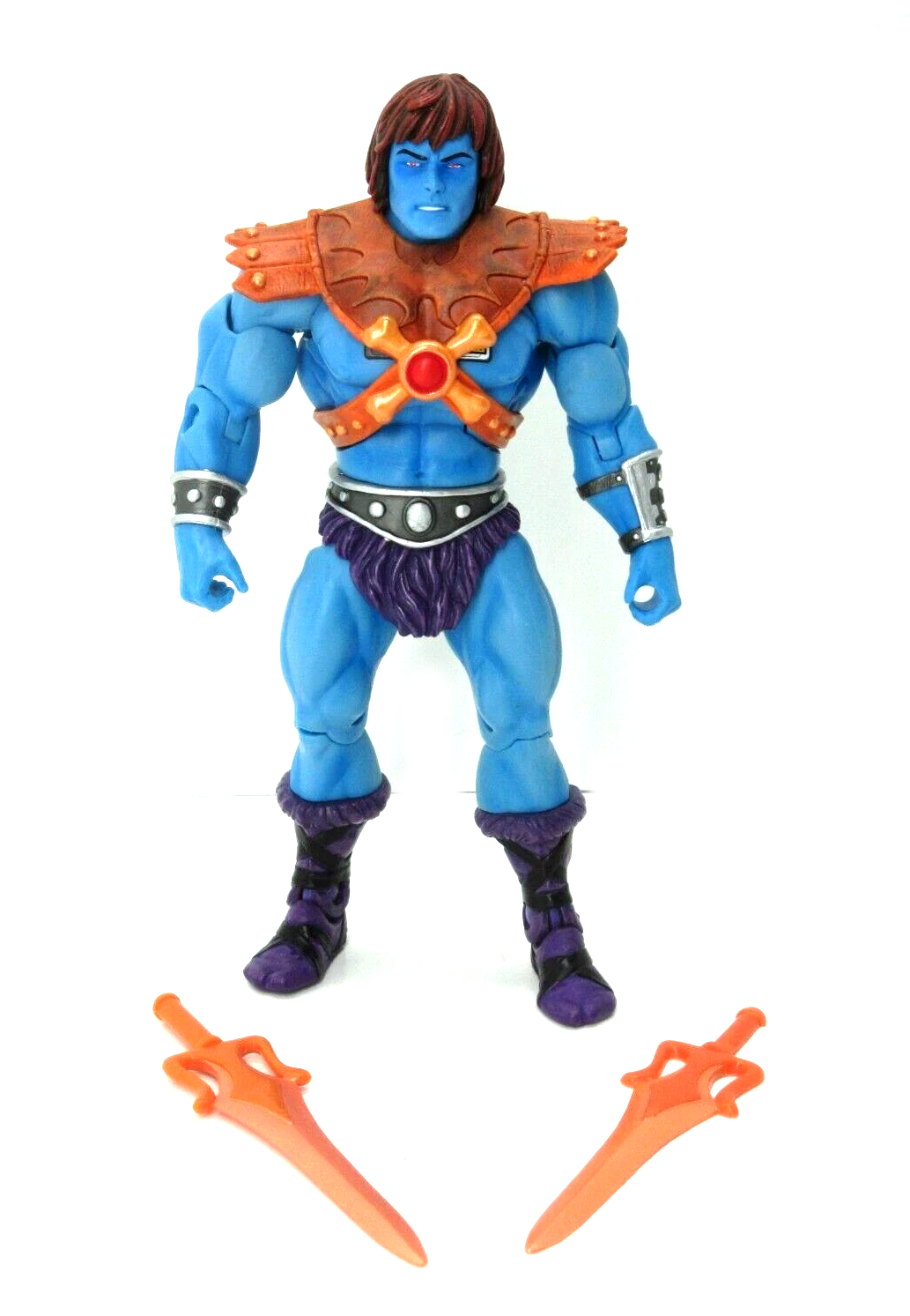
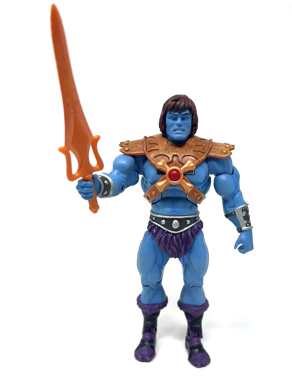
Masterverse Revolution Sorceress Teela
The Sorceress of Ka was released as a figure in 2024 the Masterverse line as Sorceress Teela. For whatever reason she was produced in very low numbers, and so is difficult to get on the secondary market. The packaging artwork was done by Simon Eckert.


Below a Wallpaper version 😉 -Jukka

MOTU Origins Eternian Goddess
Masters of the Universe Origins brings once again a totally new continuity with its figures and storytelling. They use old official elements mixed with unused concept materials and insert them in the new story they are telling (for instance, Veena is no longer the wife of a King Grayskull). So the Origins stories are not a continuation of the vintage material, but, like the Classics bios before them, they represent a new canon on their own.
Origins has the Goddess appear in the pack-in mini-comic for the 2019 He-Man & Prince Adam 2-pack. The artwork is by Axel Giménez with colors by Val Staples.


She was released as a figure in the MOTU Origins line in 2021 as the Eternian Goddess. Her color scheme was changed a bit from the source material – she was give silver bracers and boot tops and blue bicep rings. Her accessories were also closer to red than to brown, especially in the production figure (the image below is a prototype pic that Mattel released).

The Goddess appeared in the modern MOTU Origins mini comic, Rock and a Hard Place. In the story, Prince Adam is overcome by Stinkor’s stench, and calls out to the Goddess for aid. The images below come from Vaults of Grayskull, and you can read the full comic on their site.


She also appeared in the MOTU Origins mini comic, Lost Legend. In this story she has the “real name” of Sharella, a detail taken from the MOTU Classics bio mentioned earlier in this article. Sharella transforms herself into the Goddess. Strangely, “Oo-Larr” (the MOTU Classics name for the “jungle” He-Man) is retconned as being the same person as “Wun-Dar.” This page comes from Vaults of Grayskull, and the full scan is available at their site.

Other Versions of the Goddess
The Goddess was released as a statue by Iron Studios, as a ReAction figure by Super7, and as a mini figure included with the Mega Construx Castle Grayskull set.


Mondo’s The Goddess: a short review
Mondo’s Goddess figure went up for pre-order March 2025 and was shipped out October 2025. The back of the package makes clear that this isn’t the original Sorceress from He-Man and the Power Sword, but rather the transformed Teela that appeared in the Masters of the Universe Revolution series. I should note that although her costume is similar to the Revolution Sorceress of Ka, this figure is really its own thing and is a blend of different influences, including the 2015 DC comics, the vintage Mark Taylor design, and even a bit of 200x Teela.
Still, on my shelves she’ll represent the original Sorceress character created by Mark Taylor. That was my approach in the Classics era too, with characters like “Oo-Larr” that were retconned into new characters. I just thought of “Oo-Larr” as He-Man from the mini comics, and I will think of Mondo’s The Goddess as the original Sorceress character envisioned by Mark Taylor. Call me a curmudgeon if you must!


The figure is at 1/6 scale, and is intricately detailed, sculpted and painted. I inspected my example for paint problems and other irregularities, but thankfully I didn’t find any. Her left ankle is slightly loose, but it doesn’t seem to inhibit her ability to stand. Otherwise all of her joints are good, neither too tight nor too loose.


The Goddess comes with three different heads. two of which have a placid expression. The neutral face is available with either a helmet or a snake tiara and long hair. The smiling face is available with the long hair and tiara. Any of the three can be used with the snake headdress. Mondo made the interesting choice of giving her gold eyes with dark red sclera, which enhance the snake theme, but also make her look slightly evil. I’m okay with that – the original concept seemed slightly sinister too!

There is also a removable skirt, although I found it challenging to get it looking right. I wasn’t that interested in it as an accessory, so I put it on for the photo, but otherwise it’s going to live in my parts bin.


The Goddess also comes with a spear, a sword and a shield. To me these are really Teela accessories. I see Goddess more as a spell caster than a warrior, but they are an option if you want them. For me, her snake staff (or Staff of Ka, as it’s come to be called) is her primary weapon.

Speaking of magic, she also comes with a mystical snake magic effect, which can be attached to either hand. She comes with a total of ten hands, so you have plenty of options there.


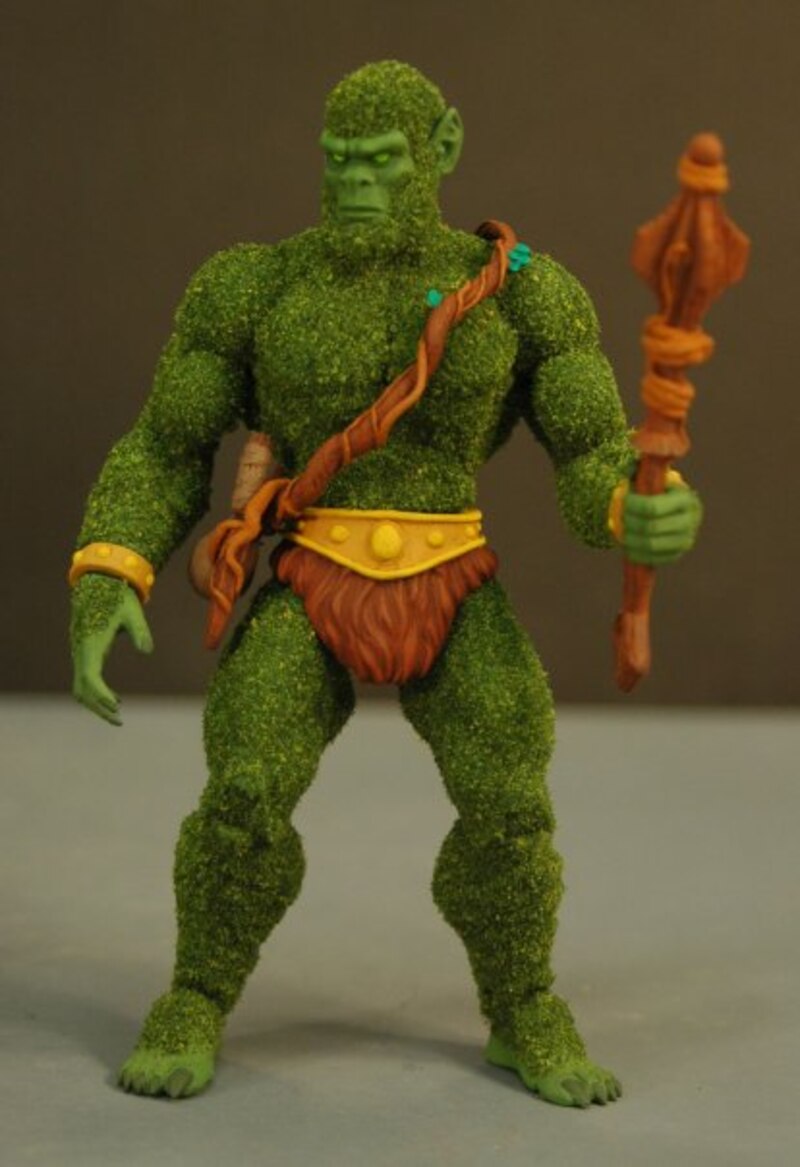
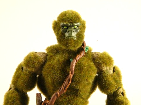
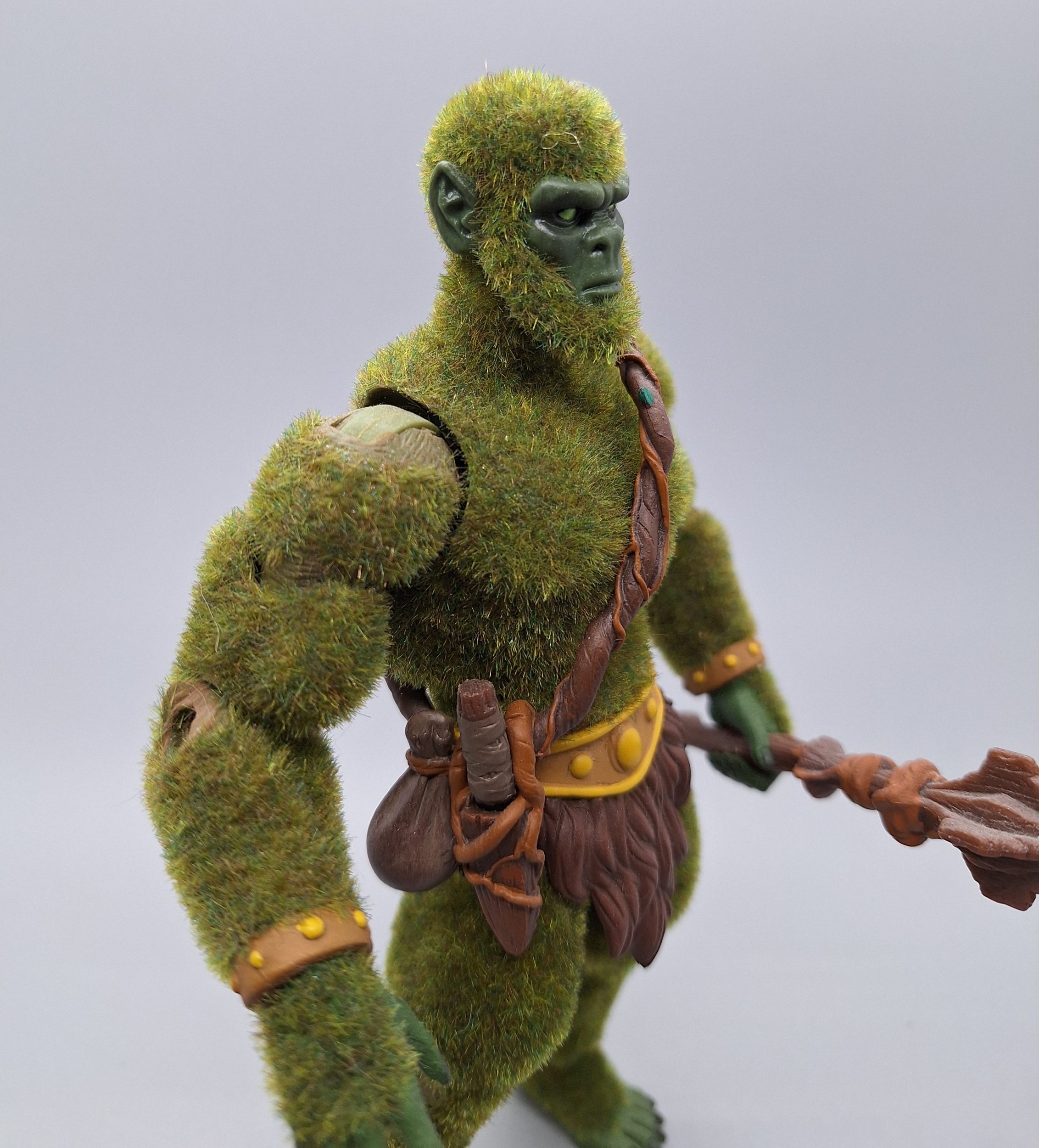
Adam: Overall she’s a beautiful figure, one of the best Mondo has ever done. There is something compelling about the character itself. Her roots lie at the very beginning of the Masters of the Universe mythos, and I feel she has an important role to play in it. But for a long time she was forgotten, and arguably brought back to life through the advocacy of artist Nate Baertsch back in the MOTU Classics era.
Jukka: I agree, that the (Green) Sorceress aka Goddess has gained popularity in the fandom, due to her striking color scheme in that single minicomic appearance. Big thanks to Nate “Baena” Baertsch for creating fan arts about her, which have spread online and added to her intrigue.


Images from New Eternia blog interview with Nate Baertsch
Adam: While I don’t totally sign onto the idea that she’s some kind of Teela variant, I’m happy that the figure is at least getting represented, even if the original character behind the figure is sometimes forgotten. What I’d really like to see though is a faithful figure based 100% on Mark Taylor’s original artwork – we haven’t gotten that yet. But I do have to say that the Mondo version of the Goddess is my favorite version to date.


Thank you to the following individuals who are current Patreon supporters or Facebook subscribers!
- Adalberto V.
- Adam A.
- Allen B.
- Allison T.
- Andy Y.
- badtaste®
- Ben M.
- Chris C.
- Chupakaibra
- Cory from Make Shape Create
- Dane R.
- Eric H.
- Erik B.
- Garry H.
- Gianluca V.
- J Man
- Jacob T.
- JackieX
- James Z.
- João S.
- Johnny L.
- Jon E.
- Juan P.V.
- Kris K.
- Lyca
- Max I.
- Michael M.
- Mike G.
- MotuOriginsCork
- Nate B.
- Oprah D.
- Orion W.
- Ove K.
- Øyvind M. (Patreon & Facebook)
- Patrick F.
- Philip O.
- Rich S.
- Robert B.
- Scott B.
- Stephen B.
- Steven K.
- Tate W.
- Todd G.
- tupalev
- wolfliche