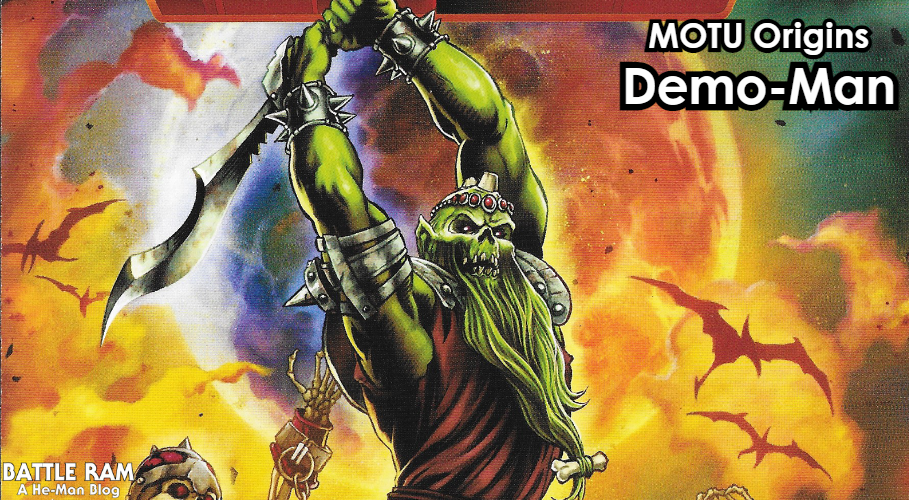
Written by Adam McCombs
When the Sketch Book Mark Taylor He-Man figure was announced, I knew for certain I’d be getting the figure. I’m very much a cherry picker of the MOTU Origins line, but I will always be a sucker for anything related to early Mark Taylor concepts. Mark Taylor, for those of you new to this site, was the main designer for the first year of Masters of the Universe toys.
The Sketch Book series is an interesting sub-line within MOTU Origins, consisting of figures based on early concepts for various characters. Under the Sketch Book name, so far we’ve also gotten concept versions of Hordak, Grizzlor, Sy-Klone and Spikor. The He-Man they’ve chosen for this release is mainly inspired by early sketches by Mark Taylor dating from 1980 to early 1981 as he sought to refine the look of the character prior before it was greenlit. Mark’s concept designs are shown below:


(The above images come from The Power and the Honor Foundation)
There are a few other elements included in the Sketch Book He-Man release. One is the orange and gray horned helmeted head from Mark Taylor’s He-Man B-sheet, dating to May 1981:

The other element is the shield from Mark Taylor’s character, Torak (which also shows up in one of the He-Man concepts shown earlier). This illustration dates to 1979 and was the inspiration for He-Man. You can see that some of Mark’s early He-Man concepts, shown earlier, have Torak’s wrist bracers:

So, does the Sketch Book He-Man measure up to Mark’s artwork? Let’s find out!
Packaging
He-Man comes in the now familiar Sketch Book Series window box, with some wonderful illustrations by “FETCH” aka Francisco Etchart. The back of the box also features some great easter eggs, including Mark Taylor’s concept Man-E-Faces design (another figure that will be coming out this year), a “dungeon master” Skeletor concept by Colin Bailey (possibly related to Dragon Blaster Skeletor), the Crimson Countess, created by Danielle Gelehrter, and an early concept by Mark Taylor for Castle Grayskull.


Let’s take a look at the actual figure. It comes with two heads, a removable harness, an axe, a shield, and a removable flexible loincloth that fits over the usual furry He-Man loincloth piece.


While the head with the dark hair is the head that goes with the costume design of this figure, you can also use the blond-haired head (ie the B-sheet head) if you like. The costume details are great, as is are the accessories. However, there are two major problems with the figure.


The most obvious issue is with the head sculpts. If you closely compare with the original artwork, you can see what they were going for, but the final result is just not very good. This figure unfortunately suffers from “Masterverse-itus” – the tendency in the Masterverse line for many heroic male figures to have very cool costumes but poorly sculpted faces. Unfortunately that problem has shown up in this Origins figure. The head with the black hair looks like it could belong to a pre-teen playing dress up. The level of detail is particularly low, and it looks like something you might see on a Playskool toy. The head with the blond hair is more detailed, but it looks ugly – and not in a good, rough and tumble way. I also have another, minor gripe – the center line of his helmet is off center.

I appreciate the effort and expense they took to give us a couple of new He-Man heads, but honestly, they would have been better off taking the standard vintage toy style He-Man head and sculpting the new hair and helmets over that. The standard head is closer to the artwork than either of these heads. I was waiting to pass judgement until I got this in hand, but honestly these faces are a letdown.

The other issue really comes down to lack of foresight. The blond-haired head inspired by the B-sheet doesn’t really go with this body, but it’s just the right head to go on the standard MOTU Origins He-Man figure. The standard Origins He-Man has the same costume, colors and accessories as those seen in Mark’s B-Sheet design. However, because of the pale skin color of this figure, the head doesn’t actually work with the standard He-Man, or any of the other He-Man figures in the Origins line, to my knowledge. Here is the standard He-Man body with the B-sheet style head:

And here is the Lords of Power He-Man body with the B-sheet-style head:

I’ve actually been pretty impressed with the Sketch Book series up to now, but this He-Man is the first real let down. It’s a shame. Do the bad head sculpts totally ruin the figure? No. It looks fine from a couple of feet away, standing on a shelf. But I wish this figure had been given some more thought, care and effort. A figure paying tribute to the great Mark Taylor and the early roots of He-Man should have been better than this.

Thank you to the following individuals who are current Patreon supporters or Facebook subscribers!
- Adalberto V.
- Adam A.
- Allen B.
- Allison T.
- Andy Y.
- badtaste®
- Barbarossa
- Ben M.
- Chris C.
- Chupakaibra
- Cory from Make Shape Create
- Dane R.
- Eric H.
- Erik B.
- Garry H.
- Gianluca V.
- J Man
- Jacob T.
- JackieX
- James Z.
- Jamie V.
- João S.
- Johnny L.
- Jon E.
- Juan P.V.
- Kris K.
- Lyca
- Max I.
- Michael M.
- Mike G.
- MotuOriginsCork
- Nate B.
- Oprah D.
- Ove K.
- Øyvind M. (Patreon & Facebook)
- Patrick F.
- Philip O.
- Rich S.
- Robert B.
- Scott B.
- Stephen B.
- Steven K.
- Tate W.
- Todd G.
- tupalev
Want to support the blog? Consider becoming a Patreon supporter or Facebook subscriber. You’ll also gain access to exclusive content and early access to posts on the blog. Thank you!