
Written by Adam McCombs
Announced in 2017, Super7’s vintage style, 5.5″ Filmation inspired Skeletor figure was released in 2018 along with similar versions of He-Man, She-Ra and Hordak. The design ethos seems to be based on the following premise: what if, in the 1980s, Mattel released a series of He-Man variant figures that were “as seen on TV”? That’s pretty much exactly what we get with this series, including the occasional design shortcuts that Mattel might plausibly have implemented in the 80s.
Design & Development
Within the packaging for Skeletor we get a brief write-up of the history of how Skeletor’s design was translated from toy to cartoon:

In the above sheet (put together by The Power and The Honor Foundation), we see the vintage Skeletor figure, along with a work in progress and a finalized version of Skeletor’s animated design. His animated appearance in an early Castle Grayskull commercial is also referenced, although an image isn’t included, likely because most images of Skeletor in the commercial are close-ups.
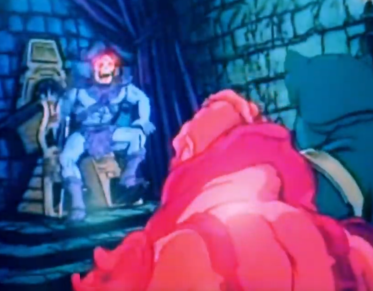
In Skeletor’s first animated appearance (a commercial animated by Filmation Studios to help advertise the toyline), Skeletor more or less follows the design of the action figure, including the highly detailed costume, monster feet, and red eyes. The only liberty taken is with his face, which doesn’t feature the green paint applications of the action feature. The commercial can be viewed in its entirety here: https://www.instagram.com/p/BpmvudrnPlj/

As shown in the card that came with the Super7 Skeletor figure, Skeletor’s more detailed action figure design was simplified for ease of animation once the animated series was greenlit for development. The evolving and finalized designs can also be seen in the images below. He also has a more realistic hood design compared to the vintage action figure, and an angrier-looking face.

He-Man and She-Ra: A Complete Guide to the Classic Animated Adventures (James Eatock)


In some ways these changes brought him a bit closer to Mark Taylor‘s original design, which also featured a larger hood and relatively human-looking feet

In fact, material from the Series Guide shows an intermediate Skeletor design that is partway between Mark Taylor’s original concept and the animated version:

The prototype Skeletor figure was revealed in February of 2017 at New York Toy Fair. It’s pretty close to the mass produced figure, although his colors are a bit different, with paler blue skin, a more vivid yellow skull, and black fingernails:

Production Figure
Design-wise, the sculpt of the chest and pelvis seem to be taken directly from the vintage 1982 figure. The arms are based on the vintage figure as well, but the “fin” structures on the forearms have been removed. The feet have been changed, removing the three-toed feet and substituting the streamlined boots from the cartoon.

The production figure, as is always the case, isn’t quite as sharp as the prototype. It’s pretty closely based on the Filmation source material, but of course with the bulky proportions of the vintage toy.


The figure comes with a pretty Filmation-accurate Havoc Staff, with the exception of the color, which came out more pink than light purple. Skeletor also includes a purple version of the He-Man’s cartoon style Power Sword (not a weapon Skeletor used in the cartoon, but a nod to the vintage figure), as well as a half Power Sword that fits together with the 2018 Super7 He-Man figure. The Swords are pretty closely based on the animated design, but also feature a hand guard, which Mattel tended to use on almost all of its swords in the vintage line.

Out of the packaging the armor tends to ride a little low, and it’s fairly stiff plastic, making it difficult to adjust. However, 10 seconds with a hair dryer makes it temporarily rubbery and pliable, which allowed me to adjust the armor to sit correctly, as shown in my example above.
Compared to the vintage figure, the 2018 version is certainly less detailed, but the face actually looks a bit more evil. The new version has a hard head as opposed to the soft, hollow polyvinyl of the original. The Filmation-inspired Skeletor’s blue skin is also quite vivid compared to the pale blue of the original.

Packaging
The design of the packaging was directed by The Power and the Honor Foundation. The main carded version (which was actually released second) is based on the original 1980s design, with an “AS SEEN ON TV” burst which, although not featured on vintage MOTU packaging, was pretty commercially ubiquitous at one point. The shape of the bubble on the front has been altered compared to the vintage packaging.

The main artwork on the back was done by Errol McCarthy, who worked on cardback art for most of the vintage MOTU figures. The cross sell artwork and the insert were illustrated by Emiliano Santalucia:


The first version to be released was actually a two pack, in the style of some of the vintage figure gift sets. This set was released in limited numbers.


Another limited release of the figure came in the form of a “Los Amos” package, based on the design of vintage “Los Amos” (Mexico) figures:

Want to support the blog? Consider becoming a Patreon supporter. You’ll also gain access to exclusive content and early access to posts on the blog. Thank you!
I have mixed feelings about these figures. I generally avoid Filmation-style figures in general, though I have no problem with them existing. I grabbed one of these because, despite opening everything I get, I’ve long wanted a vintage MOC Skeletor as a display piece. I figured, unless I get lucky and suddenly have a huge surge in book sales or something, this was as close as I could ever get. Later, I wound up pre-ordering one from BBTS as well, figuring I’d wanna open one up, too. Long story short, I wound up deciding not to open one, partly due to the epidemic of leg breakage issues, but mostly because I decided my vintage collection wouldn’t be improved by having a Filmation version in it. One to display in the package would be plenty. One of the two I ordered looks quite nice, with none of paint issues the other one suffers from. I also love that they actually got Erroll McCarthy to provide the cardback art!
My main issue with this line is that it’s yet another one that has been taken over by Filmation. When this line was announced, with still-yet-to-be-released He-Ro and Eldor as part of it, I (and many others) found myself dreaming about all the vintage-style figures we could now get. Concept characters (like Demo Man and Vikor) who never saw the light of day, figures (such as the green Sorceress and Lodar) who should have been, even characters who came later (like King Grayskull and Draego Man) that would be awesome additions to the vintage line! But, with four waves revealed, it appears that Super 7 is only interested in it as yet another line to churn out Filmation-style variants, and that is such a sad waste of a wonderful opportunity.
I also hope they’ll do more with the series than just Filmation variants. I’m happy to get the filmation versions, which are fun, but there’s a ton of potential to do so much more, as you say
I bought the first four as support for the concept of 5.5 figures, and snapped up He-Ro and Eldor as soon as they went on sale. I intend to order Shadow Weaver and perhaps Evilseed, but the rest either aren’t different enough (you couldn’t spring for an Energy Bow attachment for Trap Jaw?) or just plain unappealing (Beast Man and Teela). If they put out the 1988 wave, though, I’m definitely there.
I actually wasn’t planning to buy any of the Filmation stuff, but I finally relented. For Filmation figures, I definitely am more interested in figures that weren’t produced as you mention, like Shadow Weaver and Evilseed. I’d also love to see 5.5″ versions of characters like Fang Man, Strongarm, Icer, etc.
Teela does look a bit uninspiring. Beast Man’s prototype at least has the wrong colors, I hope that is fixed in the final version.
yeah.. gotta say i’m not that impressed.. colours are off from the show and not a big fan of some of the bits (though I’m a bit bias). IN fact, the original blue is much closer to the cartoons desaturated colours etc.. still interesting enough article..
I don’t like the filmation style applied to action figures. As kid I became somewhat aware that the filmation design was simplified for a practical reason, and altough sometimes it beothered me in the end I accepted it. The same reason do not apply to action figures so the lack of details to me is a big “no”.
I must say that i like some details of this figure like the sculpts of the head and the havok staff (but not the color: I would paint it immediately XD), but the rest is not very impressive in my eyes. The blue used for the skin does not fit Skeletor: the vintage pale blue give to the figure an unhealty look, very fitting for someone who has a skull for face.
Is not bad but overall looks more cheap than the original (maybe “cheap” is exaggerated but I can’t find a better word to describe what I mean)