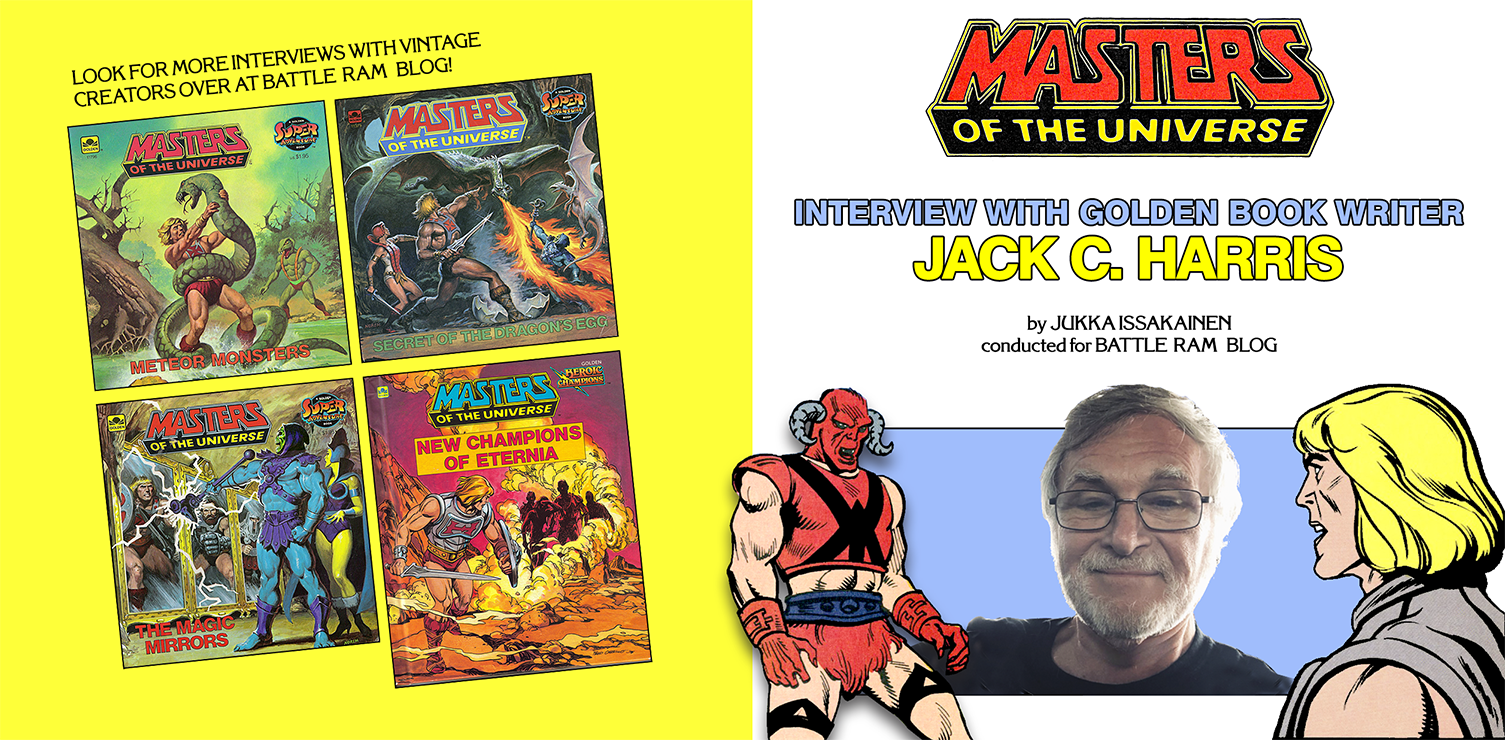
Interviews

Interview – Bob Nall – creator of MOTU logo and package designer (2015)

Mr. Bob Nall

Interview by Jukka Issakainen

Note from Adam: this is a 2015 interview with Bob Nall conducted by Jukka Issakainen. Jukka’s interview inspired me to interview Bob myself several years later. Jukka uncovered quite a lot of great information here, and he asked me to repost it here.

Jukka: Hi Mr. Nall. My name is Jukka Issakainen and I recently discovered your name via Power-Con that you were the person behind “Masters of the Universe” logo, packaging etc.

Bob Nall: Hello Jukka. Yes, it’s true – I did design the Masters logo and was instrumental behind the entire package design line look and am proud to this day.

Jukka: What was your involvement with Mattel?

Bob: I started at Mattel in 1976 as a Sr. Art Director. I designed logos and packages for many brands and settled on Boys items (mostly Hot Wheels). When the product designers developed He-Man (largely designed by Mark Taylor – who worked in the same group) I had the opportunity to look at the retail face of the brand. We looked at many names before coming up with MOTU – it was almost called ‘Lords of Power’ but many thought that was too religious in nature.

Anyway, my career there took me through most of Mattel Brands including Barbie for a while and eventually I ended up as Vice President of Package Design for all Boys Toys and allowed me to influence all packages for Boys.

Jukka: Can you tell more about the work you did? Like with packaging.

Bob: I worked for Mattel for 31 glorious years of creativity and during that time I worked on most of Mattel’s product lines. I left in 2007. The last 15-18 years I mostly worked on Boy’s Toy’s ( Action figures, Hot Wheels, Matchbox, Games etc.). I was the primary Designer for the origination of the Masters Packaging Line Look.

I designed the original logo and the first blister cards and commissioned the final artwork. I was promoted to Manager around this time (’81/’82) and subsequently had a significant hand in directing the art through the designers that worked for me.

Jukka: Do you remember (or have in your possession) earlier concepts that didn’t make it into production?

Bob: I did have the original sketches and concepts for the MOTU logo and other candidates titles (Lords of Power) but unfortunately they are long gone I’m afraid.

Jukka: ​If you can’t find any (or they are long gone) old sketches or ideas for the logo or alternative versions. Can you try describing them?

Bob: I can say that they were all very dramatic and heroic looking. I created maybe a dozen or so before settling on the ONE. Normally I would do many more but I got to a solution quickly that everyone loved. My final draft was very tight and was done in prisma colored pencils. The final art was done by John Hamagami and was air brushed. He matched my art exactly and even improved on it a bit.

Jukka: Do you recall more about the process for the logo? What paper you used? How big?

Bob: I don’t recall the paper but my original was approximately 9×12. The final art by Hamagami was approximately 18×24 which included the blue background and exploding rocks.

Jukka: Were there inspiration from logos such as STAR WARS with the perspective-use on the logo?

Bob: This technique has been well established for many years – it inspires “bigger than life”‘” drama. Do you remember Ben-Hur? A 1959 drama. Check it out.

Jukka: Haha. Alright.

Bob: Also it was emanating from the exploding rocks. Seriously – just going for drama.

Jukka: Were you ever approached again to work on the MOTU logo and packaging after your original work was done?

Bob: All packaging that went through the Mattel Product Line was overseen by me and Marketing. I did not participate in licensed items or entertainment – that was handled by the Licensing group but they did follow Packaging’s guidelines. There were other versions of the logo that showed up but they were all based on my original design.

Jukka: I found a pic of the alternative logo of MOTU on the minicomic cover. Can you tell me more about this logo version?

Bob: As you can see, the logos on the left are the original and the one on the right is someone’s (probably a licensor) version.

It mimics the original but is not too good as far as logos go (my opinion). Back in the day, MOTU was taking off and making tons of money so many Mattel entities and others outside of Mattel wanted a piece. These types of anomalies popped up all the time.

But, I will say this – the logo you are questioning definitely followed the original MOTU logo which I created. It may have been rendered that way for a variety of reasons (who knows) but none of which came through my office for approval. As I said, there were many hands in the pot once the brand became successful.

If you may recall my earlier comment – Lords of Power was a runner-up contender for the brand name but MOTU was chosen instead.

Jukka: Did Mattel give you a direction/outline to work from, or were able to come up with the design on your own completely?

Bob: In the early eighties directional outlines were rare. In the case of MOTU I invented the concept from my imagination and my work was positively received by upper management – so we went with it. I did collaborate with Mark Taylor ( primary product designer for the line) on synchronizing package with product.

I was passionate about MOTU. Whenever I design something it means a lot to me. I believe that all designers feel that way. All work that I was involved with at Mattel was an opportunity to improve my surroundings.

Jukka: Do you remember why you decided to go with what you did? For example, using a blue background instead of a black “universe” background?

Bob: Mark Taylor and I agreed to capture the feeling that Frank Frazetta’s fine art posters conveyed. That was the inspiration of the overall look of the art. I chose to present the logo in the blue background so that the packaging would have more presence in the retail environment. Blue is known to have ‘shelf appeal’ for Boy’s products. Black can bring strong emotional appeal but it can tend to recede.

Jukka: Did you make the MOTU packaging designs with the actual figures in mind? (the red and blue)

Bob: Red and Blue are both popular colors for Boy’s products and in my mind they convey strength and vitality. As a basic color palette blue did a good job of conveying ‘good’ and red conveyed ‘evil’ – you can see this in the cross-sell of the items throughout the line.

Jukka: How did you experience the rise (and fall) of the original line?

Bob: Large company’s like Mattel often jump on a success and over produce to the point at which they kill it. Happens every day around the world. It seems that there is a propensity to get more and more until there is no more left. I think we simply over-produced the line until our consumers lost interest. Won’t be the last time.

Jukka: Do you know how the idea for the mini-comics came about?

Bob: The mini comics came about in an attempt to “authenticate” He-Man as a comic action hero. We interviewed many comic artists and started with Alfredo P. Alcala, again in an attempt to hold costs down and get great art.

Alfredo didn’t speak great English and was a bit of a loose cannon at that time – we had to struggle to get the work on deadline but we needed to hold budgets so we put up with his idiosyncrasies – I remember one time he came to our offices to present his work and he was without shoes. A true artist.

He did the whole thing – we provided a storyline and Alfredo laid out the panels, did the pencils, line art and color. It was great for a while but eventually his lack of reliability made us look elsewhere for the comic art.

We next hired Lee Nordling to coordinate the work. Lee managed a few artists that did the various stages of the comic development. The entire process was very time consuming and getting too expensive.

Jukka: Did you decide which artists to use for the painted box arts? Were there artists that you would have wanted to do illustrations but were not available or didn’t happen for other reasons?

Bob: We were trying to emulate the style of Frank Frazetta as we could not afford him. The first item that required an oil painting was He-Man and Battle Cat. That artist was Rudy Obrero.

Rudy ended up doing many pieces for the line over time. Another artist that was used very often was William George. Once we established a style and a working relationship we could then proceed efficiently saving Mattel from paying exorbitant fees. In a company like Mattel where tons of work is outsourced finding value is a top priority.

Bill George became a favorite in the early eighties because of our long standing relationship with him and his ability to quickly meet our needs with great art and a fair price. Bill did most of the box art oil paintings on the accessory items during those prime years. Mattel still has most of those original oil paintings.

Some of the designers that created the box layouts and commissioned the final art were: Harry Garo, Jiro Tomiyama, Joe Mendez and Jim Wolfe. There were others but those guys were the main designers.

Jukka: Did you for example design MODULOK package?

Bob: At the time of Modulok I was the Manager of the Package Design Group that was handling MOTU items. I was instrumental in the design direction along with the Marketing Manager (whose name escapes me) and the Package Designer himself.

Jukka: Were there specific requirements given to artists about the packaging painting? For instance if there was art about Fisto riding the mechanical horse Stridor, was it dictated that which evil warriors would also be in the image. Or did the artists have freedom in choosing?

Bob: William George did most of these and sometimes we would tell him specifically who we wanted in the frame and sometimes he would just add them. At times he had to remove and replace a figure so we usually caught this at the pencil stage.

B&W sketch image courtesy of Musclor.fr.st website

Jukka: Do you have any recollection which artworks the others (Garo, Mendez, etc) did?

Bob: These designers worked in my group – they laid out the packages, they did not do final paintings. Mark Taylor did the original He-Man and Battle Cat package and found and hired Rudy. Harry Garo designed the Skeletor/Panthor package, and William Garland painted final. As the line kept growing there was A LOT of artwork going on with 5 or 6 designers within my group. Jiro Tomiyama did a lot of them and Jim Wolfe managed quite a few projects.

Jukka: Do you remember how the artists who worked on the cardback-arts?

Bob: The main guy that did the cardback art was Errol McCarthy – he did the comic style art and believe me it was beautiful! The cross-sell images were little gouache paintings and I think Bill George did the illustrations.

Jukka: I wanted to ask, who illustrated the 1987 spin-off THE POWERS OF GRAYSKULL logo? And who did the art on that metallic skull?

Bob: As I recall, Jim Wolfe designed the Grayskull logo to stylistically live with the Masters logo. He did not illustrate final art – can’t remember who did. Probably the same artist did both the logo and skull – Jim Wolfe would know.

Jukka: Jumping to the 2002 toyline and its packaging. In them, the back-side had a photo of the figure and its functions. Do you know why they didn’t create art instead?

Bob: Money and time. Every fan would like to believe that MOTU was a work of complete passion and only passion – that simply is not true. Mattel is a business. And like every business it survives on costs vs profits. We had to do our best to keep costs down and the quality very high. We were all passionate about that.

Jukka: What’s your opinion on the later logo and packaging designs? I mean MOTU Commemorative, 200X and MOTU Classics.

Bob: The Commemorative logo (black on black) did come from my group and we believed that it skewed higher-end for the Adult Collector.

Other logo applications were executed to deliver a version of the original and not to be confused with the original. I think they each serve their purpose – so it is not so much a design call but more a strategic application. They are all good. Mine however was the best (of course).

Jukka: If you were to do a new MOTU logo and packaging, what would/might you change? Or would you leave it all as it was back then?

Bob: If I were to design it for today’s market (30 years later) it would no doubt be different. I would be influenced by today’s trends. It would probably be more ‘tech related’ but not necessarily better. Designers are all highly influence by what is going on around them. They all want to be part of what’s happening and they try to put their influence on what is popular. Enhance the current.

Jukka: Thank you very much!

Golden Books, Interviews, MOTU History

Interview with Jack C. Harris – Golden Book Writer

Interview by Jukka Issakainen

Thank you very much for agreeing to this interview! Tell us about yourself!

Born and raised in Wilmington, Delaware, I was a life-long comic book fan and, originally, I studied art at the University of the Arts in Philadelphia with the goal of being a comic book artist. However, that path changed when, upon graduation, I was hired by DC Comics in New York to be one of their Assistant Editors. That shifted my focus on to editing and writing. As a full Editor at DC, I edited such titles as Green LanternWorld’s Finest Comics, Legion of Super-HeroesBlack LightningFirestorm and many others. As a writer, I wrote stories for Wonder Woman, Supergirl, Batgirl, Robin and others. I created the Ray and wrote the graphic novel, Batman: Castle of the Bat.

How did you end up working for Western Publishing (Golden Books) and their projects?

After leaving DC and working for a trade magazine for the licensing industry, I freelanced for DC, Marvel, Archie Comics, Darkhorse and just about every independent comic book company there was.

While working for the licensing industry magazine, we covered publishing. I received a press release regarding Golden Books’ (Western Publishing) plans to issue a series of Masters of the Universe storybooks. The editor was a gentleman I knew from the comics industry. In my capacity as a freelance writer, I contacted him and soon had MOTU assignments.

With Masters of the Universe stories, what did Mattel provide you with in order to form new tales for our heroes?

When crafting these stories, the editor would forward everything I needed for the backgrounds of the characters. These would be in the form of press releases from Mattel, which included a photo of the toy or a picture of a prototype. Sometimes, I would get the toy itself.

How long would writing a story take?

I was free to plot any kind of story I wanted as long as it didn’t go against the main, established storylines and characterizations of the characters. I could usually plot a story in a day and talk it over with the Editor. This was during the days before the Internet, so our communication was over the phone.

Once a plot was approved, it took me about a week to type up a script, writing about two manuscript pages for each printed page. Typically, a 24-page storybook followed a 48-page, typewritten manuscript. These were delivered through the mail or, if I was going to be in the city, I would drop the manuscript off in person.

With character selection, did your Editor (or Mattel) require specific characters with each respective story?

In the very first MOTU story I did, Mattel did request the inclusion of Fisto, who was a new character at the time. They sent me a Fisto toy (but I don’t recall whatever happened to it).

You wrote a hardcover story “New Champions of Eternia”, which has a unique origin story for the Skeletor henchmen Evil-Lyn, Beast Man, and Tri-Klops; as passengers onboard the spaceship that Queen Marlena piloted. What do you remember about this story and reference Mattel provided?

All of the origin stories and back stories of the MOTU characters came, in detail, from Mattel. I might have embellished them in a narrative, but the basics were always there from Mattel, whether in text or in the drawings or prototypes. There may have been incidences where I made something up, but it was too long ago to recall specifics.

Which story was your first and which one is your favorite and/or least favorite?

Mattel requested Fisto’s appearance in the first MOTU book I wrote, The Secret of the Dragon’s Egg. This is also my favorite of the ones I wrote, mostly because of the stunning Norem cover. Some time ago, I tried to track down the original art of this cover, hoping to obtain it for myself.

Super7 Art Print, in association with the Power And Honor Foundation

My least favorite was New Champions of Eternia because the interior art completely misses the mark, from misinterpreting my original manuscript to not maintaining the established “look” of the characters.

What were the challenges?

Compared to writing for the comics, the storybooks were a little easier since they usually focused on one major incident, rather than a complicated series of events. The scripts would include descriptions of all the illustrations for the artist and all the dialogue for the typesetter. References for the characters were attached, usually copies made from the material provided by the Editor which he had obtained from Mattel.

I don’t have copies of any of these old scripts.

Goat Man from Golden Books (Masters of the Universe)

In the story “The Secret of the Dragon’s Egg”, there is a new character called Goat Man. He did not have a toy in the 80s and your book was his only appearance. What can you tell us about him and his creation?

In the instance of “Goat Man,” I had originally included an unnamed monster minion for Beast Man, but the editor added the name to him. He wasn’t based on any toy.

What was the name of your editor while you worked on the MOTU stories?

Mike Tiefenbacher was my editor at Golden; there were a few Assistants I also worked with such as Charlie Kochman, who later became an editor at DC.

There were many talented artists working on the stories. How did they get paired with writers?

The editor assigned the artists, so I never had any input as to who was going to draw my stories. I was lucky, in that I usually got some extremely talented individuals to illustrate my tales. Some of them I had teamed up with previously in comic books, such as Luis Eduardo Barreto and Fred Carillo. What really impressed me were the painted covers, especially the ones by Earl Norem, who also illustrated covers for such magazines as Reader’s Digest and Field and Stream.

Were there any stories left on the “cutting room floor”? Or pitches that were vetoed?

I never pitched a MOTU story. These were always assigned to me. I would get a call from the editor and he would give me a list of characters to use and I would go from there. The only “pitch” I would give was to the plot of the adventure. I never originated the discussion of stories.

Golden Books also did stories with “She-Ra, Princess of Power” who was He-Man’s twin sister. Were you offered to do any stories for She-Ra?

I never did any She-Ra stories.

Who is your favorite MOTU character?

He-Man himself was always my favorite MOTU character, because he had all the classic “super hero” traits, from super-strength down to the Clark Kent-ish meek alter ego.

You have worked as an Editor and a Writer. What pros and cons do you feel come in those positions? Which one do you prefer?

The best part of being a comic book editor was all the great creative people you were able to meet and work with! The downside were the never-ending deadline pressures!

Oh, and being a writer was more fun than being an editor.

Were there any artists you would have liked to have worked with? Did the writers have any say in the matter?

I was paired with many other artists on other books, such as Al Bigley, Mike De Carlo, Dan Adkins, Carmine Infantino, Gene Biggs, and so many others.

Your MOTU stories appear in both softcover versions and hardcover. Did you know the format in which the story would be published, and what the approach was like?

The format for these books was 8″ x 8″ in both soft and hardback editions. I never knew if the soft covers would also be published in hard-cover editions, and it really didn’t matter as the scripts were typed up in the same matter for either.

What other projects did you work on during your time at Golden Books?

Once I had the MOTU books under my belt, other projects followed, on an extremely wide field of characters and subjects, both fiction and non-fiction: Other licensed characters such as Batman, Conan, the Dino-Riders, Garfield, the Ring Raiders, Zelda, the Galaxy Rangers, the Super Mario Brothers. I did a biography of Dwight Eisenhower and non-fiction books on jet planes, firefighters, and boats. It was a long and varied list.

Did you ever watch the animated series by Filmation?

Since I was writing so many licensed characters, I spent many a Saturday morning watching cartoons with my three daughters. This was “research”!

What projects are you currently working on?

Currently, I am mostly retired, but still touch upon the occasion freelance assignment. In October, I have a book coming out from TwoMorrows Publishing entitled Working With Ditko, which chronicles my many comic book collaborations with legendary comic book creator Steve Ditko.

Thank you very much Mr. Harris!

You’re welcome!

Interviews

Patrick McDonald: Child Actor & Star of Two Bad Commercial

Patrick McDonald with Two Bad

Interview by Adam McCombs

Adam: So you appeared in the original commercial for Two Bad – how cool is that? How did you end up in that commercial?

Patrick: First I want to take a moment to thank you for the questions. It’s a humbling experience to see the reaction from the communities for revealing my connection to this commercial, particularly this figure. I started acting when I was 8 years old and it was 1981.

I remember going on the audition for this particular commercial 4 years later and was excited! I had to return several times for follow up interviews before I was chosen among the other children to participate. At that time toy commercials were very common. To see a toy commercial like this was a daily occurrence for a child like me. They were especially common in the afternoons during cartoons. Being 12 years old at the time I was extremely excited and couldn’t wait to be a part of this specific commercial.

Adam: It looks like there are four kids in the commercial – which one were you?

Patrick: You can see in the four shot I am the moppy haired blonde boy on the far right holding He-Man. You can furthermore see close-ups of my face as I deliver my line as He-Man, “Well, well, an evil warrior!”

Young Patrick McDonald, holding He-Man
Far right: Patrick McDonald

Adam: What can you tell me about the process of shooting the commercial? How long did it take? Did you have a formal script you were following?

Patrick: When you’re an actor, even a child actor you get used to the process of showing up on set, getting into wardrobe, being placed in the makeup chair, the lights, the cameras, and all the action that follows. This was just another day in the park for this young boy. I remember it took two days to shoot. I remember there being several of the figures on set of both He-Man and Two-Bad. They looked fantastic, brand new, and unplayed with. They had several on set just in case one got a scratch or was damaged during shooting. After the shoot was over I remember them telling me I could take one with me. You can imagine how exciting it was for that 12-year-old boy to be holding a Masters of the Universe figure that no one else had seen.

Adam: I assume you were probably one of the first kids to play with Two Bad, before he was actually available – were you allowed to talk about that with your friends, or did you have to kind of keep it confidential until it was released?

Patrick: I don’t remember ever being told that I could not discuss Two-Bad with anyone. However, within a very short period of turnaround time I started seeing myself in the afternoon between commercial breaks of the cartoons I was still watching.

Adam: Do you know exactly when you filmed the commercial?

Patrick: I’m certain it was 1985, as far as the month I’m not exactly sure. What I can tell you is 38 years later having revealed to the community that I participated in this commercial the response I received was much more positive, loving, and humbling than any 12-year-old boy would have ever expected. It is an honor to have played a very small role in a particular character figure for such a wonderful, giving, and entertaining phenomenon as Two-Bad was for the Masters of the universe. With the re-release of this figure I have come full circle. That 12-year-old boy never would have imagined how big and popular Two Bad would be for generations to come.

Adam: You mentioned starting acting at 8 years old. Can you tell me more about that and what roles you pursued?

Patrick: Most of the things I acted in were commercials. There are still several of my McDonald’s commercials on YouTube. And I officially stopped acting when I was 18 years old. By that time I had appeared in over 23 commercials nationally. I got to play in a few episodes of a soap opera called Santa Barbara and a few episodes in a television show called The Hogan Family with Jason Bateman and Sandy Duncan.

Patrick is the boy who drops his ice cream in the sand
Patrick is seen on the steps, sliding closer to the girl.

Adam: Growing up, what was your introduction to Masters of the Universe? What were some of your favorite MOTU toys?

Patrick: Like most boys my age I was introduced to He-Man through the cartoon series that started in 1983. I remember having a He-Man birthday cake at one of my parties. I also remember using Christmas wrapping paper tubes as swords running around the house shouting, “By the power of Gray Skull, I HAVE THE POWER.” By the time I had done the commercial, Two Bad was part of wave 4. So up until that point I had figures like He-Man and Skeletor like most of you, Whiplash and Fisto as well.

I was a mud kid when I was little. I think a lot of us created scenes and scenarios in the backyard using whatever we had at our disposal. The great thing about He-Man was he was magical. He could be placed into almost any scenario and still come out the hero.

Adam: Are you involved in collecting MOTU figures today, or is this more something you remember fondly from childhood?

Patrick: I wish I could say I became a huge Masters of the Universe collector. However, the same year I did the commercial for Two Bad a movie called Back to the Future was released. That became my new obsession. I have since become a huge Back to the Future collector.

Adam: Aside from your role in the Two Bad commercial, what is one of your fondest childhood memories related to Masters of the Universe?

Patrick: Although I was a He-Man fan it was truly Skeletor that I was more of a fan of. In retrospect now that I’m older I realize that this character reminded me of my father. Skeletor was tough but also extremely funny and very likable. Creating my own Skeletor castle out of mud, grass, and weeds in the backyard was one of my biggest accomplishments as a 10-year-old.

Thank you for taking the time to ask me these questions It’s been an honor. If there’s ever anything I can additionally do to contribute to what you do for our community it would be an honor.

Many thanks to Patrick for taking the time to answer my questions!

Want to support the blog? Consider becoming a Patreon supporter. You’ll also gain access to exclusive content and early access to posts on the blog. Thank you!